Lund University students imagine problem-solving furniture for tiny workspaces.
Design-minded companies typically flaunt their cred through inventive and wildly creative offices. Of course, this requires a certain amount of space—and capital—to achieve. But before a business gets big enough to achieve a dream build-out, it probably started off with just a few people in a small, scrappy, temporary space.
But according to Stefan Diez, an industrial designer who is based in Munich, that doesn’t mean small offices shouldn’t be well designed and stocked with thoughtfully considered furniture.
Over the last four years, Diez has worked with Hay, a Danish furniture company established in 2002, on a project called theNew Order office system.
In collaborating with the brand, he noticed what he calls a blind spot in the furniture industry: small-scale office design. Startups and small offices typically open up shop in spaces that are intended for temporary use. They often don’t have the infrastructure of an established office, and are stretched thin financially, as well.
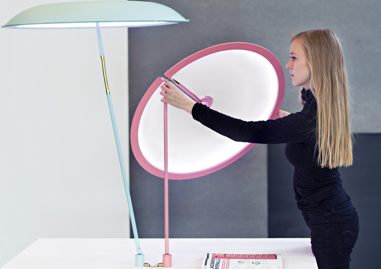
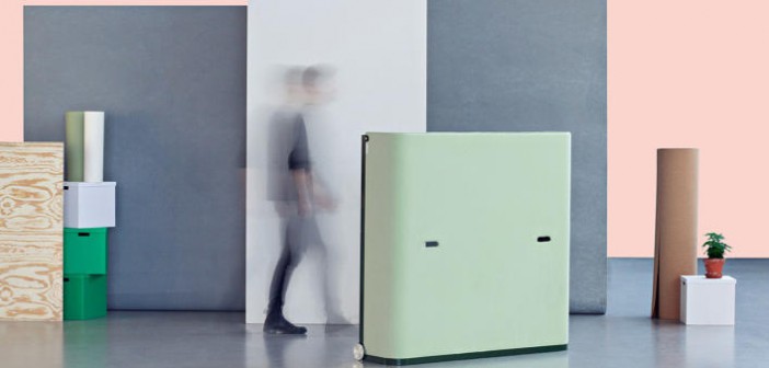
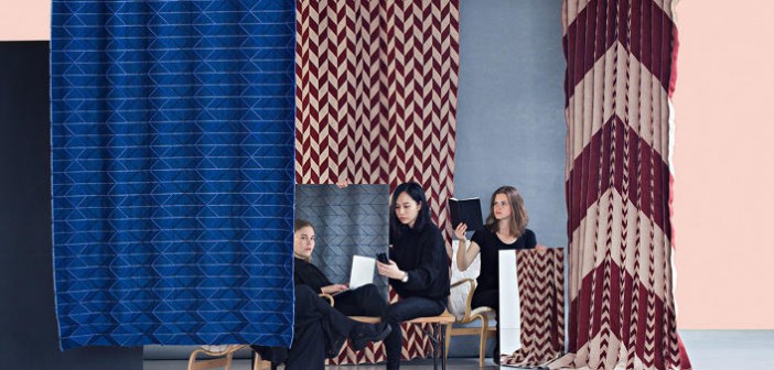
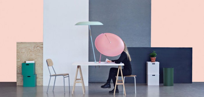
Umbrella—Malin Yngvesson
“Vitra, Herman Miller, and Steelcase have a sales structure that involves going through a professional office planner,” Diez says. “A small business with limited resources wouldn’t engage with a planner. They’d do it themselves and go to Ikea or get some old office chairs wherever they can find them. It’s surprising that we still have this deficit.”
Recognizing this challenge, Diez and Hay wanted to see how the next generation of designers—presumably the very people who would be using and purchasing this furniture—would solve the problem. Diez occasionally teaches university courses about how to push contemporary design forward through a problem-based approach and had the opportunity to tap the creative minds of students at Lund University.
The course yielded 12 projects—which range from furniture to lighting to acoustic dampeners—that tackle the storage, privacy, collaboration, social, and infrastructure obstacles that a small office might face.
At brief’s heart was what Diez and the students identified as a fundamental shift in how younger businesses are run. In an age of mobile communications and an equally mobile workforce, the reasons why people come to an office are changing. It’s not about a workstation, but more of an arena for collaboration.
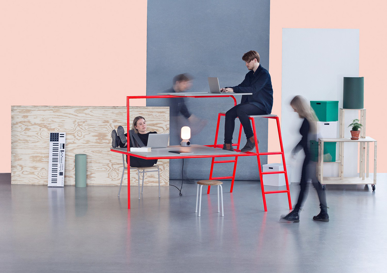
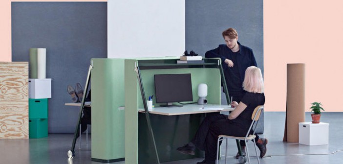
Bunk Desk—André Gunnarsson
“Some people say, ‘I do my emails on the toilet or train,”’ Diez says. “Offices are becoming ‘demachined.’ [Desktop] computers are gone and laptops are here. The heavy-duty infrastructure is disappearing, and the office has become more and more focused on communications, the thing you can only get in an office.”
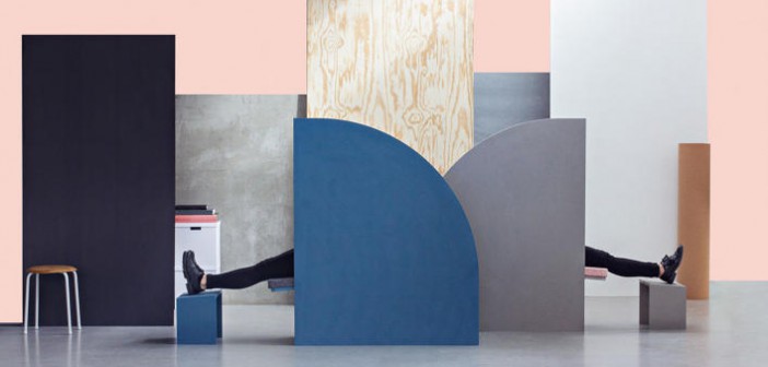
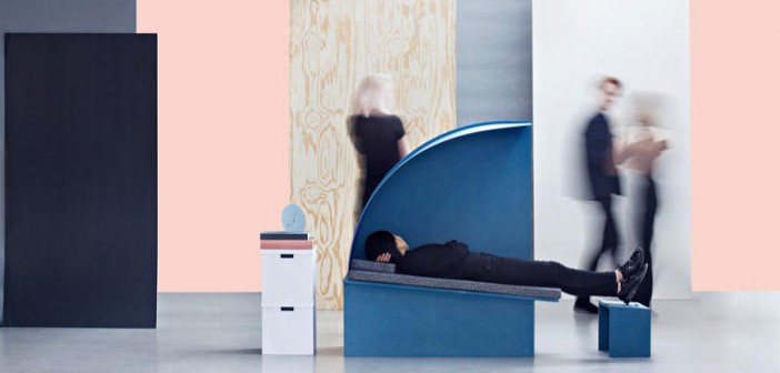
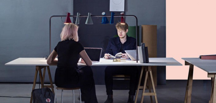
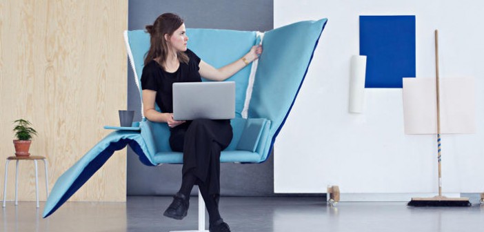
To that end, abating noise pollution and distractions that can arise from being in a small space filled with chatter was a major preoccupation. For example, the Bunk Desk by Andre Gunnarson offers a workstation that’s stacked atop another one, which offers a bit of physical separation from the rest of the office. The Zip It chair by Rae Bei-Han Kuo, as its namesake suggests, zips up to create a cocoon-like escape from the rest of the office. Tapping into thezeitigeisty trend of incorporating sleep into a company’s culture, Frederika Hansson designed the BRB nap pod, a high-sided lounge chair with an ottoman. She argues that while ping-pong tables and coffee rituals help inspire good work, sharing a small office is sometimes like sharing a room with a sibling—having private time is necessary.
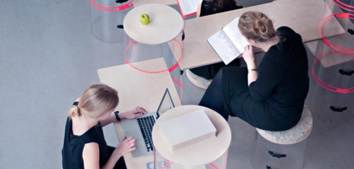
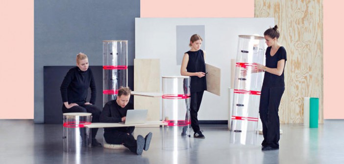
To bolster collaboration, Sofie Aschan Eriksson designed a modular furniture “landscape” of stackable cylinders which feature slots to support wood planks. They can be configured into stools, standing-height tables, or desks and transform along with the tasks at hand. So if two people need to just sit and chat, they can grab a couple of cylinders to use as chairs. If more people need to chime in on a project, they can build their own workstation for the time its needed, then re-stack the components when not in use.
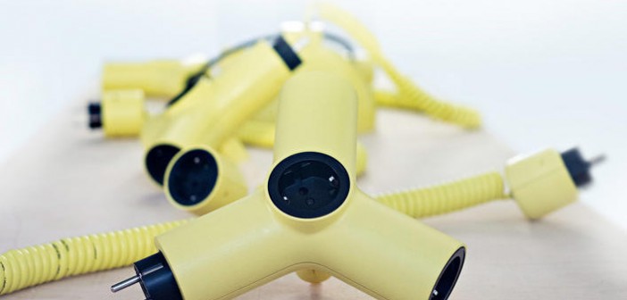
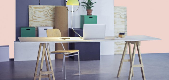
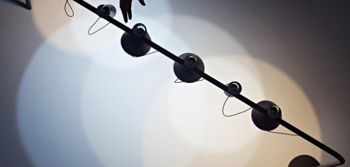
Many of us can sympathize with the frustration of an office with too few electrical outlets. For small offices, it’s all but guaranteed that there won’t be plentiful power distributed throughout a space. In lieu of a tangle of extension cords and power strips, the Plug & Play modular power grid by Bjorn Fjaestad and Jennifer Bengtsson is suspended from a ceiling and offers drop-down lighting and outlets.

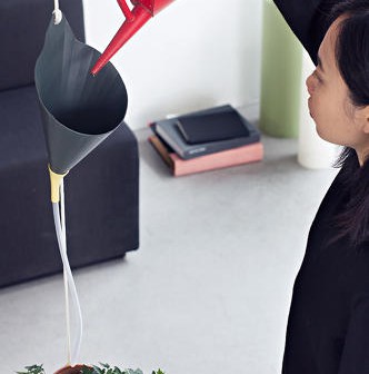
Babylon—Elias Monzòn
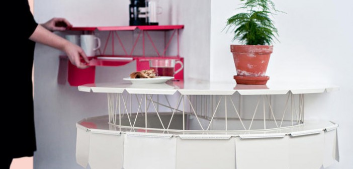
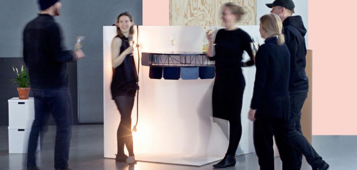
Another need for these businesses? Ways to humanize their offices. To that end, Anna Mattson and Isis Flote created a tiny elevated table for coffee breaks that can nestle into corners—and Elias Monzon created a series of hanging planters.
Diez encouraged the students to think about the fabrication realities throughout the project. “What I like to teach my students is that as designers, we have to have deep knowledge about production,” Diez says. “Manufacturers conduct less and less research and development. They produce with suppliers and often suppliers are developing the product. It’s a strange situation.”
Technical details—like how a hinge works or what materials to use—are Diez’s obsession, and essential to controlling what the final design will look like once it’s rolled off an assembly line. If you don’t, Diez cautions, “you’re becoming more of a stylist and guessing a solution rather than specifically designing.”
For example, the Umbrella privacy divider and acoustic muffler has a hinge on it that lets users move it around. Gravity, weight, and physics come to bear on the design‘s performance. Having the right size and type of hinge to support the piece and to give it functionality was key to the design‘s success.
Though the project is conceptual, some of the ideas might find their way into Hay’s furniture offerings in the future—plus, the project has opened up a line of communication between the students and one of the hottest and most ambitious European furniture companies operating today. See the full collection in the slideshow above.
All Images: via Lund University School of Industrial Design

