It’s been a bleak year. Chatbots went racist. News turned fake. And we’re beginning to reckon with the fact that all our addictive apps may be coming at a huge social cost.
But as Newton once said, with every action, there is an equal, opposite reaction. It’s why the optimists among us believe that society will balance out this era of tech overload with something kinder, more ethical, and more sustainable–with something that makes sure your iPhone works for you, rather than you working for it.
Finally, the optimists have a bit of evidence to point to, because in the last year, we’ve seen an influx of concepts and products, created by everyone from students to major design studios, that rethink the dark patterns to which we’ve all become accustomed. The business of technology is frequently at odds with the interests of users–often championing profit or engagement over all else. But from fashion to senior care to banking, a new wave of ideas puts the deep, underserved user needs first. Of course, many designers have worked toward this cause for years. However, as our 2017 Innovation By Design (IBD) honorees show, now it’s happening en masse, at a time when it’s needed more than ever before.

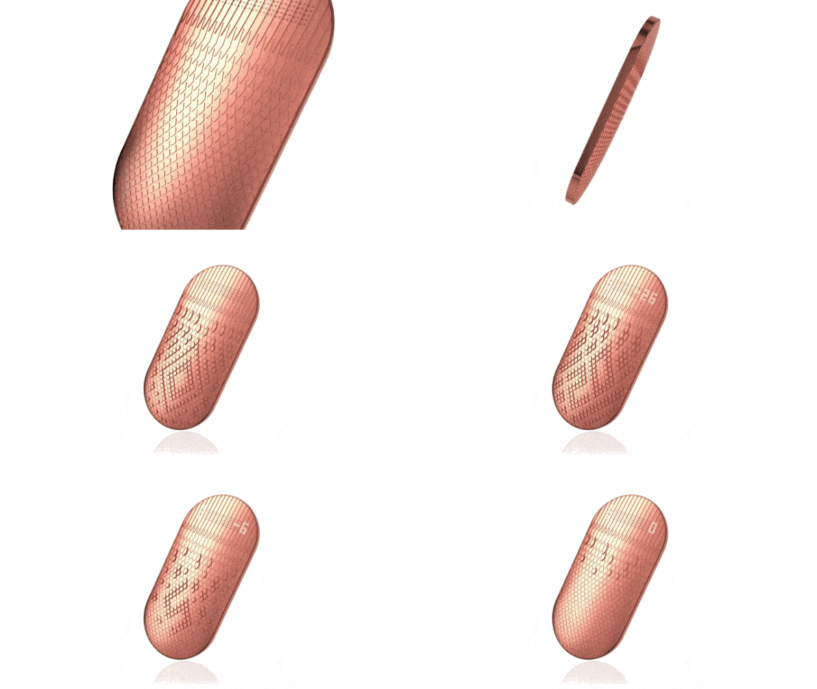
Take Affirm. It’s an app-based microlender that uses UX to be a lot more transparent than your typical, convoluted banking and credit card site. Rather than tiny terms and conditions, full of variable APRs with incalculable repercussions should you miss a payment, Affirm takes a product you want to buy, and displays precisely what it will cost you each month–and in total payments–when distributed over multiple payment plans. Sure, the APR might still be a stomach-churning 20%. But with Affirm, the financial consequences of that non-cash purchase are laid out clear as day. Thanks to a bit of interface, the clueless consumer transforms into an informed consumer, right at checkout.Likewise, Scrip promises a safer way to spend money you do have. At a time when the average American has less than $400 in their bank account but can drop $1,000 with a fingerprint via Apple Pay, Scrip is a half-digital, half-analog wallet designed to make it painful to spend money again. It uses tiny actuators that ripple under your fingers, reminding your subconscious about the ache of parting with real money rather than amorphous credit.

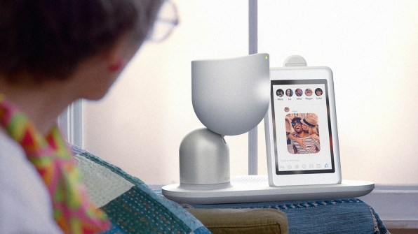
Scrip is purely conceptual. But another project, ElliQ, is a home robot intended for actual release. At first glance, it’s the very definition of Silicon Valley excess. It’s a little animatronic figure that holds a tablet on your side table. A robot for your tablet! But rather than serve as yet another portal to too many notifications, it’s created as a companion for elderly people who often live alone at home. And the robot is an assistant that helps set up calls to family, tracks users’ movement and suggests healthy activities, and makes sense of whatever is going on the tablet screen at that moment. ElliQ is essentially the opposite of the stereotypical telemarketer calling your grandmother, and confusing her into making a donation or dropping cash on a timeshare, or the nurse who can only check in once every few weeks.Scrip and ElliQ were made by two of the most lauded industrial design firms in Silicon Valley, NewDealDesign and Fuseproject, respectively. These studios brought us products like Fitbit and Sodastream. And they’re thinking about the most vulnerable among us, even while they develop plenty of products for the upper middle class and, yes, even the 1%.
Hopefully, the studios aren’t just working on these projects out of the goodness of their hearts, but because they could be sustainable, scalable businesses in a world where we invest in products that promise to invest back in us. Just look at the Well. It’s a luxurious showerhead developed by Matter, but it also features a series of LEDs on the side, that track your water consumption. The LEDs symbolize the showerhead drying out to encourage everyone to use only his or her share of the water supply. It’s the UX equivalent of buying a fine steak that promises you won’t eat so much that you’ll wake up with meat sweats.

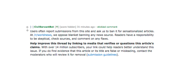
Students, too, have stepped into the conversation about ethical UX. J. Nathan Matias is a PhD candidate at the MIT Media Lab. He was interested in how AI–which is generally a black box–could be trained by its own users. He developed a platform called CivilServant, and he aimed it straight at a Reddit world news thread. It added a box that allowed anyone to click on a news headline, asking for reputable citation. Ultimately, without impacting anyone’s freedom of sharing or speech, and without altering any Reddit code, CivilServant slowed the spread of fake news through a technique Matias dubbed the AI Nudge.

Another MIT Media Lab project took an entirely different approach to ethical UX. Rather than changing computers, it aimed to change people. Treesense used a combination of VR and electrical stimulation to make you feel like you were a giant tree in the Peruvian rainforest. You could feel the breeze in your leaves, and the birds on your branches. And as a logger began to cut you down, you’d suffer the same fate of Peru’s illegally logged rainforests. It’s empathy, mainlined via UX to all of your senses.

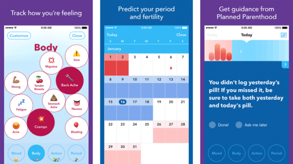
And in a move that’s most encouraging, more caring UX is even finding its way into social services like healthcare. There are countless period trackers in the world. Many serve advertisements to women who are trying to get pregnant. Planned Parenthood’s Spot On app is like a free extension of a Planned Parenthood clinic, right on your phone. It uses simple, straightforward language to encourage contraception education, like “You didn’t log yesterday’s pill! If you missed it, be sure to take both yesterday and today’s pill.” And as one IBD judge pointed out, its playful interface–which allows you to track symptoms like cramps or fatigue inside emoji-filled bubbles–takes a less clinical approach for nervous users who might be in their young teens, multitasking between this app and Snapchat.None of these ideas or products will singlehandedly defeat dark UX and save the world. But their promise is in their breadth, that designers at every level, and in seemingly every sector, are considering how to make their products more transparent, earnest, and most of all, induce the self-improving behaviors that raise our morale–rather than the self-destructive behaviors that raise some company’s bottom line.
As a society, we really do seem to be learning good design is about more than milking the fast and easy. It’s about building the valuable and lasting. Design is about making our lives better, one tiny fix at a time.
–
This article first appeared in www.fastcodesign.com
Seeking to build and grow your brand using the force of consumer insight, strategic foresight, creative disruption and technology prowess? Talk to us at +9714 3867728 or mail: info@groupisd.com or visit www.groupisd.com
