MY WAY OR THE MOTORWAY.
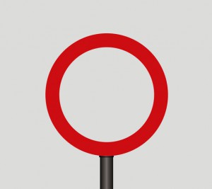
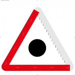
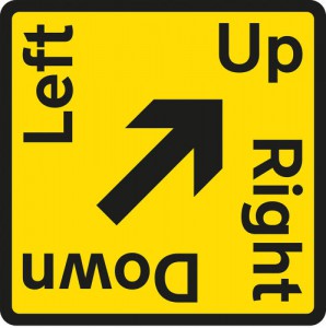
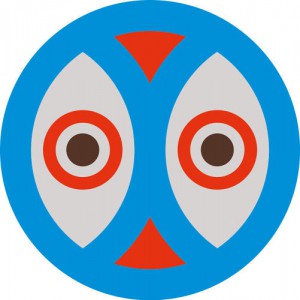
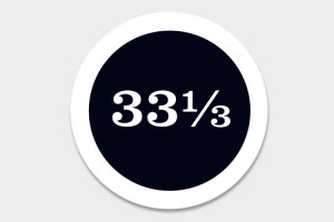
This year, the British road signage system is having a significant birthday. It’s been 50 years since Jock Kinneir and Margaret Calvert designed the familiar circle, triangle and rectangle road signs to accommodate the influx of motorists in the 1960s and bring order to the newly paved roads and motorways. To celebrate, the design association Made North asked 50 contemporary designers to put their own spin on the old traffic sign.
“The brief was quite open—in my experience, the more open the brief the more interesting content you get back,” says Made North’s Patrick Murphy, who spearheaded the project with the help of Calvert. Together, they chose well known British and international designers—like Aubrey Powell, Mike Dempsey, and Milton Glaser—who they thought could have fun with the project and could explore different uses of the signage. “We wanted them to make something for people to think about, to laugh, to change their daily routine when they saw their sign. Something that would create an impact and make people think in a public space, using the scale and dimensions that Margaret and Jock created.”
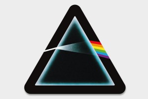
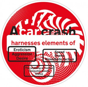
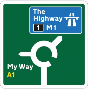
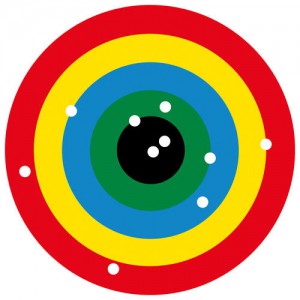
The resulting redesigned signs run the gamut from being humorous and playful—like album cover designer Aubrey Powell’s Pink Floyd-inspired sign—to more serious symbols of social and political issues, like Fuel‘s “No Right Turn” sign, which implies a red X through a swastika. There’s interior designer Ben Kelly’s trippy “Further” sign, a reference to the Merry Pranksters Magic Bus, and the charming split faces signs from Graphic Thought Facility.
Murphy hopes that the project will give people pause and allow them to think about how design impacts every day life. When Kinneir and Calvert first created the signage system, it was revolutionary. One of the most effective information design projects ever launched in the U.K., it standardized the road network and produced two new Typefaces—Transport and Motorway—that were more legible from the road and more approachable than the blunt, modernist lettering used prior. Their British signage system went on to become a model for modern road signage the world over.
Now, the signs are so ingrained in modern life they work on an almost subconscious level. As Murphy points out, on a typical walk down the street you can pass 20 road signs and barely register any of them, even as you’re following their instruction. “Good design is successful at conveying information,” says Murphy. “It’s all about communication and these signs are really good examples of that.”
Since the project’s inception, it has grown to accommodate over 80 designers from the original 50 and next week, 60 of the signs will be displayed around London for the London Design Festival. An exhibition including the road signs will also be showing at the Design Museum starting on September 20.

