Do better in 2018–do away with these design crimes.
In many respects, 2017 was an incredible year for design. Brands such as Nike took a powerful stance on inclusion. Virtual reality enabled exciting new experiences. Inventors solved some of the longstanding problems mainstream design has ignored, like better breast pumps for nursing mothers. However, there were plenty of blunders, frustrations, and annoyances, too. Simply put, these 10 design trends need to die.

OPAQUE ALGORITHMS
Has the moment of reckoning finally come for opaque algorithms? Algorithms are the silent puppeteers of our lives, deciding how we vote, what we read, how we dress, what we watch, how we’re policed, and more. We don’t know how these algorithms work. What’s even more troublesome is that the companies that are designing and using these algorithms often don’t either. One of Facebook’s algorithms, for example, created anti-Semitic categories for users, which violated the site’s standards. This needs to end–and help is on the way.
This year, the ACLU launched a new initiative to fight biased AI Ideo recently purchased a data science company to figure out ways to insert human-centeredness into algorithmic design. As my colleague Cliff Kuang wrote in the New York Times Magazine and on Co.Design, a new field of explainable artificial intelligence is emerging to help the problem as well. This is called X.A.I.–as artificial intelligence learns, it teaches humans what it’s doing and how it’s making decisions.
DESIGN FOR THE ATTENTION ECONOMY
The old saying goes “time is money,” but today attention is the ultimate capital and companies are doing their damnedest to keep yours through UX. Apps bombard you with notifications to continually get you to open them and engage with their content. Websites deploy armadas of pop-up ads and fly-in notifications. News feed algorithms continually serve up content it thinks you’ll like so you never leave. This is the design equivalent of a sugar rush–it’ll keep you hooked until you have too much and start to feel queasy. As GQ editor Kevin Nguyen pointed out on Twitter, this philosophy yields frustrating experiences:
my instagram feed:
3 days ago
3 days ago
1 day ago
ad
five days ago
3 hours ago
6 hours ago
3 days ago
4 days ago
3 days ago
2 days ago
ad
1 day ago
1 day ago
3 hours ago
4 days ago
5 days ago
3 days ago
2 hours ago
ad— Kevin Nguyen (@knguyen) November 20, 2017
Design should work in service of users–and actually respect us. For example, when my colleague Mark Wilson reviewed the Google Pixel 2 smartphone, he cited the subtle notification experience–a pale pink or blue dot versus the iPhone’s bright red alarms–as one of his favorite features. More of this in 2018, please.

DIVORCING MESSAGING APPS FROM THEIR SOCIAL PLATFORMS
Social media apps already let you send direct messages within them–a helpful way to organize your conversations based on the social circles you keep on various networks. Now, tech companies are developing more spin-off messaging apps, like Facebook Messenger and Instagram Direct, even though the apps already have messaging capabilities. This is not in the best interest of the user. In the United States, smartphone users have an average of 90 apps and use about 30 of them on a regular monthly basis. Do our conversations and activities need to be spread across even more apps?

MIDCENTURY MODERN DESIGN
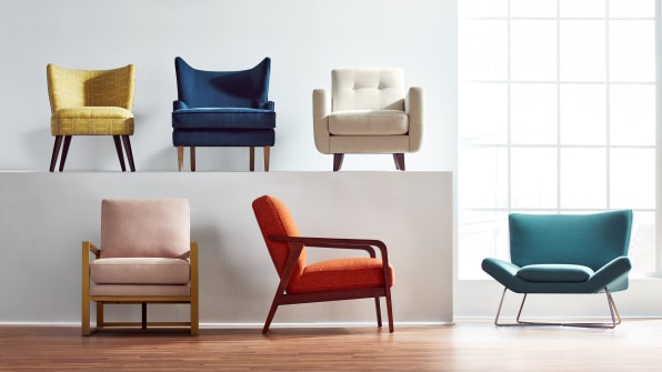
Last year, the New York Times asked, “Why won’t midcentury design die?” When the paper of record finally gets around to a style trend piece, it usually signals the nail in the coffin. Not so with midcentury modernism and its myriad derivatives. This isn’t an assault on the classics themselves, which have rightly earned a place in the design canon. However, the style has been bastardized for contemporary consumption so many times over that the era’s true principles–good-quality, mass-produced, affordable design–have been lost. Take the Peggy Sofa from West Elm. It looked good, but it was such poor quality–legs routinely broke, upholstery buttons popped off–someone wrote an essay about it for the Awl. Additionally, retailers’ attempts to optimize a style to appeal to the widest audience possible has left us with a cookie-cutter aesthetic–you see the same look whether you’re shopping on Amazon, Target, West Elm, or Wayfair.
The next furniture design trend shouldn’t attempt to be a simulacrum of midcentury style, but rather, embody the manufacturing principles that the era stood for. Sofa legs shouldn’t routinely break. Bookshelves should survive a move. The designers and manufacturers of midcentury furniture created products that still survive decades after they were made. And the pieces were so prolific that they’re still in stores across the country today.
Today’s materials and manufacturing techniques are even more sophisticated than yesterday’s so there’s no excuse for manufacturers to keep on peddling subpar wares. It’s an opportunity to do better. One Ammunition designer’s side project proposes an alternative: a furniture line made from robust materials and, more importantly, robust fastenings and screws, enabling assembly and disassembly.

“MILLENNIAL” BRANDING
Look at brands that are targeting consumers in their 20s and 30s, and you’d think they’re all designed by someone who calls him or herself the millennial whisperer. The formula is simple: soft pink–or its close cousin, a dusty pastel peach–a clean typeface, probably some botanical motif, a curt name, and a minimal look. I call it “millenimalism” and you can see it on brands like Hims, Chobani, Glossier, Mansur Gavriel, Thinx, and dozens of others. Even Jay-Z–who is firmly a gen-Xer–used the aesthetic on the cover of 4:44. his latest album. Brands–and the designers they hire–can do better than playing into the same tropes. Instead, how about branding that communicates what the brand is supposed to be in a way that stands out from the pack? Wolff Olins’s brand identity for Dotdot, a new open-source internet of things language from company Zigbee, for example, is drawn from a colon and two vertical lines. Anyone can type these symbols, which speaks the language’s accessible and universal aspirations.
IOT FOR KIDS
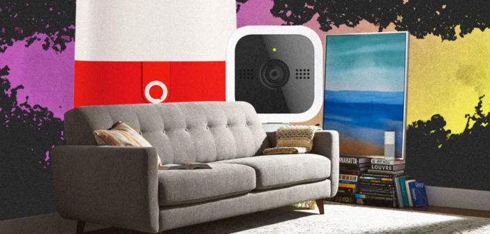
Tech companies have been cramming connected devices down our throats for years, but this year they’ve targeted young consumers. Companies positioned connected dolls, stuffed animals, smartwatches, and AI baby monitors, among other kid-centric IoT-enabled devices, as helpful assistants for parents and delights for children. Turns out these products have major flaws that pose security and privacy risks. (Who would’ve guessed?)
Mattel cancelled Aristotle–billed as an Amazon Alexa for kids that could also soothe tempestuous tots using AI–after privacy advocates and consumer watchdogs expressed concern over how much data it collected. Germany banned smartwatches for kids, calling them “prohibitive listening devices.” Even the FBI sounded an alarm when it issued a warning to parents about the dangers lurking in IoT toys. One investigation found that strangers could hack connected toys and talk to children. Creepiness unlocked.
Meanwhile companies are launching social media apps for children. Facebook, which requires users to be 13 before opening an account,recently launched “Messenger Kids” for its younger users. Parents have to open the account and approve contacts. Lego, too, has launched an app for kids too young for Facebook. Lego Life is aimed at children ages 7 to 12, and the Danish toy maker says its aim is to get more kids playing with bricks in real life.
As an alternative, how about analog communication and regular “dumb” toys? Just because something is marketed as “smart” doesn’t mean it’s a good idea. There are still plenty of ways to encourage STEM and creative play without a spy doll. Santa, take note.

ARCHITECTURE AS PROPAGANDA
This isn’t a new phenomenon for 2017–see Tiananmen Square, North Korea’s totalitarian buildings, Nazi architect Albert Speer. But this year we were reminded of architecture’s enduring power to be used as political propaganda thanks to Trump’s proposed border wall.
Truthfully, calling Trump’s border wall “architecture” is a stretch. Architecture has a function. The border wall is stagecraft. It exists solely to fuel nationalism and xenophobia. During his campaign, Trump rhapsodized about his “big beautiful wall” that would snake across the entire 1,989-mile U.S.-Mexico border. It sounded–and still sounds–like one of those campaign promises that politicians backpedal especially since Trump said the wall would be see-through and festooned with solar panels. He said Mexico would pay for it. Estimated costs are as high as $70 billion,and the legal process to obtain land and pass environmental review would surely be lengthy.
The Department of Homeland Security’s request for proposals further underscored how absurd the wall is. In February, the agency issued the RFP’s guidelines and gave firms 10 days to submit their ideas for how to build it. Of course you can’t design a 2,000-foot-wall in a week and a half. But that didn’t stop DHS from shortlisting candidates, Congress from allocating $20 million for prototype construction, and six companies from erecting eight imposing mock-up slabs in San Diego.
The wall’s power comes from talking about it. Talking about it makes it real. And as long as it’s discussed, it will do the job Trump intended it to do, which is to threaten people. Architecture, and architectural discourse, deserves better than this.
Instead of wasting resources on a project that divides people, the monetary and intellectual resources should go to public works projects–the pipes that deliver clean water; the schools that teach future generations, the transportation networks that connect people to job opportunities; our crumbling roads and bridges; and the public spaces that connect us to everyone else.

RETAILERS APPROPRIATING THE LANGUAGE OF URBAN DESIGN
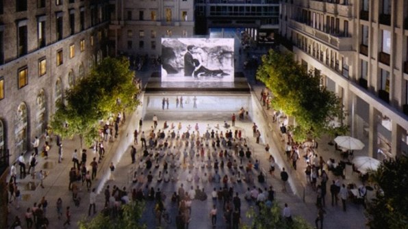
“We don’t call them stores anymore, we call them town squares,” Angela Ahrendts, Apple’s senior vice president of retail, proclaimed during the tech company’s September keynote. The retail landscape is shifting and with shoppers moving online, retailers are experimenting with new models for physical spaces. Stores are still important touch points for brands as they introduce customers to their products, sensibility, and philosophy. The latest gimmick to get you inside? Framing them like community centers and public space.
Last year, Apple began appropriating the physical features of town squaresby inserting trees and benches into its global flagship, in San Francisco, downplaying the products on display, and dedicating more space for people to gather. The same motif repeats in Apple’s newest marquee store in Fort Greene, Brooklyn.
Nike recently announced plans to develop a new flagship in New York City and emphasized building community through all of the new features in the space: a members-only club, a sneaker bar for advice, lockers for pick-ups and returns. Retail is essentially becoming the new “third space.” While Starbucks was the initial chain to capitalize on this notion almost a decade ago, there’s a big difference when the product is a $2 coffee and $200 sneakers or a $2,000 computer.
Co.Design‘s Kelsey Campbell-Dollaghan summed up why stores can never really be town squares: “Without the budget or political support to create new public spaces in cities, it’s no surprise that corporations have stepped in,” she writes. “But the subtle shift in nomenclature matters. Stores will never be public spaces. They are regulated, surveilled, and designed by companies for specific purposes.”
What I would like to see instead are actual town squares that are designed as thoughtfully–and with as much investment–as Apple stores. Considering the $47 billion tax break it’s about to receive, I think Apple should get into the business of constructing actual public space, not retail in public space’s clothing.

GENDERED DESIGN
We already know that gender-specific design–or design that isn’t intended for all genders–excludes people, from the way toys reinforce binary gender stereotypes to making the women’s version of a product more expensive than it is for the men’s version–the so-called pink tax. It’s also dangerous, and it needs to end.
For example, while women comprise 75% of healthcare workers–like nurses, home health aides, and doctors–medical instruments and tools are mostly designed by men and oftentimes for men. As a recent Co.Design story points out, surgeons’ tools are often sized for larger (male) hands and one-size-fits-all gowns are often too big (and therefore restrict movement), which could make completing delicate tasks more cumbersome.
Designing more universally can help overcome some of these biases in the products and services we use and help pave the way for a more egalitarian society. Dressing young boys and young girls in the same outfits, as Target proposes in a new line, won’t erase centuries of social inequity, but it is taking a step toward eliminating the psychological barriers between genders that reinforce “otherness.”

NORMCORE FASHION
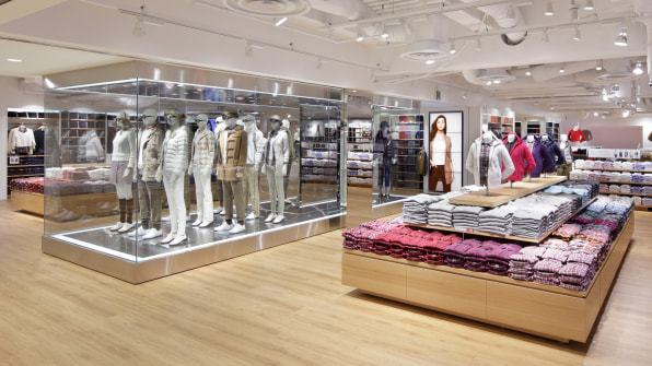
Fashion–like branding and furniture design–is heading toward a more uniform aesthetic. Stores like H&M, Uniqlo, and Zara are global powerhouses in their global reaches. Social media is connecting more people to the same fashion trends so a style that might have developed and thrived in its own microcosm–like the wildly inventive and often bizarre outfits of Harajuku, Tokyo –probably couldn’t occur today. In fact, the photographer that brought the street fashion photography of Harajuku to the world through his magazine Fruits decided to shutter, citing a lack of material.
But looking ahead, consumers will see more differentiation. Brands are trying to regain some uniqueness by tapping into local design communities and using fashion developed in specific cities to augment their collections. For example, Uniqlo opened up design studios in Paris and Los Angeles to help infuse their global offering of goods with more style. &Other Stories, an H&M sister brand, has ateliers in Paris, Los Angeles, and Stockholm to help keep its offerings unique and help shoppers express themselves through their clothing–instead of looking the same.
–
This article first appeared in www.fastcodesign.com
Seeking to build and grow your brand using the force of consumer insight, strategic foresight, creative disruption and technology prowess? Talk to us at +9714 3867728 or mail: info@groupisd.com or visit www.groupisd.com

