I’m as guilty as anyone. But it’s time to think harder about what we get mad about.
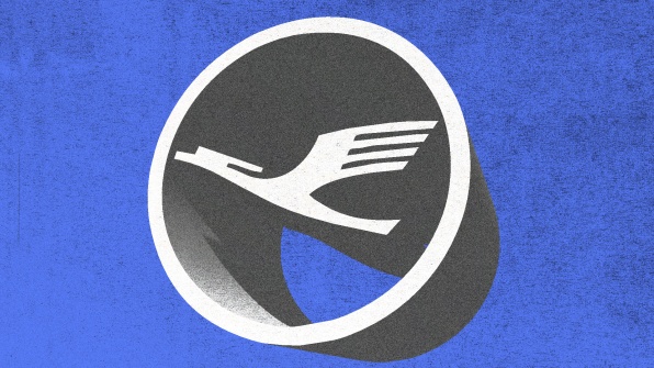
After 100 years of the same thing, Lufthansa did something drastic. Horrible. Unthinkable. Did it beat up someone for refusing to leave their seat? Worse. Lufthansa changed its logo.
I know. Even typing that gives me shivers. From here on out, the Lufthansa livery–that’s the fancy word for the graphic splash you see on the side of a plane–will feature the same bird medallion logo on its tail that you probably know, but instead of having a yellow background, it will have a blue background. No! Not blue! Please, not bluuuuueeeeeeeee!!!!
As you would expect, people are quite upset, as people always are when logos change. But to me, these reactions have finally gone too far. Societally, we’ve reached peak logo outrage. And we could all use a better pastime.
Look, I’m as guilty as anyone. From Netflix to IHOP to Bud-‘Merica to Trump Pence, I’ve written many impassioned hot takes about visual branding. Occasionally, logos are so clever we just need to tell their stories. Occasionally, logos are an overtly offensive statement, and they should be changed. Occasionally, logos are just a swing and a miss.
But truly crucial logo stories are few and far between. Everything else–the vast, vast, vast majority of quippy logo complaints–are armchair criticism of corporate consequence. Yes, tens of millions of people around the globe wear a Nike swoosh at any moment. But even if that Nike swoosh was redrawn with the drop shadow of a sloth taking a nap in a cloud of farts, it still won’t really matter. Nike is so big and baked into our society, it’s still gonna sell a lot of sloth fart shoes.
The knee-jerk criticism might amount to something if the internet had any collective memory. But did Airbnb suddenly fold when it debuted its testes-vagina? What about Uber? Did it wither and die after its techie circuit board remake? Oh, you didn’t even remember that Airbnb and Uber updated their logos? Yeah, neither did I!
After all, the single biggest indicator of a logo’s success is its recognizability, Brett Wickens, the designer of HBO’s beloved logo for The Sopranos, told me years ago. “The funny thing about identity is that it really depends on impressions,” he said. “The more different people see it, the more it becomes accepted, recognizable, and familiar–and therefore, arguably successful.”
In other words, the logo reproduced the most will also be loved the most. That’s it. The golden arches are great because they’re familiar. End stop. Our collective revulsion over a small change or redesign flies in the face of that truth, and ignores the ultimate context of branding: scale.
If you really want to criticize something, it should be these companies’ omnipresent brands–the visual and verbal languages that are forced upon us in an all-day onslaught, from the moment we open our eyes in the morning to when we close them at night. Look beyond logos, and you’ll notice the deeper brand systems at play, subliminally reinforcing their presence. Over the past year, companies like YouTube and Coca-Cola have turned to fonts, while Amazon, Google, and Apple use AI and voice interfaces to literally put their branded persona in your head. These possibilities are scarier than logos any day! Go on tweetstorms about fonts and bots!
In the meantime, don’t worry so much about the next new logo. When you’re boarding your next transatlantic flight, Lufthansa’s livery will have nothing to do with your experience. From the design of the seats to the way its staff is trained, its brand goes much deeper than a facade. They’re what a company actually is. They’re the real brand. And they’re what you should be worried about.
–
This article first appeared in www.fastcodesign.com
Seeking to build and grow your brand using the force of consumer insight, strategic foresight, creative disruption and technology prowess? Talk to us at +9714 3867728 or mail: info@groupisd.com or visit www.groupisd.com

