4 things you didn’t know about Twitter’s logo
THE DESIGNER WAS ONLY THREE YEARS OUT OF ART SCHOOL WHEN HE DEVELOPED TWITTER’S LOGO
Grasser worked for nearly seven years in finance before getting a degree from the Art Center College of Design in Pasadena, Calif. And he was only three years out of school when he got a secretive call asking him to interview for a project he couldn’t know anything about (he would later found out that he’d made it onto a list of 100 portfolios for designers being considered–he was number 88 and the first phone call). It was only after he got the job–at a new design agency called West that had Twitter as one of its first clients–that he learned his first assignment would be to redesign Twitter’s logo.
“They took me into the other room, told me it was Twitter,” Grasser remembers. “I was thinking, hold your face still, don’t let them see the panic. Really, me?” At this point, he’d designed logos in school and as part of his job after graduating, but it was by far the highest profile assignment of his short career.
GRASSER AND HIS TEAM DREW THOUSANDS OF BIRDS TO GET THE RIGHT SHAPE
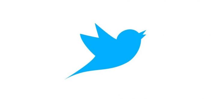
Twitter founder Jack Dorsey told Grasser that he wanted the designer to start from scratch on the logo–not to refine the cartoony bird that represented Twitter previously. With no other explicit brief–but with the assumption that he had to develop a bird of some kind–Grasser began watching videos of birds in flight and drawing hundreds of different types of birds to get a sense of which one might work. Would it be a blue jay? A sparrow? A hawk? He asked an intern to research the average wingspan on most common birds to help inform how big the wings should be. Grasser got so into the world of birds that he even downloaded the bird sounds of the Amazon rainforest to listen to while he worked.
THE FINAL BIRD WAS DERIVED FROM 15 CIRCLES
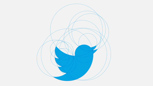
A hummingbird ultimately inspired the puffed-up chest of the Twitter logo, but the design was really the result of a different exercise: To ensure that each curve of the chest, wings, head, and beak were uniform, Grasser overlayed 15 different circles over his drawings.

“With a logo, something that small, you want repetitive shapes and forms,” Grasser says. “It makes it easier for the human eye to understand, and it’s less cluttered.”There’s a larger symbolism behind the circles as well. Grassers says that the circles symbolize the idea that Twitter democratizes information and gives everyone a voice. Of course, that’s not really the case, at least not anymore: Women and people of color are routinely harassed on the platform and Twitter regularly does nothing about it. But this was before Twitter became the toxic, poorly policed cesspool it is today.
The circles are also meant to convey a neutral visual. This is so that the design can “sit next to the most serious news that comes out on Twitter and also some of the silliness or more lighthearted moments or euphoria or joy or sadness,” as Grasser says.

JACK DORSEY KNEW THE FINAL LOGO DESIGN THE MOMENT HE SAW IT
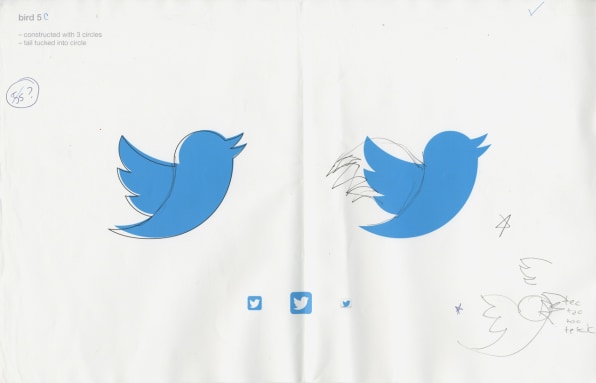
Grasser says that after several months of drawing birds and refining the logo, he ended up presenting 24 potential birds to Dorsey. They all looked relatively similar. “If I put them on a page, you’d be hard-pressed to tell the difference,” Grasser says. “But Jack [Dorsey] in two seconds pointed out bird 5CS.”
Bird 5CS is still the image that graces the Twitter app, its web page, and all of the many materials used by the company.
It’s tough to say how relevant Grasser’s original symbolism remains today, now that Twitter has devolved into Hell, as one writer put it succinctly. For those who have suffered from the company’s inability to enforce its community standards, the logo is certainly no longer a neutral harbinger of open conversation.
This article first appeared in www.fastcompany.com
Seeking to build and grow your brand using the force of consumer insight, strategic foresight, creative disruption and technology prowess? Talk to us at +9714 3867728 or mail: info@groupisd.com or visit www.groupisd.com


![[Image: Martin Grasser]](https://images.fastcompany.net/image/upload/w_562)
