In 1982, the French magazine Expansion named the 30 men who had contributed most to the Industrial Revolution.
The top 6 were Thomas Edison, Albert Einstein, John Maynard Keynes, Alfred Krupp, Vladimir Ilyich Lenin, and Karl Marx.
Number 7, a marketing legend, is the subject of today’s post.
Because his style, flair, and boldness transformed the industry.
That same year, Advertising Age said that David Ogilvy…
“… Came as close to being anointed king of the Advertising World as it was possible for a mortal to come.”
Of course, if you’re not a grizzled veteran of the marketing game, you may not recognize the picture of the man in the eyepatch… one of this marketing giant’s most famous ads.
But you’ve probably seen the more current incarnation, the Dos Equis campaign featuring, “The Most Interesting Man in the World.”
That’s a direct swipe of David Ogilvy’s, “The Man in the Hathaway Shirt,” which we’ll get to in a minute.
In fact, Ogilvy’s life makes the “Mad Man” series look like kids selling lemonade from a sidewalk stand.
More on the crazy story behind the ad shortly, as we dig into the method and madness of the eccentric Scotsman who is also called, “The Father of Modern Advertising”…
… Including his 10 tenants for writing success.
So What’s the Big Deal About David Ogilvy?
Here’s what Ken Burnett, a well-known and successful fundraiser, says about the man…
“To say Ogilvy influenced me would be a bit like saying that Scotsmen are occasionally affected by whisky. To call this a massive understatement is, in itself, a massive understatement. Back then I was so immersed in the wisdom of what he was saying that I would have highlighted at least three paragraphs on every page. Truth is, I modelled the best years of my business life on the sayings of this man. And I prospered as a direct result.”
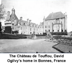 Prosperity earned from hot advertising is what it was all about in those glory days back in the 1950s, 1960s, and 1970s.
But those innovative strategies and techniques are STILL applicable today.
Obviously, Ogilvy made out like a bandit as evidenced by this picture of one of his homes (see photo at left).
And to give you a feel for his success, before we get to his killer ads, a quick story about working for the famous-but-irascible cosmetics entrepreneur, Helena Rubinstein, one of the richest women in the world.
In private, Ogilvy referred to the 4-foot, 10-inch Rubinstein as a “fascinating witch.”
Apparently, that was putting it kindly, because a $100-million net worth made it easy to indulge her tyrannical eccentricities, one of which was to fire her ad agency every year and to hire a new one.
When David Ogilvy was brought on board, as usual she began complaining:
“Your ads are too big!”
“You’re taking on too many new accounts and not paying attention to us!”
“Your people must be very stupid, because they do bad work.”
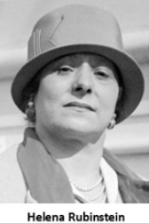 But Ogilvy’s work must have been ‘adequate,’ especially when his approach was to replace small ads with large newspaper ads that looked more like “news.”
In his David Ogilvy biography, “The King of Madison Avenue,” Kenneth Roman describes the results of the Rubinstein campaign:
“Within three weeks, a single advertisement brought in orders equal to sales estimates for the next 12 months. No more ads could run until the factory increased its production. When Ogilvy resigned from the Rubinstein business in 1963, the press noted that it was the first agency that had kept the account for man than a year; he held it for 15!”
OK… now let’s take a look at a masterpiece… David Ogilvy’s famous Hathaway shirt ad.
The World-Famous Ad That Made Him Famous …
I’m not exaggerating when I say this ad became world famous.
It all happened in 1951 when Ellerton Jette, the president of C.F. Hathaway, a small shirt manufacturer, made David Ogilvy a ridiculous offer.
At the time Hathaway’s competitors were big names like Arrow.
So when Jette offered a measly $30,000 to go up against the big dogs, Ogilvy said, “I almost burst into tears.”
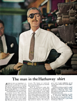 But he took on the project because Jette promised he’d never fire Ogilvy’s agency… and even better… would never change a word of the copy.
So how did Ogilvy work within a prohibitively small budget?
He knew he had to do something unorthodox.
The eyepatch idea was #18 on his list of possible ways to proceed.
So Ogilvy picked up a couple 50-cent patches from a drugstore on the way to the photo session.
He told the photographer:
“Just shoot a couple with these to humor me.”
The rest is history.
The first run of the ad was placed in The New Yorker magazine for $3,176, and to the astonishment of all concerned, the complete stock of Hathaway shirts in New York sold out within a week.
And almost immediately, it was imitated around the world with companies putting eye patches on models, dogs, cats, cows… even babies!
People wore eye patches to fancy-dress balls, in plays on Broadway, and on TV shows.
David Ogilvy weighed in on the phenomenon:
“For some reason I’ve never known, the eye patch made Hathaway instantly famous. Perhaps more to the point, it made me instantly famous, too!”
So what makes this ad so powerful?
Obviously, the eye patch for starters.
But why?
Because it creates an overpowering curiosity.
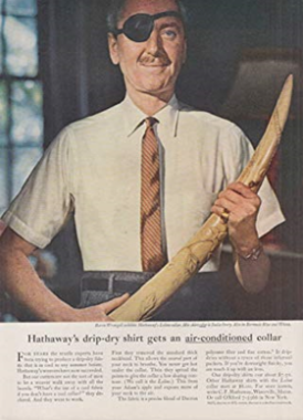 You just HAVE to know why he’s wearing one.
But then Ogilvy turns it up a notch by what he DOESN’T say.
He NEVER says a word about the eye patch in the copy.
Which makes you read every word of the copy… maybe more than once.
By leaving it to the reader’s imagination, the mystique intensifies.
But that’s not all, as demonstrated by the succession of similar ads with the same actor with the eyepatch…
What followed the original success were a variety of different photos… teaching calculus in front of a blackboard, holding an elephant tusk, examining a shotgun, placing bets at the racetrack, playing a clarinet in the conservatory, sailing a yacht…
… In other words, all the trappings of a man of adventure, elegance, leisure, intelligence, charm, and sensitivity… with a little “bad boy” streak.
If a Hathaway shirt could do all that, who wouldn’t want to buy them?
Here’s a sample of the copy…
American Men are beginning to realize that it is ridiculous to buy good suits and then spoil the effect by wearing a cheap, mass-produced shirt. Hence the growing popularity of HATHAWAY shirts, which are in a class by themselves.
HATHAWAY shirts wear infinitely longer— a matter of years. They make you look younger and more distinguished because of the subtle way HATHAWAY cuts their collars. The whole shirt is tailored more generously and is therefore more comfortable.
Here’s one of my favorite parts… that amplifies the exotic ambiance of the shirt…
The tails are longer, and stay in your trousers. The buttons are made of mother-pearl– very big and masculine. Even the stitching has an antebellum elegance about it.
Above all Hathaway makes their shirts of very remarkable fabrics, imported from the four corners of the earth — Viyella and Aertes from England, wollen taffeta from Auchterarder in Scotland, Sea Island cotton from the British West Indies, hand-woven silk from India, broadcloth from Manchester, linen batiste from Paris. You will get a great deal of quiet satisfaction out of wearing shirts which are in such impeccable taste.
Pearls of Marketing Wisdom Direct From the Mad Man’s Mouth …
Finally, here are Ogilvy’s instructions for writing, sent as an in-house memo to everyone at his agency…
The better you write, the higher you will go in Ogilvy & Mather. People who think well, write well.
Woolly minded people write woolly memos, woolly letters and woolly speeches. Good writing is not a natural gift. You have to learn to write well. Here are 10 hints:
1. Read the Roman-Raphaelson book on writing. Read it three times.
2. Write the way you talk. Naturally.
3. Use short words, short sentences and short paragraphs.
4. Never use jargon words like reconceptualize, demassification, attitudinally, judgmentally. They are hallmarks of a pretentious ass.
5. Never write more than two pages on any subject.
6. Check your quotations.
7. Never send a letter or a memo on the day you write it. Read it aloud the next morning — and then edit it.
8. If it is something important, get a colleague to improve it.
9. Before you send your letter or your memo, make sure it is crystal clear what you want the recipient to do.
10. If you want ACTION, don’t write. Go and tell the guy what you want.
BUT WAIT!
I thought that was all, but I just found another little treasure… Ogilvy’s recommendations for headlines from the book, “Confessions of An Advertising Man.”
———
Rule #1: “The headline is the ticket on the meat.” Use it to flag down the readers who are prospects for the kind of product you’re advertising.
Rule #2: “Every headline should appeal to the reader’s self-interest… It should promise a benefit.
Rule #3: Always try to inject news into your headlines, because the consumer is always on the lookout for new products or new ways to use an old product, or new improvement in an old product.
The two most powerful words you can use in headlines are FREE and NEW. You can seldom use FREE, but you can almost always use NEW – if you try hard enough.
Rule #4: Other words that work wonders are:
HOW TO, SUDDENLY, NOW, ANNOUNCING, INTRODUCING, IT’S HERE, JUST ARRIVED, IMPORTANT DEVELOPMENT, IMPROVEMENT, AMAZING, SENSATIONAL, REMARKABLE, REVOLUTIONARY, STARTLING, MIRACLE, MAGIC, OFFER, EASY, WANTED, CHALLENGE, ADVICE TO , THE TRUTH ABOUT, COMPARE, BARGAIN, HURRY, LAST CHANCE.
Headlines can be strengthened by adding emotional words, like DARLING, LOVE, FEAR, PROUD, FRIEND, and BABY.
Rule #5: Include your selling promise in your headline.
Rule #6: Headlines should arouse curiosity.
Rule #7: Some copywriters write tricky headlines — puns, literary allusions, and other obscurities. This is a sin.
Rule #8: Research shows that it is dangerous to use negatives in headlines. If, for example; you write OUR SALT CONTAINS NO ARSENIC, many readers will miss the negative and go away with the impression that you wrote OUR SALT CONTAINS ARSENIC.
Rule #9: Avoid blind headlines — the kind which mean nothing unless you read the body copy underneath them: most people don’t.
———
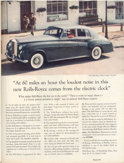 And speaking of great headlines, Ogilvy thought his best ever was for the Rolls-Royce account.
Here’s the headline, and take a look at the actual ad on the left.
At Sixty Miles an Hour the Loudest Noise in the Rolls Royce Comes from the Electric Clock.
So… there’s all the marketing wisdom that you can absorb for today.
Put it to good use and leave your comments below
Happy Selling!
–
This article first appeared in www.daniellevis.com
Seeking to build and grow your brand using the force of consumer insight, strategic foresight, creative disruption and technology prowess? Talk to us at +9714 3867728 or mail: info@groupisd.com or visit www.groupisd.com

