Logos are an indispensable part of doing business in the modern world. The variety of styles and symbols is stunning, but it hasn’t always been this way. In the balance of history, the use of logos for commercial gain is relatively new, occurring within the last 150 years.
That’s not to suggest that representational figures weren’t around in prior eras. Humans have been distilling complicated ideas into simple, symbolic markings for millennia.
Designers today can learn a great deal by studying the historical evolution of logos; stylistic tastes, tools of creation, and consumer expectations have cycled through various states of change. By looking back, we can better chart the future.
With that in mind, join us on a journey through the annals of design history, and test your knowledge of noteworthy logos as we go.
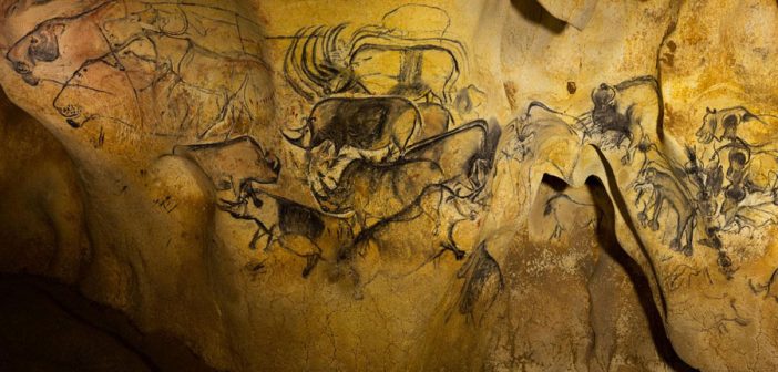
Cave Paintings
An abundance of prehistoric cave art has been found in Europe (over 300 sites in France and Spain alone), but cave paintings also exist in various parts of Asia, Australia, and the Americas.
It’s generally accepted that cave paintings were done by people living before the invention of written language, but exact dating has proven problematic, even contentious, as radiocarbon testing and stylistic analysis often fail to align as expected.
The purpose of cave paintings is also unclear, but they’re believed to hold religious significance in a way that connects to hunting. Animals account for the majority of subjects painted, though humans, handprints, and abstract patterns can also be found.
Whatever their age and purpose, the aesthetic beauty of cave paintings is astounding and shows that the artistic simplification of complexity is a practice as old as man.
Question 1:
In what European country are the world-famous Lascaux cave paintings found?

A) Germany
B) Portugal
C) France
D) Italy
Logograms
A logogram is a single written symbol that stands for a word or phrase. This differs from the alphabets we’re used to, where multiple characters representing distinct sounds are combined to create meaning.
If a written language is based on logograms, it’s considered lographic. However, it’s difficult to capture human verbal concepts through stand-alone symbols, and there is no known language that is entirely logographic.
From Sumerians to Egyptians, there are many instances of logograms appearing in the writings of ancient peoples, but their use is not confined to the past. Today, we incorporate logograms through shorthand symbols like & (and), $ (dollar), and @ (at).
Question 2:
Which ancient civilization, famous for the complexity of its written language, is responsible for this logographic mark meaning b’alam _or _jaguar?

A) Maya Civilization
B) Assyrian Empire
C) Egyptian Empire
D) Inca Empire
Victorian
Spanning the 60+ years of Queen Victoria’s reign, the Victorian era began as the Industrial Revolution was drawing to a close. As such, it was an age marked by the expectation that leaps in science and technology would eventually end the problems that had plagued humanity for thousands of years.
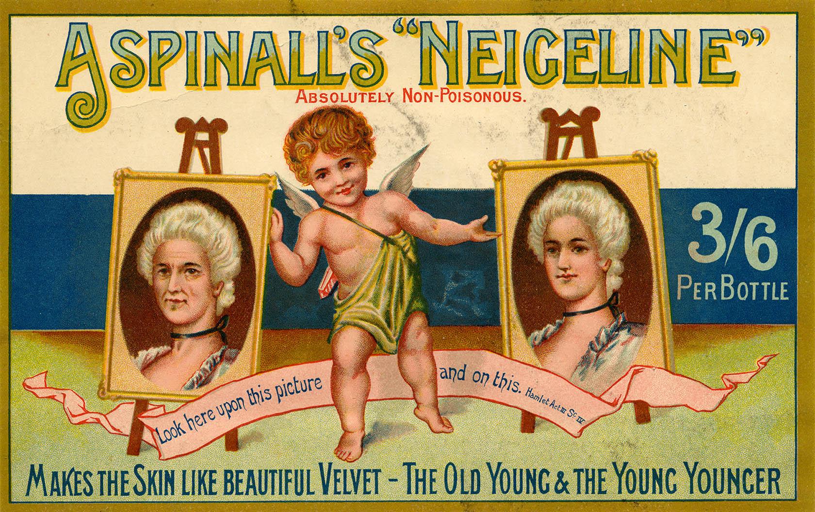
During this time, manufacturers began to explore new means of self-promotion in order to distinguish their products from other mass-produced goods, and logo marks gained popularity as a way to symbolize quality, technological superiority, and social status.
Stylistically, Victorian design and advertising reflected the optimism of the times and depicted people using products in ornately decorated settings and best-life scenarios.
Question 3:
What item has been removed from the Victorian version of this (still) iconic logo?

A) Bird
B) Sun
C) Bottle
D) Hammer
Art Nouveau
Art Nouveau signaled a departure from the Victorian tendency to rehash the design elements and embellishments of bygone eras—towards a more focused and modernized aesthetic that combined geometrically structured compositions with flowing linework, floral references, and reduced color schemes.
Practitioners considered Art Nouveau to be a “total style,” a genre that covered everything from architecture to fashion, housewares to street lamps. It was an all-encompassing concept, art as a way of life.
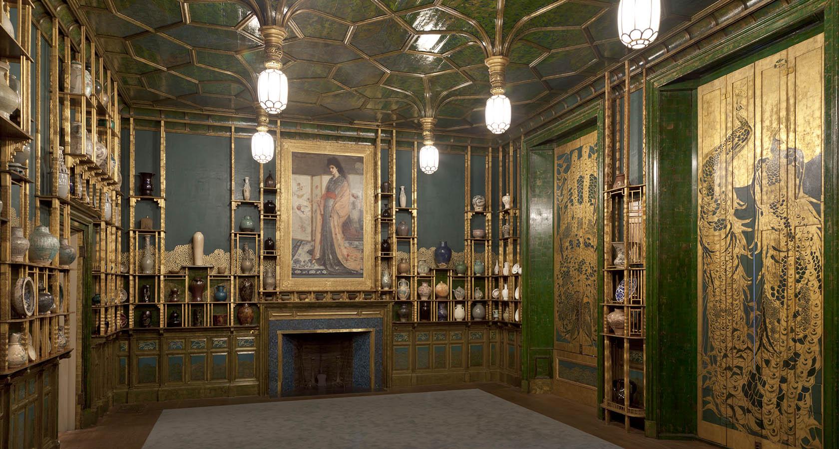
The era also brought a recommitment to craft and a call to imbue design choices with meaning. Frivolous ornamentation without function was frowned upon, but stylistic remnants of the Victorian era remained, and Art Nouveau’s modernity quickly became antiquity.
Question 4:
What famous beverage brand, now popular among grandpas and hipsters, employed this sinuous, Nouveau logo over 100 years ago?

A) Pepsi
B) Pabst Blue Ribbon
C) RC Cola
D) Budweiser
Early Modern
The Early Modern era was a time of radical philosophical and technical experimentation. Reeling from the global carnage of WWI, designers sought to make a complete break from all traditional artistic methods and modes of thinking.
Representational imagery waned, and abstraction gained prominence as designers stripped both concept and form down to their core elements.
In advertising, bold typography and uncomplicated graphics were set against solid color backgrounds. Logos followed suit, yielding a crop of designs that were exceedingly simple yet profoundly enduring.
Question 5:
Which German tech giant claims this 1918 sketch of an encircled armature as its logo genesis?

A) Bosch
B) BMW
C) SAP
D) Siemens
Art Deco
Emerging from France in the 1920s, Art Deco was an outpouring of design extravagance fueled by the ongoing certainty that mankind would one day overcome all societal ills through knowledge and innovation.
The distinctive look of Deco can be difficult to articulate because it repurposes and reimagines such a wide array of stylistic eras, but it’s safe to assert that subtlety was never a strong point of the period.
Art Deco logos exude a sense of opulent glamor. They are luxurious, bold, and weighty without being heavy, rooted without becoming stagnant; characteristics that are equally evident in the architecture, industrial design, and fashion of the era.
Question 6:
True or False—Fiat used this ornate, Art Deco logo on its vehicles for nearly 18 years at the start of the 20th century.

True
False
Modern
The Modern era brought a deepening commitment to objectivity in design. Conceptual clarity and communication without excess were highly prized. Form follows function, and function is informed by data.
During the Modern era, visual designers sought ways to work within constraints, developed rigorous grid systems, and explored the expressive impact of negative space. Logos were increasingly simple and iconic, relying on neatly aligned and cleverly combined geometric shapes.
Even though the Modern era has technically ended, its influence continues to touch every sphere of the contemporary design world. Our ways of training, thinking, and problem-solving stem from Modernism, as do nearly all the visual principles of our digital products and design systems.
Question 7:
Which of these is the correct composition of the original London Underground logo?
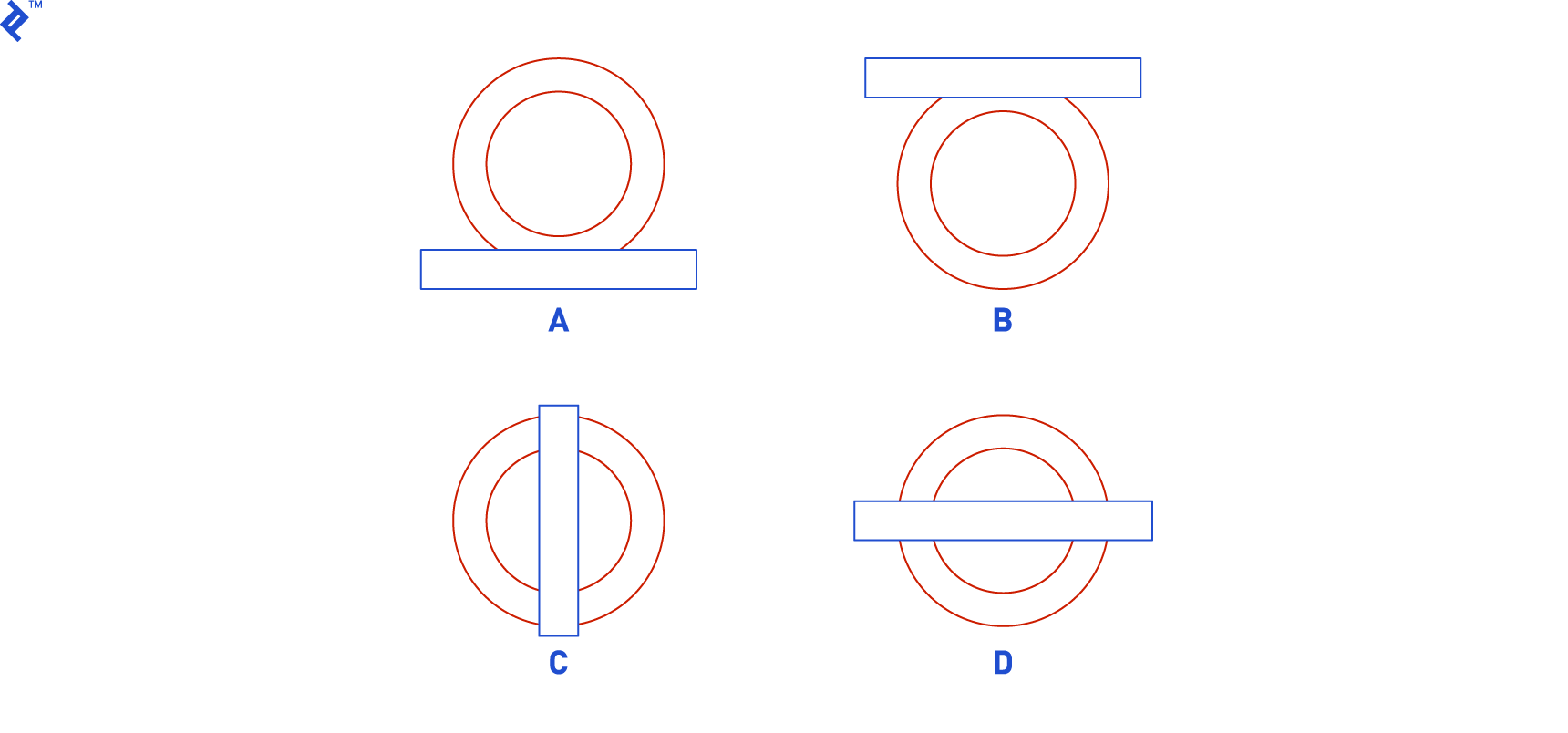
A) A
B) B
C) C
D) D
Heroic Realism
Global conflict occurred throughout the Modern era, and Heroic Realism (or propaganda art) became a popular way for governments and manufacturing industries to motivate and unite the general public towards a common cause.
Heroic Realism typically presents idealized scenarios of working class people performing everyday duties. Subjects are strong, resolute, and realistically rendered. This placed the genre in direct opposition to Modernism, which was rejected by proponents of Heroic Realism as bourgeois vanity.

Communist, Socialist, and Democratic governments were all patrons of Heroic Realism. In some cases, the imagery of that era is shockingly graphic and offensive, but today, it provides a valuable reminder that design has the potential to perpetuate harmful and archaic stereotypes, even in a period of astonishing innovation.
Question 8:
Captain America has used over 50 different shields; which one appeared on the cover of his Hitler-punching debut issue in 1941?

A) A
B) B
C) C
D) D
Late Modern
After WWII, opposition arose against the prominent beliefs and practices of Modernism, especially its notions of objectivity and absolute truth. It was the start of a slow fade to Post-Modernism, and designers began to examine and question the unwavering certainty of Modern ideals.
From an aesthetic standpoint, Late Modernism did not signal an outright rejection of Modernist design principles. In fact, some of the most memorable logos associated with Modernism were created during the Late Modern era, and many of the formal design characteristics now synonymous with corporate branding were solidified during the period.
True or False—This version of the Westinghouse logo (designed by Paul Rand in 1959) is still used by the company to this day.

True
False
Postmodern
If Modernism was the pursuit of the ideal through objective means, Postmodernism asks, “What is ideal?” It was an era of skepticism, a deconstruction of long-held traditions and beliefs. Suspicion permeates Postmodernism, especially where reason is involved. Irony is exalted, and contradictions are called conclusions.
Out of this topsy-turvy worldview came a body of design that was intentionally paradoxical. Styles representing vastly different social structures were married to create new meaning, often dripping with satire.
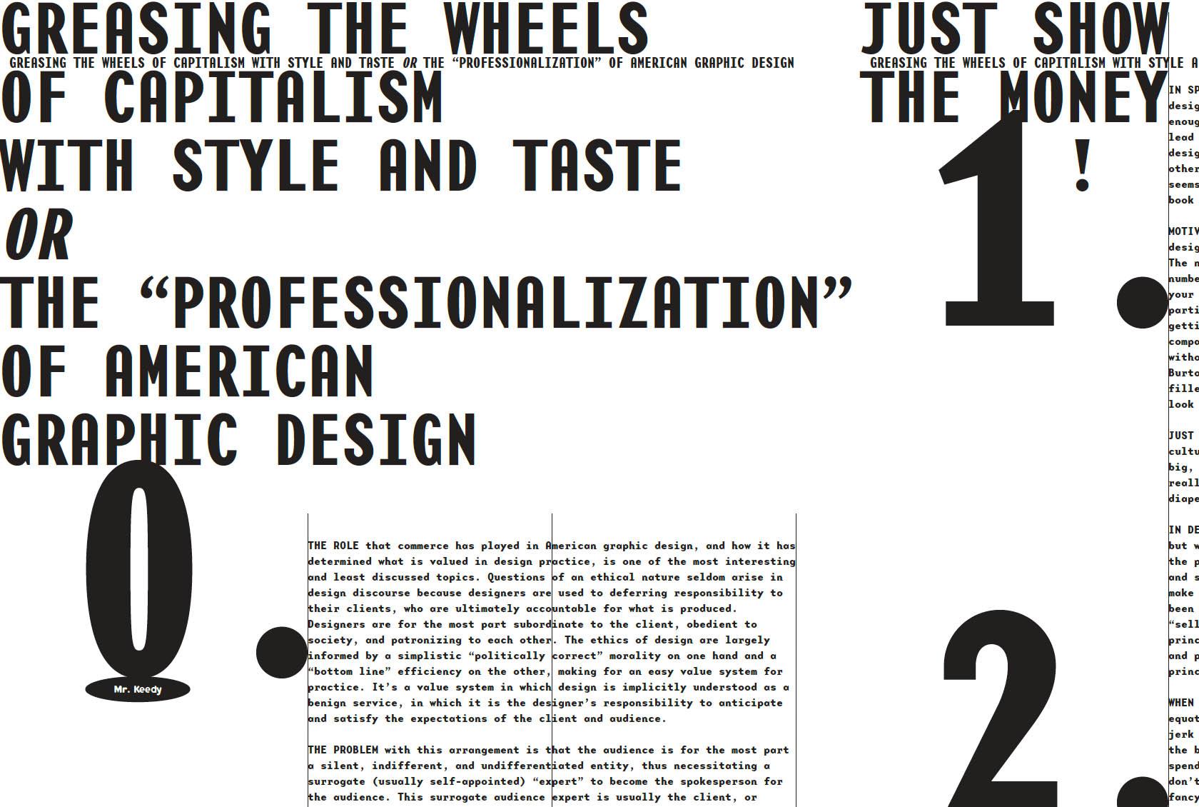
In graphic and logo design, this played out through typography, color, and calculated randomness. For instance, designers might juxtapose letterforms with vastly different formal characteristics or implement some shockingly incongruent color scheme, but these choices, while having the appearance of aimlessness, were premeditated to make a point.
Question 10:
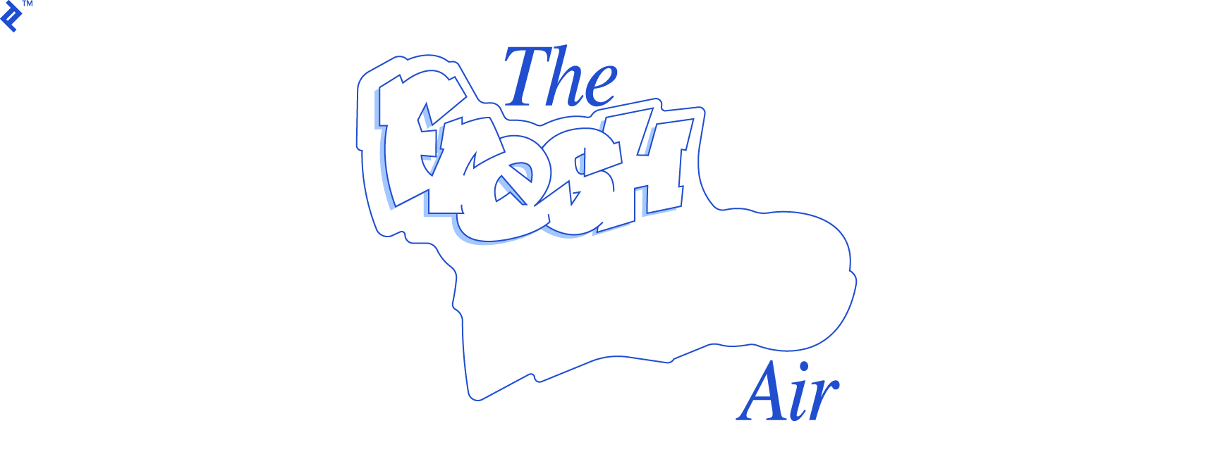
Which well-known “Will” starred in the 90’s sitcom represented by this incomplete, Postmodern logotype?
A) Will Ferrell
B) Will Rogers
C) Will Forte
D) Will Smith
Digital: Skeuomorphic
The Digital era is less known for philosophical breakthroughs than for the introduction and proliferation of digital design tools. The advent of desktop publishing democratized access to creative endeavors and encouraged a new wave of artistically inclined people to “design something” despite no formal training.
Initially, digital art was clumsy. The influx of amateurs and devaluing of traditional processes worried longtime practitioners, but quality and craftsmanship prevailed. With time, sophisticated works of digital design were produced.
This progression is especially evident in the trend of skeuomorphic logo design, where objects and icons are illustrated with a level of detail and beauty that often surpasses the real thing.
Question 11:
These jumbled, navigational elements once comprised the skeuomorphic logo for which web-based product?

A) Internet Explorer
B) Expedia
C) Safari
D) Mapquest
Millennium: Flat Design
In recent years, we’ve witnessed renewed enthusiasm for the techniques and tools of the past—a handmade, hand-lettered, hand-crafted revival. But we’re also expanding the boundaries of digital design with graphics that move, react, and even adapt to our preferences.
In some ways, our design efforts are conflicted. We’re fascinated with metrics and numerical certainty, but like Postmoderns, we remain skeptical that there could be one right way to do anything.
Luckily, our confusion has resulted in a staggering array of stylistic diversity. Consider the recent rejection of skeuomorphism; its replacement, the inanely named “Flat Design,” is nothing more than a return to the principles of Modernism. In a matter of one iOS update, we went from extreme realism to iconic abstraction, and our next major shift will come just as suddenly.
It’s a bit hard to keep up with all the change, but it sure is fun to watch.
Question 12:
True or False—Slack’s speech-bubble-inspired logo update is accurately formatted here.

True
False
Answer Key
- **C) **France
- **A) **Maya Civilization
- D) Hammer
- B) Pabst Blue Ribbon
- A) Bosch
- True—Fiat used this badge from 1904-21.
- D) The logo’s original configuration is the same as today’s.
- B) See the cover of Captain America Comics (1941) #1.
- False—See the correct version here.
- D) Will Smith
- C) Safari
- False—See the correct version here.
How’d You Do?
11-12 Correct Answers: Legendary Logo Master
Put your right hand in the air, reach over to your left shoulder, and give yourself a big ol’ pat on the back.
9-10 Correct Answers: Colonel Logo
We salute your sophistication and superior knowledge of design history.
7-8 Correct Answers: Completely Adequate
No shame in an honest C+.
5-6 Correct Answers: Keep Shootin’
“You miss 100% of the shots you don’t take. —Wayne Gretzky” —Michael Scott
0-4 Correct Answers: Stupid Quiz
It’s probably rigged anyway.
–
This article first appeared in www.toptal.com
Seeking to build and grow your brand using the force of consumer insight, strategic foresight, creative disruption and technology prowess? Talk to us at +9714 3867728 or mail: info@groupisd.com or visit www.groupisd.com

