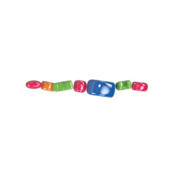
Paul Rand’s logo for IBM is among the most recognizable bits of branding in the world. It’s a wordmark, after all. You can’t mistake it for anything other than “IBM.” But if you turn the camera 45 degrees and look at those exact same letters from overhead? All you’ll see are a few random dots of silver.
The branding, audio, and design agency Why Do Birds just released an interactive quiz, which renders some of the world’s most iconic logos, like IBM’s, from a view above. The project is a bit of self-promotion: a riff on the “bird’s-eye view” the agency brings to branding.


But it’s a fun exercise. Without giving away all of the answers in the little quiz (stop reading right now, and ignore the captions in our slideshow, if you really don’t want spoilers), let me just say that Coca-Cola becomes a provocative slew of swirls, while McDonald’s looks like an unclasped gold bracelet. For some, the brand colors are so recognizable that there’s only one answer possible, even when the geometries look like nonsense (*cough* T-Mobile *cough*). And one in particular stumped me so hard, but the reveal was so satisfying I almost giggled (RIP Toys “R” Us).Perhaps there’s a takeaway here that in the modern era of multimedia, we need to think about visual identities in all three dimensions at all times. But then again, nah! Every brand entrant on this list has been absurdly successful in representing its respective company, even in good old 2D. And the fact that you can figure any of them out at all, seen from a completely unintended angle, is a testament to just how deep of an imprint these logos have made on our gray matter.
–
This article first appeared in www.fastcompany.com
Seeking to build and grow your brand using the force of consumer insight, strategic foresight, creative disruption and technology prowess? Talk to us at +9714 3867728 or mail: info@groupisd.com or visit www.groupisd.com

![[Airbnb. Image: Why Do Birds]](https://images.fastcompany.net/image/upload/w_562)
