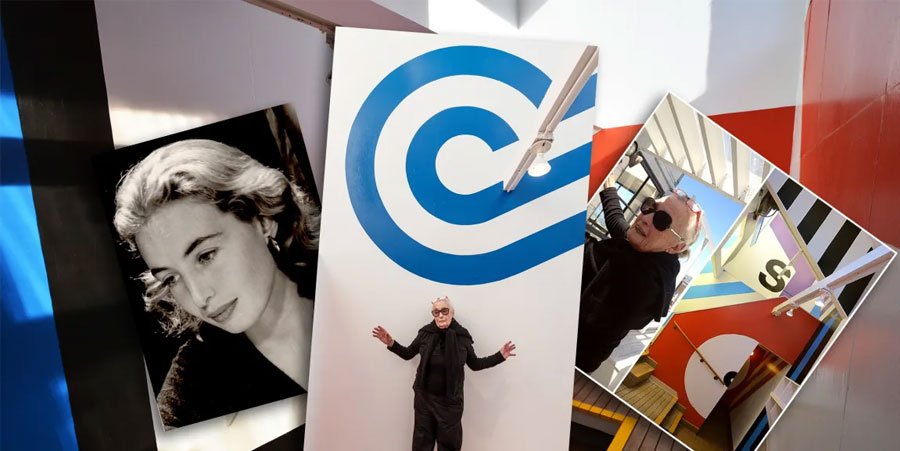
Barbara Stauffacher Solomon changed the world of design with her life-sized graphics. A new collaboration with filmmaker Gary Hustwit is designed to introduce her to a new generation of design lovers.
If you stepped into a fashionable home or hotel in the 1960s and ’70s, you might have found the walls plastered in floor-to-ceiling lines, arcs, circles, and letters that transformed the proportions of the room—making you feel like you’d entered some kind of psychedelic alternate universe. This design trend, known as Supergraphics, was wildly influential, but few people outside the design world know the remarkable woman who first invented it: 92-year-old designer Barbara Stauffacher Solomon.
Gary Huswit, a filmmaker and visual artist, wants to remedy that. Over the years, he has made films that feature her work and today, he releases limited-edition graphic T-shirts and tote bags in collaboration with Solomon that feature Supergraphics. The goal is to introduce Solomon and her body of work to a new generation of design lovers.
Solomon has been working as a designer for more than 70 years and continues to do so now, as a grandmother. When I call her in her San Francisco home, it’s early—7 a.m.—but she’s eager to get her interviews out of the way so she can get to her drafting table. She’s currently working on a new typeface that she says is abstract, like a much more simplified version of Helvetica, and she’s preparing several retrospective exhibits of her work that will be shown in Los Angeles and Chicago. “Being stuck at home during COVID worked out just fine for me,” she says. “It allowed me to focus on my work.”
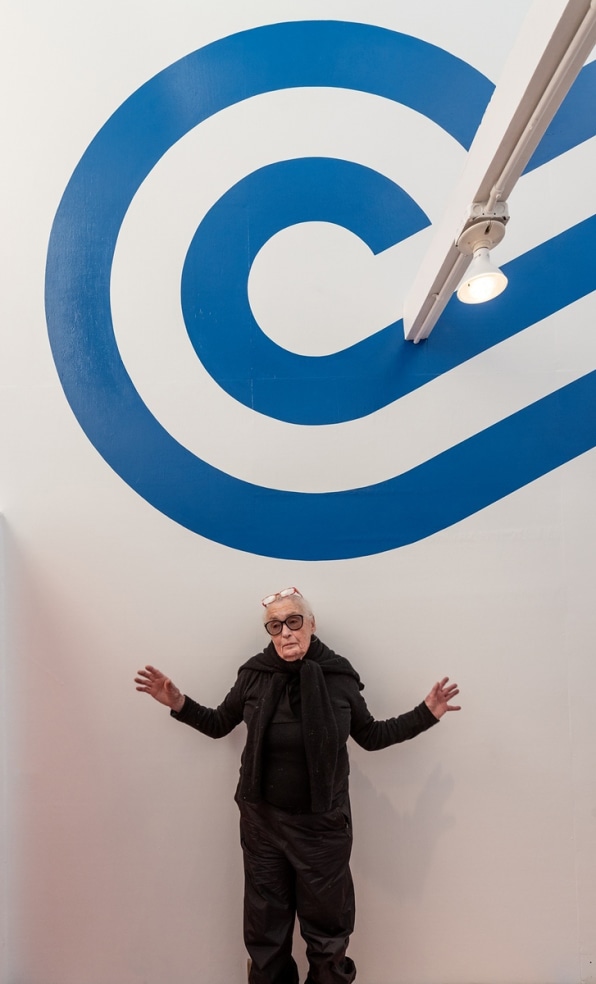
While Solomon is known for her work as a graphic designer, she says she came into the field by accident. Growing up as a third-generation San Franciscan, she spent her childhood doing art and eventually became a dancer. At 20, she wed the filmmaker Frank Stauffacher, but he died suddenly of a brain tumor, six years into their marriage. Alone in her mid-twenties, with a young daughter, Solomon had to figure out how to support herself, so she made the decision to move to Switzerland to train as a graphic designer. “I had always loved art,” she tells me. “But if I told people I was an artist, I wouldn’t have been able to make money. If I said I was a graphic designer, I would be paid like an architect.”
At the Basel School of Design, she studied with Armin Hofmann, a graphic designer who was instrumental in developing the Swiss Style of typography, which was focused on clean lines and readability. There, she fell in love with the Helvetica font, which she went on to use frequently in her work, including in Supergraphics. Studying under Hofman, she saw Helvetica as a font that represented truth, honesty, and bringing great design to the masses. “The idea was to get rid of adornment by rejecting the serif,” she says. “The rich could have their complicated serifs. Helvetica was for the people.”
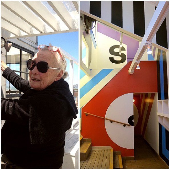
But after several years in Switzerland, Solomon decided it was time to go back to her home town of San Francisco. John F. Kennedy had just been elected President, and she felt that there were exciting things happening in the United States that she wanted to be part of. When she returned, she was able to find work as a graphic designer because people remembered her late husband. She connected with landscape architect Lawrence Halprin, who was willing to give her big projects right away. “My husband had been very beloved in the community and people remembered him fondly,” she says.

Her first project was to help design Sea Ranch, a housing community in Sonoma County that was initially designed to be a commune of sorts, but eventually became a holiday spot. This was where Solomon leaned into the Supergraphics concept. She painted graphic patterns on the walls at an architectural scale, which have gone down in design history as a brilliant example of how you can change a space through graphics alone. She also created Sea Ranch’s iconic logo, which looks like rams’ horns, reminiscent of the animals that graze on the land. (It also calls to mind the waves of the Pacific Ocean that are the backdrop of the area.) Sea Ranch was a huge success, winning her two awards from the professional organization the American Institute of Architects. This led to many other projects, allowing her to continue working as a graphic designer for the next few decades, including a long-standing partnership with the San Francisco Museum of Modern Art.
At the time, it was unusual for a woman to achieve the kind of commercial success that she did. Solomon believes that she was very lucky that she was able to get a big break thanks to Halprin. But she also recognizes that there was some sexism at the time. “I was pretty and all of these men (who were clients) wanted to flirt with me,” she says. “It’s just true. So I played into it to the hilt. I didn’t care: I had a child to support.”
Huswit, who has been inspired by Solomon’s work for years, believes that part of the reason she isn’t better known is because she’s a woman. “I think a man who was as talented as she was would have been given more projects, and bigger projects,” he says. “And many others went on to take inspiration from her work without giving her the proper credit. This is why I think it’s so important to find ways to tell her story and introduce her name to new audiences.” He hopes the new graphic tees and totes will be one small way to do this.

Later in life, in her fifties, Solomon decided to take a break from her work to get a degree in linguistics from UC Berkeley. Having spent her entire career drawing letters, sometimes at an enormous scale, she wanted to learn about the meaning of the words she was creating. And she was particularly interested in how the way a word was presented—its size and typography—influenced its meaning. But part of what drew her to academia was that she got disenchanted with the world of design. Helvetica, which was designed to be the font for the masses, was co-opted by corporations: Companies from BMW to Crate & Barrel used it in their logos. “Design was a way to take a shit product and make it look chic,” she says. “I felt like it lacked substance. Design became a way for corporations to put a pretty sheen on products that weren’t very good.”
Her time at Berkeley also taught her to write. So she has spent the past few decades writing books, including an autobiography called Why? Why Not? that intersperses storytelling with her classic graphic design. But she still does many artistic projects that catch her fancy. In one project in St. Moritz, Switzerland, she painted the letters LOL at enormous scale across the walls. “It stood for Little Old Lady,” she says with a laugh. “Or Lives on Liquor.”
…
This article first appeared in www.fastcompany.com
Seeking to build and grow your brand using the force of consumer insight, strategic foresight, creative disruption and technology prowess? Talk to us at +971 50 6254340 or mail: engage@groupisd.com or visit www.groupisd.com/story

