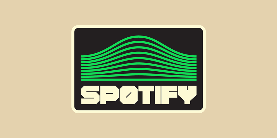
20th century nostalgia isn’t going anywhere, and plenty of brands are cashing in on the desire for more old-fashioned graphics. Portuguese lettering artist and type designer Rafael Serra has clearly taken note, and recently presented his own endearing, ’80s-inspired logo redesigns.
While most of the brands he chose already retain a strong ’80s association, like Vans or Uno, he doesn’t shy away from modern tech, like Spotify and Playstation. The designs feature a light spot-the-reference feel that ’80s kids are sure to love. Serra’s reimagined Spotify logo recalls a glitchy landscape from Tron, while Microsoft and Playstation’s color-blocked squares evoke the classic look of handheld memory game Simon. Clean lines and poppy, streamlined colors ground his designs in the here and now.
Check out some of our favorites below, and explore the rest of Serra’s work on his website.


This article first appeared in www.printmag.com
Seeking to build and grow your brand using the force of consumer insight, strategic foresight, creative disruption and technology prowess? Talk to us at +971 50 6254340 or engage@groupisd.com or visit www.groupisd.com/story


