Design plays a far more important role in how our leaders are chosen than anyone realizes, writes Blue State Digital’s Matt Ipcar.

[Photo: Daniel Acker/Bloomberg/Getty Images]
The unveiling of the Trump-Pence logo, along with the immediate and blistering reactions and subsequent retraction, was no surprise to anyone who has worked on the design side of the aisle in politics.

Penetration jokes and comparisons to the Aryan Nation’s logo notwithstanding, the most offensive thing about the Trump-Pence logo was the careless use of one of our most important symbols, the American flag. Coming on the heels of a July Fourth weekend which saw millions of Jews offended by geometric symbolism—in the form of a Star of David overlaid on a big pile of money in a shared anti-Clinton graphic—the Trump campaign’s misuse of the flag, with only seven stripes and the canton replaced wholesale with a cufflinked (and, yes, sexually suggestive) monogram, is just another example of the campaign’s inability to be as creative with graphics as they are with the truth.

Pete Marovich/Bloomberg/Getty Images
Logos are the least of it.
Service Design
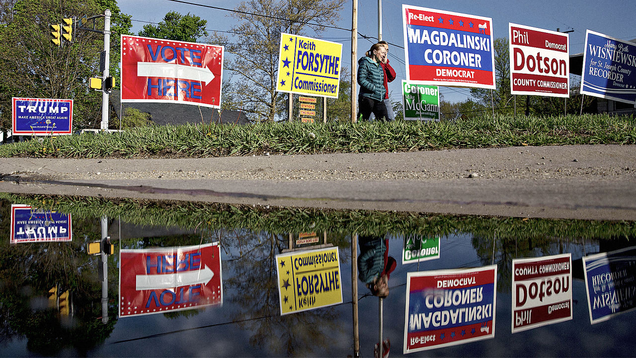
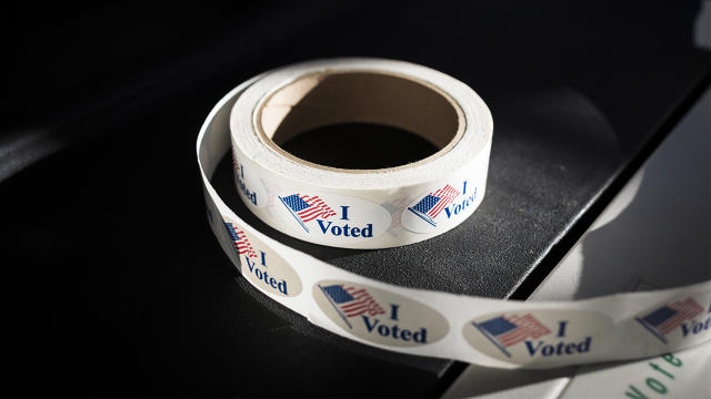
The primaries, caucuses, and the act of voting itself are all impacted by design, from the way the system has evolved within the constraints and peculiarities of the state, federal, and party systems to campaign finance laws and early voting. All of these elements were designed without much thought to user paths and entry touch points, let alone fairness. This is true in big general elections, but italso impacts smaller races.

Ian Thomas Jansen-Lonnquist/Bloomberg/Getty Images
Experience Design
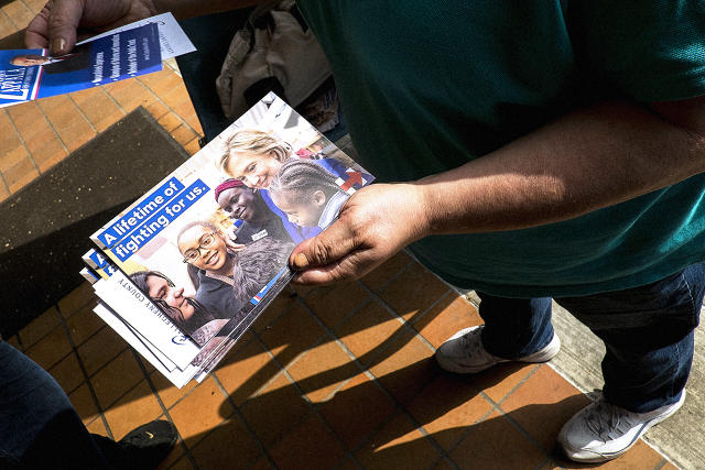
Experience design underlies all modern interactions with candidates: from the design of voting machines and hanging chads to the architecture and administration of the digital platforms and technologies themselves; from the way offline events can envelope people and build excitement to the experience of using your computer or phone to really be a part of a campaign; and from the ease of the online donation experience to how data is used to pinpoint potential voters and segments.
Visual Design
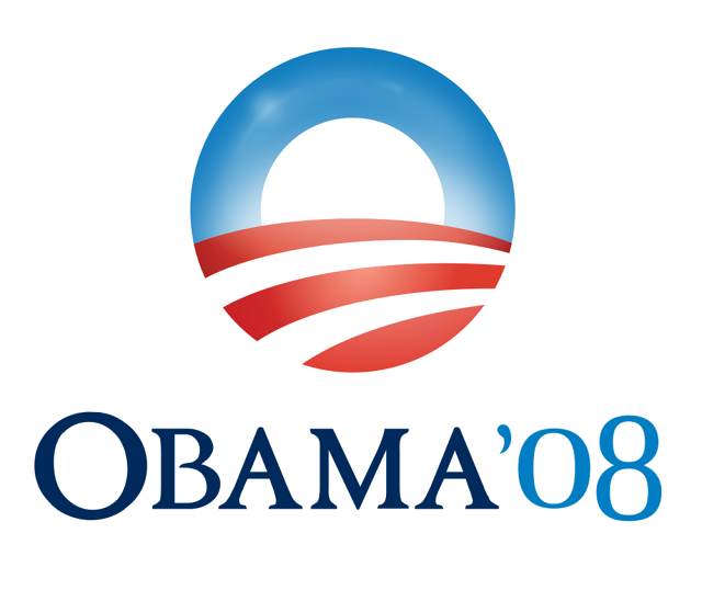
Lastly there’s the part that gets the most ink: campaign branding and visual design made up of colors, messaging, typefaces, social share graphics, website, and of course logos. Historically, there has been much uproar and glory surrounding presidential campaign logos—far more than matters, ultimately. Having witnessed the rollout of Hillary Clinton’s logo during her campaign launch—designed by Michael Bierut of Pentagram—we’ve seen how swift and unnerving these reactions can be. (The difference between the Clinton campaign and the Trump campaign is that her logo was actually designed with care and has weathered the critical storm.)

Clearly all three of these themes are important and impact elections. Service design is beyond any single candidate’s control; experience design is often neglected at the expense of visual design; and, even if you get the last two done right, a slip of the tongue in a debate, a loss of momentum or energy (perceived or real), or simply a mismatch of candidate and message can be difficult to recover from.
In politics more than any other area I can think of, the brand is nearly a pure expression of the person running. It is built from without, from attributes bestowed upon the candidate by the public, resisting most efforts by the campaigns to shape and control it. You can create the most perfect logo or tagline in the world, but it will do little to change public perception, especially if it does not sync up in an honest way with the candidate.
On the flip side, if this externally bestowed brand is imbued with dynamism, strength, trust, and respect, you probably can go the lazy route—red white and blue toothpaste swirls or sexually suggestive flags accompanied by tired, unoriginal tag lines and rally cards—and still win the race. I predict Trump will lose—his brand does not meet these requirements, even among his own party. This is a man who can buy nearly anything or anyone, but at this point he can’t afford to be lazy with design.
As the campaigns move into high gear, and we start to see ever more offensive, sloppy, or dubious creative being pumped out by the Trump campaign, it’s worth keeping in mind that it’s the deeper service and experience design problems that are not quite so visible—voting machines, redistricting, primary rules—that will still remain unresolved after November 8th.
This article first appeared in www.fastcodesign.com

