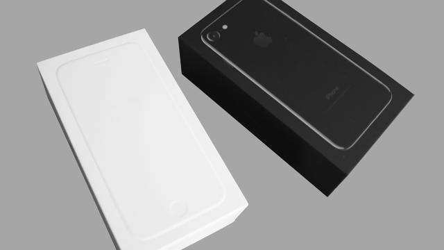
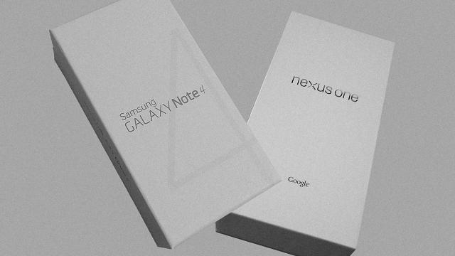
Smartphone packaging is tasteful, greener, and totally indistinct.

[Photos: zacaltman, William Hook, Marc Fonteijn, Honou, Kyle Hasegawa via Flickr]
Or Samsung Galaxy. Or LG V10. Or HTC anything.
Oh, you thought I was going to say iPhone, didn’t you?
That’s the problem. Apple’s packaging has always been tasteful, and the company has been playing off the idea of hero shots on white backdrops for a long time now. But now, it’s the aesthetic everyone is using. As a result, no brand feels distinctive anymore. No product feels special. Unboxing, once the internet’s favorite fetish, has lost its thrill. And it’s not just smartphones. Basically every smart thing on Kickstarter has this same, generic white box treatment, too.
While Apple is in many ways to blame, the sameness of our packaging is a symptom of an even larger trend: the sameness of the products inside.

[Photo: courtesy the author]
COPYCATS BY COMPETITION
No doubt, every major smartphone manufacturer saw what Apple was doing with its packaging and copied it every bit as hard as they did everything else about the iPhone. If you’re Samsung, and you want to woo an iPhone buyer, you make your product look as much like the iPhone as possible. Dirty play? Maybe. But it makes sense strategically.
However, as we’ve reported, if you’re a third-party accessory that would like to be sold in an Apple store, you actually have to follow some pretty specific packaging guidelines. The CEO of Moment iPhone camera accessories told us that:
Moment had to work within Apple’s color spec, the majority of the box had to be white, and the product itself had to “be the primary focus of the package.” (Yes, those guidelines are strongly reminiscent of the company’s own white boxes that just read “iPhone” or “iPad.”)
So packaging looks the same because some companies want to be Apple, and others want to be with Apple. But Apple is taking an active role in ensuring that more of the market looks Apple-esque than needs to. Through policy, the company is actually taste-enforcing some of the electronics industry, insisting that it adopts this aesthetic.
But packaging is not necessarily worse than it was a decade ago—aesthetically or environmentally—when blister packs, foam liners, and instruction manuals the size of small books were all the rage.
Apple has been a positive force of change in a lot of ways. It has led by greener example. With nothing more than paper, Apple has designed a protective package that you can basically stand on (really—my 165 pounds of pressure dented the box a bit—but it’s intact). Modules fit together so snugly that not a bit of material seems wasted, and things won’t jostle in transit. Even now, eight years into their own iPhones. Between the iPhone 6 and 7, for instance, Apple replaced a chunky plastic earbud case with a single, well-shaped scrap of paper with the cords wound inside. For the iPhone 6, Apple also replaced a printed, full-color portrait of the phone with an embossed silhouette in its stead—likely stamped into place by an industrial machine—that required no ink. (But in the iPhone 7 package, they simply inked over the emboss, too.) Apple has even implemented some materials that biodegrade so effectively they melt away in water.
I actually feel that their packaging is far less enjoyable to unpack than, say, it was on my Powermac G4, which was full of so many tiny, material instructions that it literally made me giggle unwrapping cords and setting it up. Now, it’s damn hard even to slide the iPhone box open. But it doesn’t take a deep environmental analysis to reason how such small decisions—like cutting ink or millimeters of material—play out over tens of millions of phones. Trading a bit of delight for a lot of sustainability is worth it.

COPYCATS BY CONVERGENT EVOLUTION
But Apple copycatting is only part of the story. The other part is that every smartphone package may look like the iPhone because every smartphone isthe iPhone these days.
From any manufacturer, the products it’s selling are more or less identical. Each box contains the same five-inch-ish screen, a tiny power cord, some earbuds. By nature, no wonder these boxes have begun to look alike; everything inside them is the same, and every company has trimmed the fat of excess packaging away.
This is emblematic of a larger shift in phone culture, away from seeing phones as precious objects or designs unto themselves—do you remember the last time you watched an “unboxing” video?—and toward seeing them simply as digital shells, vessels for the content/media/software you want to consume. Nobody ever watched a television unboxing video for good reason. Nobody gives a crap what a TV looks like.
If the new Google Pixel exemplifies anything—with its curved glass, integrated antenna, and piano black exterior that makes it nearly indistinguishable from an iPhone—it’s not that Google is some elite phone manufacturer now. It’s that the smartphone has become stupid-simple to produce well as an object. Now, it’s the services it connects to that give it value (which, ironically, is why Google built its own phone in the first place). Google built a phone so that you’d use more of its services.

[Photo: zveiger alexandre/iStock]
MAYBE THE NEXT ERA SHOULDN’T EVEN TRY
In this world where phones are nothing to be admired, I can’t help but wonder about the next chapter in packaging design.
Imagine a world filled with electronics that are packaged in all the rainbow absurdity of the cereal aisle, each brand elbowing the other with added sugars, flavors, and colors, visualized in a full spectrum of mascots and typography. (I mean, just imagine seeing “Captain Crunch” written in Helvetica on a white box. That’s the state of electronic packaging design today.)
But that’s unlikely considering that the phone is a utilitarian object of little distinction. So maybe it would be more something like Amazon’s Frustration Free Packaging—the bare-minimum cardboard container and nothing more. Nobody walks into a T-Mobile store, after all, to compare the boxes of various Android phones. They look at the handsets themselves. Or they’ve already picked their phone out after reading a review online. Heck, a lot of us order online anyway!
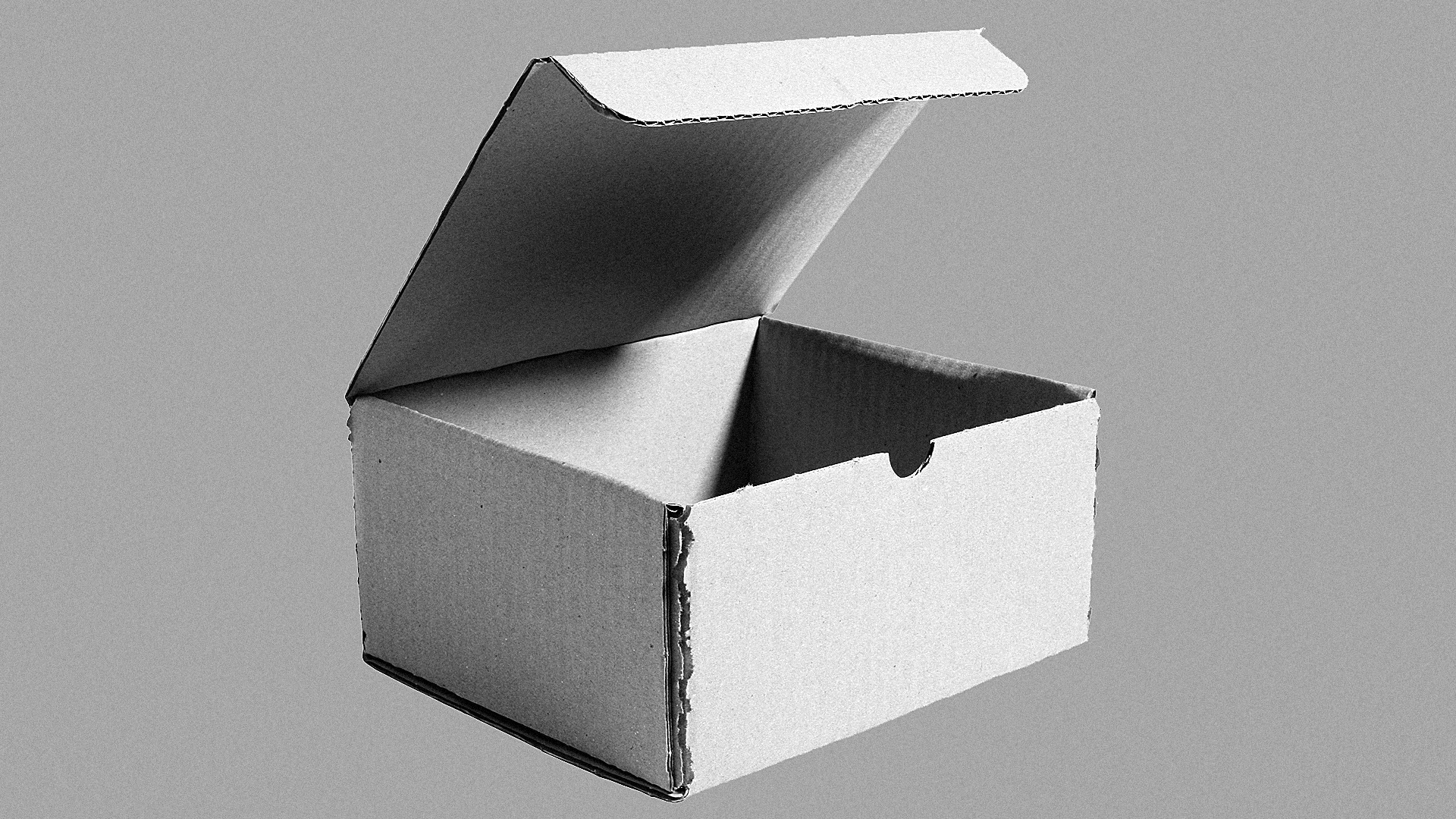
In which case, why bother with the package at all? It matters for all of three seconds. Just ship my iPhone, or Pixel, or Galaxy in the cheapest, safest, most environmentally friendly container possible. It doesn’t need to be black or white, whatever gray of the pulp is fine. Don’t even tell me it’s an iPhone. I know. Because I bought the thing.
Just let me tear open the pack, dump it on the floor of my living room, and come to terms with the fact that the real reason all of these phones are packaged to look the same is that they are more or less the same. Every phone is the iPhone these days: It’s an internet-connected touchscreen. It’s been copied to death. And it’s been a long time since it was genuinely something to be excited about—at least, certainly not as much as a surprise bowl of Captain Crunch.
This article first appeared in www.fastcodesign.com
Seeking to build and grow your brand using the force of consumer insight, strategic foresight, creative disruption and technology prowess? Talk to us at +9714 3867728 or mail: info@groupisd.com or visit www.groupisd.com
