It’s not just a UX term. It’s a metaphor for the web, culture, and politics in 2016.
The definition of a dark pattern is simple: “a user interface that has been carefully crafted to trick users into doing things, such as buying insurance with their purchase or signing up for recurring bills.” As explained by the experience designer Harry Brignull, dark patterns are not bad design. They are, as one book on dark patterns puts it, evil design. Brignull coined the phrase a few years ago to describe products and interfaces that intentionally trick users, and in doing so, unwittingly gave us the language to talk about 2016.
To echo pretty much everyone on the planet, 2016 was a shit year. It was full of good people dying and bad people succeeding. But more than that, it was a year defined by the intentional misleading of people by design, from products to democracy itself.
This year, it felt like nearly every app and product had embraced some form of dark pattern. Users tweeted about seeing them on Skype, Facebook, Amazon, Uber, Office Depot, even America’s Test Kitchen, and yes, LinkedIn—truly a dark pattern early adopter. Even a UI feature that most of us see every day—the omnipresent “loading” or “processing” bar—was revealed as a completely fake way to pacify users.

[Pattern: MaleWitch via Shutterstock. Photo: Fredrik Skold/Getty Images]
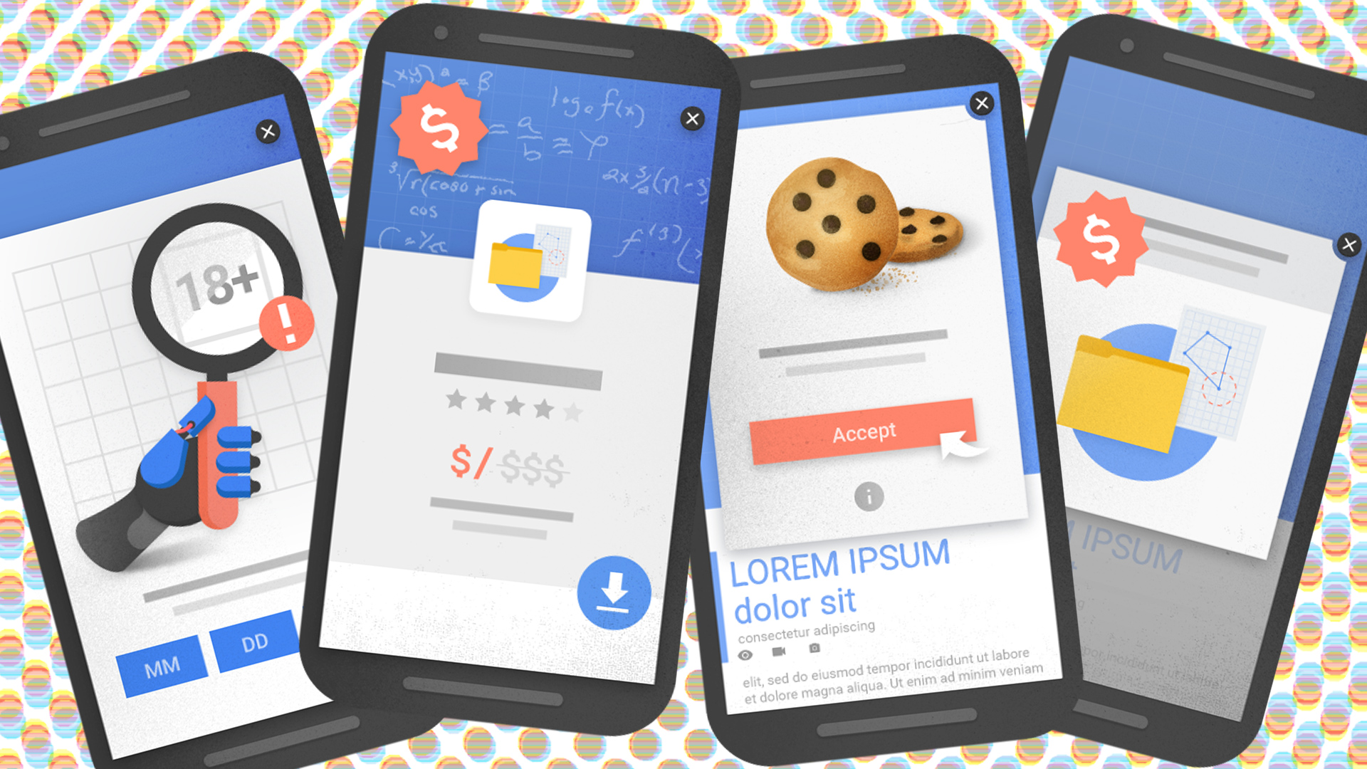
We saw dark patterns elsewhere, too, including publications that greet users with pop-up ads pressuring them into subscribing or clicking on ads, a classic way of “roadblocking” users. Some ads asked readers to choose between subscribing or trolling themselves. A classic example from from Women’s Health advertised a bikini body plan that could only be escaped if a reader clicked a line of small text below the sign-up reading “No thanks, I already have a bikini body.” The Boston Globe used a dark pattern often called “misdirection” by making it difficult to see the “close” option on a subscription pop-up. Misleading interstitial ads became such a problem that Google announced it would begin penalizing sites that serve pop-ups in its search rankings. Maybe less surprisingly, the Trump campaign used the classic“forced continuity” dark pattern on its donors. One voter in California even reported seeing a dark pattern on a ballot.
But while the steady evolution of dark patterns on the internet has been going on for years, something changed this year: We saw them wielded as weapons against democracy.
The most obvious way this happened is through fake news. As documented by BuzzFeed News, companies based in Macedonia fabricated pro-Trump news stories designed to garner the most clicks from high-value American users on Google and Facebook, netting them thousands of dollars in advertising revenue per month. “Yes, the info in the blogs is bad, false, and misleading but the rationale is that ‘if it gets the people to click on it and engage, then use it,” one person behind a fake news operation told BuzzFeed News. It was a trick, designed to boost engagement and profit.

Meanwhile, Facebook’s NewsFeed algorithm carefully serves news stories—both true and false—to users depending on their observed opinions, a form of confirmation bias which could be interpreted as a dark pattern. By only showing users some of the news, with the intention of keeping users engaged and active on the platform, the algorithm lies by omission. Even the details of interface used by both Facebook and Google mislead users: By cloaking every URL in the same “pretty” interface elements, whether from ABCNews.com or its fake news counterpart ABCNews.co.co, both companies lent legitimacy to lies through design.
Then there was the biggest, most insidious dark pattern of all: Donald Trump’s brilliant use of fabricated news stories and lies during his campaign. Most of us would assume a candidate for public office would operate based on some basic ethical standards including not directly lying to the public, the same way most of us would assume a company wouldn’t directly trick us with its UX. Both assumptions turned out to be wrong.
the #trump campaign was a successful dark pattern. now we have a 4 year subscription to bigotry and regression #ux #USElection2016
— Craig Phillips (@ycphillips) November 9, 2016
We’re standing at the edge of a new era in both tech and government—one that makes the old world, where “less friction” and “more engagement” was the main goal of both, look quaint. Rather than simply designing ways to engage users and make their lives easier, design is being called upon to do something much more complicated: Give users agency to understand and challenge the products they’re being sold. “Modern user experience is a black box that has made it easier and easier to consume things, and harder and harder to remake them,” Cliff Kuang wrote on Co.Design in the days after the election.
This is a far more complex topic than the traditional “problem and solution” paradigm that governs many design stories. It will require designers and users to collaborate on a much more intimate level, building a foundationfor the ethical design of products in our society. This will take decades. In 2011, interaction designer Stephen P. Anderson wrote a prescient essay about just that. “All design influences behavior, even if we’re not intentional about the desired behaviors,” he wrote to suggest that drawing a line in the sand is difficult for designers and users alike. “Be conscious and aware of what you’re endorsing with your time, not only for the welfare of others but for your own sense of self. The work you choose to take on defines you.”
In 2016, the library of dark patterns that emerged in recent decades—collectively shaped by both users and designers—were weaponized to profoundly influence our world. Will 2017 be the year when we finally shine a light on them, and demand more transparency and accountability from our products and political system alike? I hope so. In the meantime, let’s celebrate our successful unsubscribe from 2016.
This article first appeared in www.fastcodesign.com
Seeking to build and grow your brand using the force of consumer insight, strategic foresight, creative disruption and technology prowess? Talk to us at +9714 3867728 or mail: info@groupisd.com or visit www.groupisd.com

