A successful rebranding requires a weird, unpredictable alchemy.
In the past month, two major sports teams have completely overhauled their visual identities—much to the chagrin of their respective fan bases.
The Italian soccer club Juventus’s contemporary, hyper-minimal approach was lamented by fans who associated its old badge with decades of championship seasons and broad success; the club has veered sharply away from its iconic badge only once in its 120 years of existence. Meanwhile in the NFL, the Los Angeles Chargers’ attempt to meld its existing lightning-bolt branding element with its new L.A. identity became a magnet for ridicule from what felt like every corner of the internet.
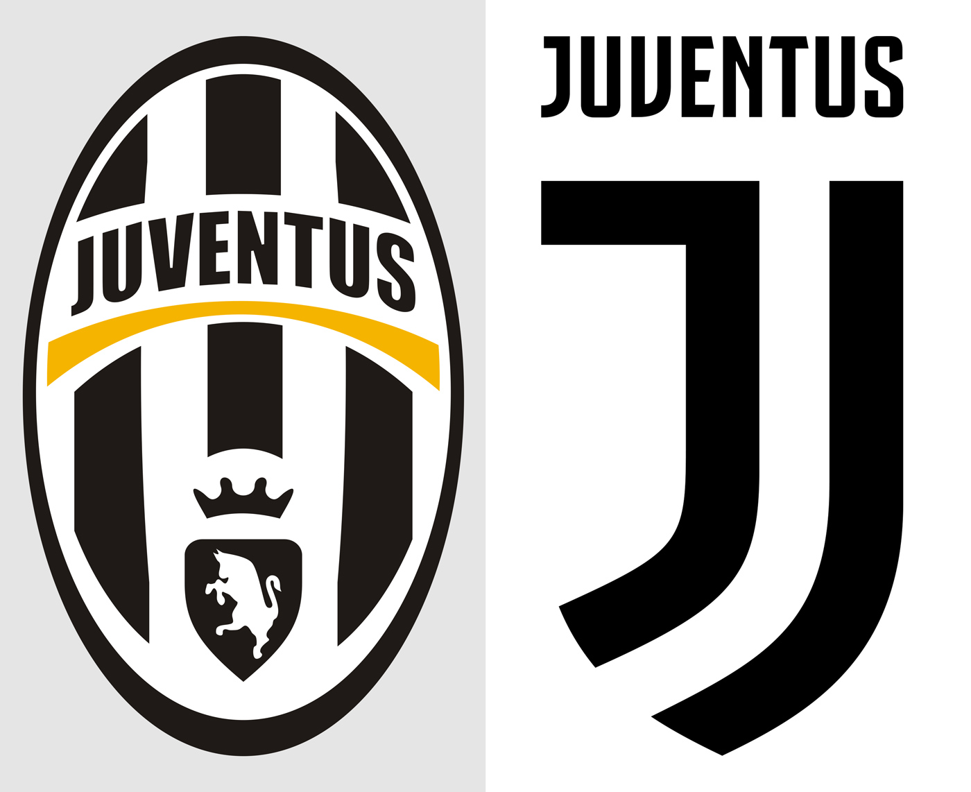
But the way the two organizations responded to the public’s outcry couldn’t have been more different. Juventus reacted by not reacting at all, letting fans and design enthusiasts defend the new logo from its most vocal critics. Perhaps the most measured of these opinions is this one, which thoughtfully argues that Juventus needs exposure to markets beyond its existing base of hard-core Italian fans in order to compete financially with clubs like Manchester United and Real Madrid.
In contrast, the L.A. Chargers—a team that hasn’t been to the Super Bowl since 1995 and is also managing the process of moving cities from nearby San Diego—couldn’t handle the derision that came with its new logo. First, it claimed that it was a placeholder. Then, it tweaked color schemes, before opting to bury it for good a week after its reveal.

While the circumstances differ, a common thread runs between these two scenarios: There are few things more fickle than rebranding a sports team. Trying to predict how the public will react is a crapshoot, and in many cases it has little to do with whether or not the design is actually “good.” “I didn’t think the Chargers’ ‘L.A.’ logo was offensive at all,” says Ross Yoshida, the Los Angeles Dodgers’ director of graphic design. “But once social media got ahold of it . . . there was a snowball effect of negative feedback.”
So what, aside from mob mentality, leads to rebranding disasters in the sports world? And what can designers everywhere learn from them? Every situation is unique, but a look at past rebrandings shows that it comes down to a mix of several factors, from respecting a client’s history to staying focused on the target audience and, maybe above all, being prepared for critiques from the peanut gallery.
RESPECT THE PAST
In many cases, the specter of history has the power to make or break a rebrand. Veer too far from a visual identity associated with success, and a team could find itself dead in the water.
“I think the way we like to look at it is ‘always looking forward, but with a glance to the past,’ says Dan Chandler, executive creative director for the creative agency Sid Lee, which helped rebrand the NBA’s Toronto Raptors. “I think you always have to pay reverence, especially when it comes to sports teams and their heritage and history, but you also can’t become some sort of vintage or retro brand either. You’re a million miles from sports performance if you do that.”
Yoshida also points out that any team with history (which, in many cases, are teams that have enjoyed an era of great success) always has to respect that tradition when considering design changes. “Generations of fans have rooted for players wearing the same logo, jersey, cap, etc.—in extreme cases, fans have tattoos of their favorite team’s logo,” says Yoshida. “In our case, we don’t want to stray too far from what fans have become connected to.”
That’s not to say that branding professionals in the sports world are always hamstrung by their team’s history. Yoshida points to the NFL’s Tampa Bay Buccaneers 1997 rebrand and the NBA’s Cleveland Cavaliers 2003 rebrand as successful examples of breaking radically from their respective pasts. But the key consideration that Yoshida points out in these cases is their timing—coming at moments when both teams were, in no uncertain terms, losers. (Both teams still maintain their current identities, no doubt aided along by the fact that they both won championships in the years that followed.)
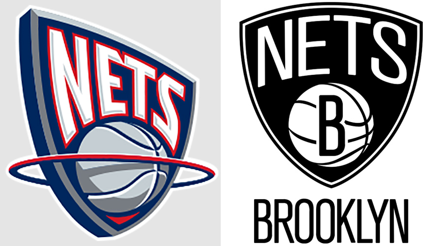
The Brooklyn Nets, which rebranded in 2011 as the team was leaving its former home in New Jersey, rolled out a minimal identity that shared little in common with the designs of its NBA peers. The stark black-and-white design had its detractors initially, but has since become engrained in the minds of fans.
To the team’s credit, the Nets’ branding success could be attributed to its embrace of history in a different way. Instead of looking to the team’s past mythology—again, not one of prolonged success—the ad agency Translation looked to the history of the city to which it was moving. According to the New York Times, they drew inspiration from the Brooklyn Dodgers and pulled branding elements that you would have seen on the subways of New York in the 1930s and ’40s. Toss in the fact that Nets gear looks as stylish off the court as it does on the court, you can see why fans adapted to the new look with little fuss (and the outlines of what Juventus may be trying to get at with its own sleek rebrand).
AVOID THE INTERNAL ECHO CHAMBER
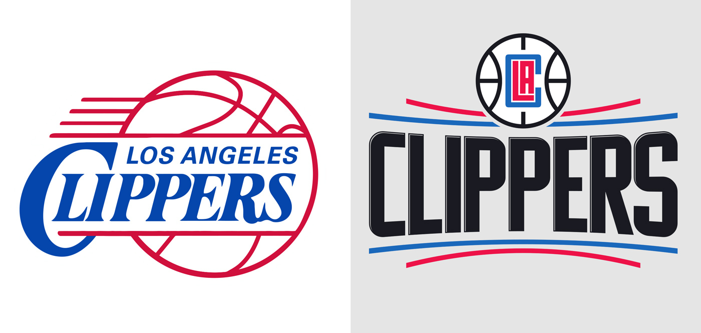
The Los Angeles Clippers, a team synonymous with losing that was looking to disassociate itself from its former owner (and renowned racist) Donald Sterling by any means necessary, rolled out a new identity in 2015. But instead of introducing a look that was befitting of a team that had stumbled into winning ways in recent years, the Clippers’ rebrand looked like it was designed to compete with Fuddruckers, not the Golden State Warriors.
It was a story familiar to designers in tech world. The end result looked like the product of “design by committee“: devoid of personality or originality, it seemed more concerned with not offending than it did with pleasing.
As Under Consideration points out, the clashing styles between the wordmark and the rest of the elements give it a disjointed feel. The brand’s cleverest ideas—the ones that draw a connection between the team and its place in the real world—are too subtle to glean by the casual onlooker. (See the references to a basketball court contained in the monogram and basketball element.) Perhaps most damningly, no specific credit was given for the logo, suggesting that the end product was caught between too many people.
Speaking broadly about branding projects that go awry, Chandler believes that sometimes designers and organizations suffer from an echo chamber effect where the ideas and concepts that make so much sense internally are completely lost on the outside world.
“The biggest danger that we face—design agencies and our clients—is when we end up talking to ourselves,” says Chandler. “Before you know it, you end up having a conversation in an echo chamber, and you end up talking about the project in your own unique, dysfunctional language. You’re not necessarily agreeing with the client, and they’re not necessarily agreeing with you, but you’re finding all these awkward, uncomfortable compromises to find that middle ground.”
“And you completely forget your audience. And when you put this idea or design out into the world, and it’s like it makes sense to us . . . .we ticked all the boxes . . . we achieved all the compromises. . . . But then the rest of the world doesn’t care about the process that got you there. All they see is the hodgepodge design, the awkward compromise.”

IT’S MORE THAN A LOGO, IT’S A STORY
Perhaps what some of these teams are missing from their identities is what Sid Lee pushes for in its work with sports organizations: Focus less on logos and colors, and more on creating an emotional connection through experience.
“People talk about the fact that we’ve moved from an age where people are interested in status symbols and are actually more interested in status stories . . . social currency generated by going out into the world and experiencing things,” says Chandler. “For us, the best brands are the ones who are able to do that and capitalize on that.”
When it came to the Raptors’ 2014 rebrand, Sid Lee veered away from traditional sports marketing logic and focused much of its efforts on something you’d see in more conventional advertising circles: the slogan. Drawing on the fact that the Raptors are the only Canadian team in the NBA, Chandler says that the “We the North” tagline honed in on the fan sentiment that the Raptors were, in many ways, NBA outsiders.
“We tapped into that sense of place,” says Chandler. “That Toronto was the only team competing in the NBA north of the border, and that kinda outsider mentality made it compelling. It wasn’t just the TV ad, it wasn’t just design, it was all of the things coming together with the same emotional sentiment at the heart of it.”
It worked. The response was favorable, and now the agency is tasked with creating an identity for the Canadian Olympic Team in the upcoming Winter Games. (It’s also worth mentioning that Sid Lee doing a nice job with the Raptors’ current logo and jerseys didn’t hurt either.)
But is the solution here as simple as turning to a high-powered external agency, instead of entrusting the brand to an internal team that knows it inside and out? Not necessarily.
“You want to push the rules, and you want to be seen as progressive, but you don’t want to push the design so far that you’re no longer in consideration,” says Chandler. “You don’t want to break so many rules that you’re no longer in the category anymore. One of our guiding principles when it comes to everything we do is to find that one rule—that one rule we’re breaking—and really just focusing on that. You need the consumer or the fan to understand what you’re trying to do. And if you’re trying to change every rule, you’ve lost your audience.”
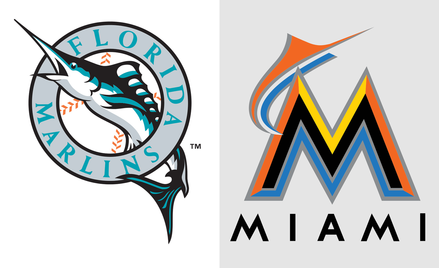
Baseball’s Miami Marlins, a team that was in the process of moving into a new stadium in 2012, found itself in favorable conditions for a sweeping rebrand. Its fan base was ambivalent about the team at best, which, given that Miami is a large market and 60% of its residents descend from Latino countries where baseball is massively popular, suggested there was room for improvement. The team worked with external firm SME Branding to create a new identity. Yet, though it attempted to capture the vibrance of Miami culture, the end product was seen as garish and contextually out of place, and was ultimately ill-received by fans and designers alike. In the end, clever design alone cannot bring rebranding success.
STICK TO YOUR GUNS
But even if a team’s branding efforts are well considered and well executed, that doesn’t necessarily mean an identity will lead to a classic or iconic status. And just because a team has some shoddy design work doesn’t mean that it will disappear in a few years. Ultimately, stumbling upon an identity that sticks involves a weird, unpredictable alchemy that depends as much on the future successes of a team as it does the quality of the design work. Such is the power of nostalgia.
“If the Dodgers were a 2017 expansion team, I doubt a designer coming up with a logo would draw the team name in script with a streaking baseball behind it,” says Yoshida. “But, the Dodgers logo (with a few nips and tucks over the years) has 70-plus years of equity with fans at this point. The Green Bay Packers logo . . . is that a good logo? The Raiders? If they came out today, they’d probably be bashed to hell on social media.”
And this is what makes Juventus’s situation such an interesting one for designers and branding experts everywhere to keep an eye on. It’s a team that could maintain the status quo forever and be fine, but also a team that has valid reasons to want something different. It’s a team that is eschewing the emotional connection that Chandler speaks so highly of, and is instead taking a headier approach in hopes that the aesthetes approve. But more than anything else, as Yoshida points out, it’s evident that Juventus prepared itself for every possible reaction from the fans.
“They put a lot of research and thought into it . . . there’s a story there,” says Yoshida. “They pushed the envelope. Again, though, it’s an old, established sports brand—a generational sports brand. They had to have known they’d receive backlash on social platforms. I hope they stick with it.”
This article first appeared in www.fastcodesign.com
Seeking to build and grow your brand using the force of consumer insight, strategic foresight, creative disruption and technology prowess? Talk to us at +9714 3867728 or mail: info@groupisd.com or visit www.groupisd.com

