Bojana Ostojic was working on Microsoft’s experimental mixed reality headset, HoloLens, when she realized that she was seeing the future of design at the company.
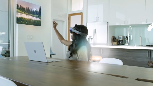
“I have to say, coming into that space really challenged me as a designer to really rethink a lot,” she remembers of her two years building HoloLens. Creating a holographic version of reality requires you to be part architect, part cinematographer, and part developer. If you’re using your hands to model an object in your living room via holograph, and need to move over to change something in the CAD model on your PC with a mouse, how should the interface respond? “Those were the moments in my holographic experience that I felt we were onto something really different than we had been in the past,” Ostojic says.
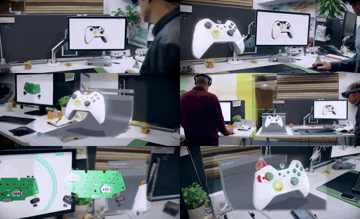
HoloLens was, and is, the most experimental high-profile product in Microsoft’s stable. Again: Holographs. So it seems like an unlikely place to incubate the company’s first new design guidelines in years. Yet Ostojic, who is now the company’s Principal Director of Design, explains that HoloLens was the inspiration for Fluent Design, a set of design guidelines the company introduced at its Build 2017 conference. It’s a loosely defined and still-evolving set of best practices for designing across mobile, desktop, voice, gesture, AI, VR, and holographic interfaces, a necessarily broad language of interactions, animations, and visuals that may be updated frequently.Conceptually, it’s the exact inverse of the precise, typography-based Metro design system the company released almost a decade ago, and a glimpse at how Microsoft is striving to remake itself with a more transparent, collaborative culture.
Over the past two years, the company has led the shift toward inclusive design, an approach that is now evident across the industry. It’s increasing its emphasis on real-world applications of machine learning and AI. It released a radical holographic device that no one saw coming, inviting developers and designers to collaborate on its development. In addition to evolving its popular Surface line, Microsoft launched a bevy of new hardware devices, like the Surface Studio, that are meant to eat Apple’s proverbial lunch: creatives. Perhaps more than anything, it’s been dramatically more transparent about its many experimental products and apps.
At the same time, such a diverse stable of devices and apps creates a problem of continuity. 2D interfaces are largely a solved problem these days, and most screen-based operating systems share some of the same basic qualities.”2D has been the name of the game for a really long time,” says Tim Allen, who came on as a partner at Microsoft this year. “The industry knows it, breathes it, and, to a certain extent, has started to perfect it, as well.”
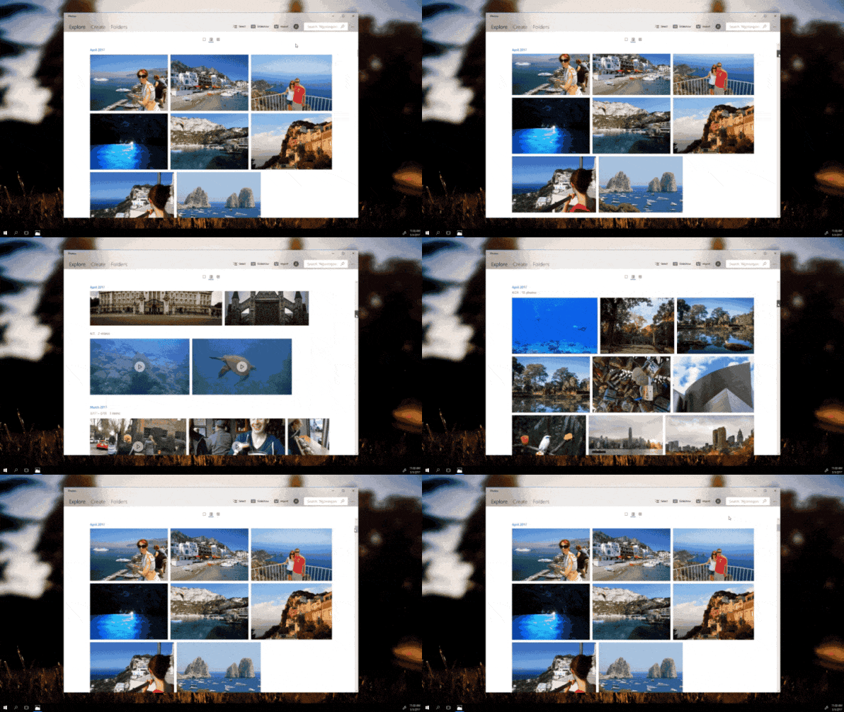
Yet no company–not Apple, Facebook, or Google–has quite figured out how to integrate the old world of 2D devices with the new world of 3D or mixed reality hardware. “With HoloLens, you’re interacting with literally light–holograms–and that’s a new experience,” says Albert Shum, Corporate Vice President of Design. “At the same time, how do you make sure, as a creator making something, that you can easily go from a PC to a HoloLens and back?”That was the problem from which Fluent Design emerged. It’s meant to serve as a cohesive interaction language across all of Microsoft’s devices and systems: Windows 10, HoloLens, Surface, Xbox, Cortana, and more. “We were realizing that a lot of our experiences today don’t need a screen,” says Shum. And beyond VR, how could they standardize an experience across emerging interface modalities like voice and gesture? Shum has led Microsoft’s push towards inclusive design over the past few years, and Fluent Design is an expansion of that kind of thinking. “We’re thinking a lot more about new technologies that enable not just new experiences, but experiences for everyone.”
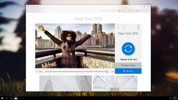
It’s still very early days for Fluent Design, and many of the conversations around the system haven’t been formalized as strict guidelines. The first wave of elements the company shared today describe things like “connected animations,” a series of motion graphics that are designed to standardize the animations that a user sees when navigating between two apps or pieces of content, or between devices. A new creative app the company introduced today, called Story Remix, creates stories from your videos and images using these animations. Then users can add 3D objects to 2D images and videos easily and seamlessly–a demonstration of the kind of mixed-dimensional creativity the Microsoft design team wants to enable.“I think we’re moving in a direction of our operating systems feeling more temporal and ephemeral,” Ostojic explains of the system’s emphasis on motion and animation. “It’s not as rigid as it used to be in the past. We summon things that come and go, we search for them, we don’t necessarily anchor ourselves in very rigid structures.”
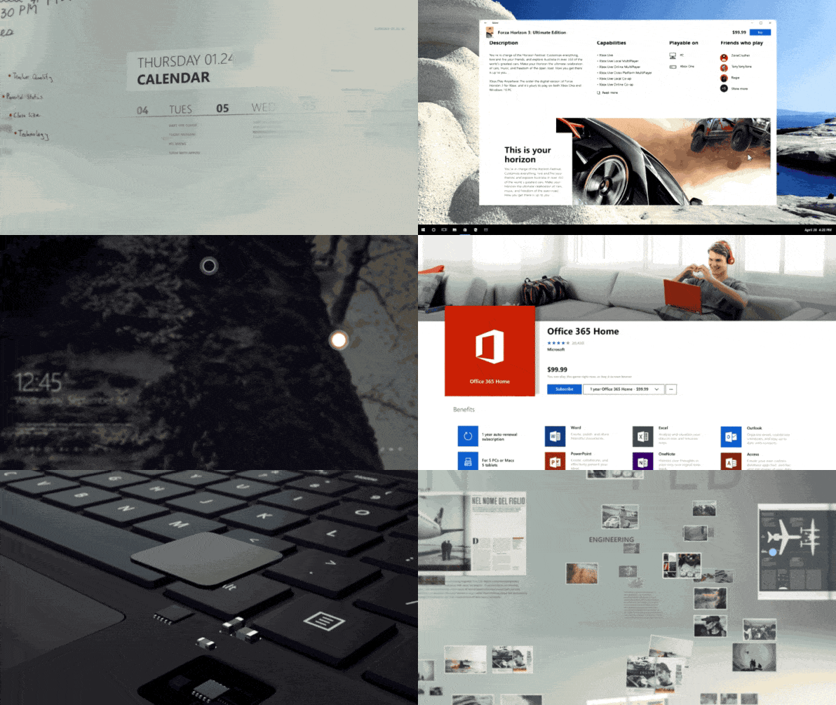
Acrylic, the first standardized design material the company is publishing under the system, is a glassy layering of materials that are rendered as a thin pane of gaussian-blurred glass. Here’s where Fluent Design is very similar to Google’s Material Design in terms of how it applies to 2D interfaces; it’s meant to replicate the physics of the real world. But its primary emphasis is on light, which Ostojic attributes to HoloLens. In the company’s holographic interface, your gaze directs a spot of light–instead of a pointer–to control menu buttons and navigation panes.“Without light, it would be very hard to orient yourself within a VR or holographic space,” she says. “[Light] becomes a very fundamental need in that kind of design paradigm. We looked at that and said, ‘Okay, if that’s effective within VR and holographic space, how do we bring it across the rest of the devices?” The answer: An interaction the company calls “Reveal,” which visually highlights unseen parts of an interface when you touch, point, or look at it, a lot like HoloLens does but across more devices. Light, rather than a color palette or a font, is the “connective tissue” in Fluent Design.
The system is intentionally light on rules, right now. Allen, Ostojic, and Shum explain Fluent Design as an evolving library of interactions, behavior patterns, and interface elements, not a finished product. Every three to four months, using feedback from the community, the system will be updated. It’s a shift away from the way design standards are typically published–and the way Microsoft presented its previous design language, Metro–and toward a fuzzier, more community-driven approach. Both Shum and Allen, who joined the company two months ago after leaving his post as president of Wolff Olins North America, describes it as a shift in culture. “I don’t think this would have been possible in an earlier Microsoft,” he says. “I think currently, there’s this drive to want to be more than just a utility–to be more than just useful for people.”Right now, Fluent Design is more of a mission statement that a fully-developed set of standards. We’ll have to wait and see how this still very young system evolves over the next few years. Will VR and HoloLens ever achieve ubiquity? Will mixed reality reign supreme? Will voice interfaces colonize even more of our world, or will they wither and die? Fluent Design aims to adapt to the uncertain future of these paradigms. Shum describes the process as creating a personality: “Design’s job is not just ‘hey, push this button and get this.’ It’s actually: how do we want our customers to feel?”
–
This article first appeared in www.fastcodesign.com
Seeking to build and grow your brand using the force of consumer insight, strategic foresight, creative disruption and technology prowess? Talk to us at +9714 3867728 or mail: info@groupisd.com or visit www.groupisd.com
