How Wright positioned himself as creative genius rivals his revolutionary designs.
“Fellow architects have called him everything, from a great poet to an insupportable windbag.” That’s how journalist Mike Wallace began a 1957 televised interview with 88-year-old Frank Lloyd Wright. By the end of the conversation–which touched upon Marilyn Monroe, the immorality of war, and redesigning the entire country–Wallace had showered him with praise, calling him a revolutionary in his work and life.

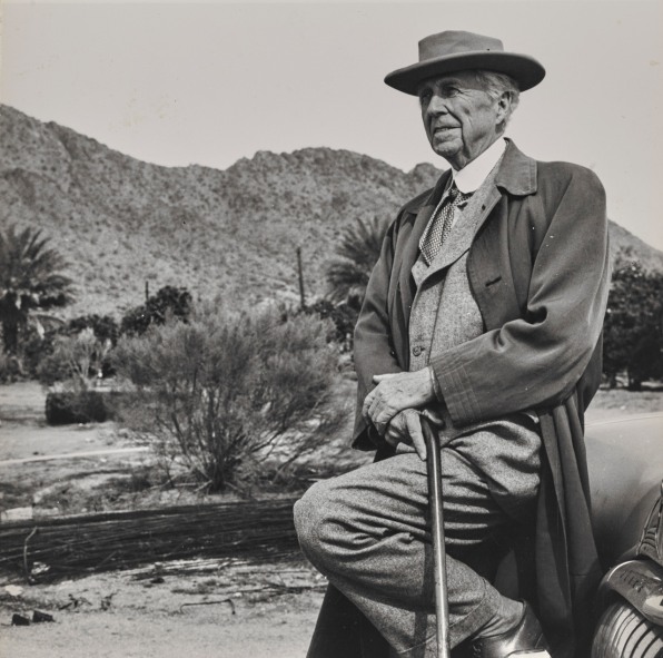
By the time Wallace interviewed Wright, the architect had indeed proposed numerous revolutionary ideas: prefabricated houses, skyscrapers with a substructure inspired by trees, homes that melt into their sites. But perhaps Wright’s greatest achievement was constructing his persona. He was an early expert in branding.
Frank Lloyd Wright at 150: Unpacking the Archive, a new exhibition at the Museum of Modern Art, sheds new light on the architect’s career and reveals how he became the most famous architect of the 20th century.
“Wright is, I believe, the only architect who is more popular with the general public than he is with practicing architects,” Barry Bergdoll, who co-curated the exhibition with Jennifer Gray, said at a press conference.
For Wright to achieve that place in history involved careful positioning of his work and his genius. Here’s how Wright cemented his place in history.

HE WAS A MASTER AT SHOWMANSHIP
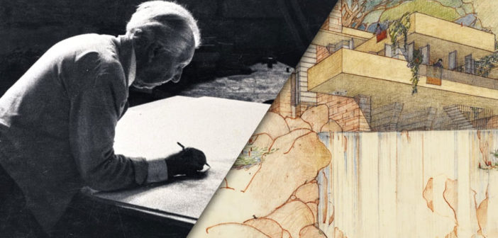
Frank Lloyd Wright at 150 focuses on more than a dozen of the architect’s works, both famous and lesser known, conceptual and built, public and private. Instead of taking a general survey approach to the 450 pieces on view, Bergdoll and Gray approached a handful of scholars from different disciplines–landscape architecture, conservation, cultural anthropology–to dive into his archive, which MoMA and Columbia University acquired in 2012, and better understand his life, his seven-decade-long career, and why he’s still wildly popular today, 150 years after his birth.
“He became a public figure in a new kind of way,” Glen Lowry, MoMA’s director, said at the press conference. “The presence of Wright disseminated way beyond circles of architecture. The character, the story, the man, exists in parallel to this protean talent that managed to produce a career that was almost a century long. [It was] the combination of the duration and the inventiveness and a personality he cultivated. He was well aware that how he presented himself had an impact on how the public would understand his architecture.”
Wright was a master of showmanship and getting his face and name into the public realm, for example: appearing on Mike Wallace’s television show twice and on the game show “What’s My Line” to communicate his work and persona to a mass audience. He built large-scale intricate models of his proposed buildings–like a five-foot tall model for a never-built glass skyscraper that MoMA restored for this exhibition–not as a design or study tool, but as a way to impress people.
One of the projects that best illustrates how he wanted to position himself was Mile High Illinois, a conceptual skyscraper designed in 1956 that was, as the name suggests, intended to be one mile tall. To present the project to the world, Wright called a press conference and prepared an eight-foot-tall drawing of the design as a visual aid.
“This drawing is a manifesto about architecture,” Bergdoll says in a video explaining the project. “It’s also an autobiography about Wright.”
As Bergdoll points out, nearly half of the drawing is text, which includes name checks of whom he admires most (Wright’s placing his own name into the architectural canon), why he’s designing the building (“to honor the state of Illinois and the city of Chicago”), and the technical achievements of the design (“earthquake-proof construction”). While the design is intended for the Midwest, Wright includes sketches of the Great Pyramid of Giza, the Washington Monument, the Empire State Building, and the Eiffel Tower in his drawing–the 1950s equivalent of Photoshopping yourself into a picture of celebrities.

HE TAPPED INTO WHAT PEOPLE WANTED–AND KNEW WHEN TO PIVOT
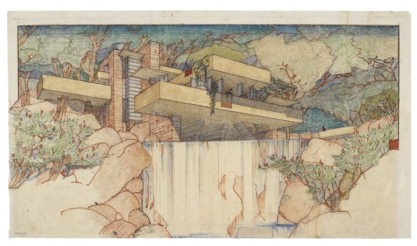
Wright is most famous for designing custom private homes, often for very wealthy people who could afford his services. While site-specific designs were what made him famous–like Fallingwater–he also designed prefab houses to make his work more accessible to the masses and expand his business.
A full-page ad for his system-built houses in a 1917 edition of the Chicago Tribune says in bold lettering: “You can own an American home” and the subheadings proclaimed the product to be “distinctly American architecture” that would endure, have personality and beauty, and have a guaranteed price.
Drawings for his system-built houses included “patent pending” on them, as historians Matthew Skjonsberg and Michael Osman, point out in an explanatory film on Wright’s American System-Built Houses, which shows how he’s interested in becoming an industrialist. While his custom homes were very much dependent on master craftsmen to build, here he’s showing an interest in mass production, which would lower labor costs and make his designs more democratic.
“For Wright, engaging with the factory was really about democratizing access to houses more generally, but also, of course, to his own authored, beautiful houses,” Osman explains.
Wright designed his first system-built houses during a time when labor was expensive, so introducing factory production was a way to solve the construction cost problem home builders were having. However, by the 1930s, when labor was inexpensive because of the Great Depression, Wright continued to design lavish homes, like Fallingwater, which eventually made the cover of Time and featured Wright’s portrait alongside it.
“In the late teens and ’20s, Wright was not so much in view, and he comes into view in the ’30s in very interesting ways—and key is Fallingwater,” Bergdoll said at the press conference. “And I think–and I’m not a psychologist–but somehow the image of that house over the waterfall, in nature is so powerful. That house is in the imagination of the entire world, the idea of living floating above a waterfall.”

HE SOLD A TOTAL, DISTINCTIVE PRODUCT
Wright wasn’t just a designer of structures; he created total environments. He often designed highly specific furnishings and landscapes for his projects.
For the c. 1923 Imperial Hotel, in Tokyo, he created custom textiles, furniture, and tableware to emphasize how the project was a total intersection of eastern and western culture and critical to the experience guests were to have while they were staying there. “Harmony was the watchword in the building, gardens, and furniture,” a brochure for the hotel reads. “The result is a restful symphony pleasing to the eye and mind of weary wayfarers.” (Also of note: When Wright photographed the Imperial Hotel, he did so in a way that mirrored the composition of Japanese woodblock prints, as historian Ken Oshima discovered.)
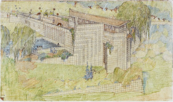
The details and ornamentation in Wright’s work make everything highly distinctive, but they were often functional. At Midway Gardens, a now-demolished Chicago entertainment center that Wright opened in 1914, Wright designed cutlery, rugs, tapestries, murals, furniture, and more, which helped guests become fully consumed by the environment and want to stay longer. His interiors were so lavish and consuming that the majority of the budget was spent on furnishings, textiles, lighting, and accessories, as historian Spyros Papapetos says in a video about the complex.
Unlike other modern architects, who shied away from ornamentation, Wright embraced it and thought of all of those elements as essential to the overall artwork he was trying to create. He even went so far as to brand many of the houses he designed with his own signature in the form of a red ceramic tile embedded into their facades–a veritable logo from an architect whose brand rivals his work.
Frank Lloyd Wright at 150: Unpacking the Archive is on view at MoMA until October 1, 2017.
–
This article first appeared in www.fastcodesign.com
Seeking to build and grow your brand using the force of consumer insight, strategic foresight, creative disruption and technology prowess? Talk to us at +9714 3867728 or mail: info@groupisd.com or visit www.groupisd.com


![Installation view of Frank Lloyd Wright at 150: Unpacking the Archive. The Museum of Modern Art, New York, June 12–October 1, 2017. © 2017 The Museum of Modern Art. [Photo: Jonathan Muzikar]](https://assets.fastcompany.com/image/upload/w_707)
