Creating a font for UX design is more important than ever before
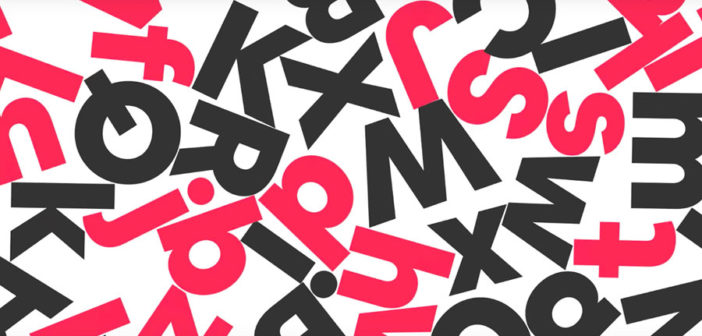
Airbnb has a new custom typeface, Cereal. The company needed a font that would not only make its visual identity more cohesive across all of its various platforms and scale easily (read: be legible on low-res phones as well as massive billboards) but could also function as a global typeface. Enter: Cereal.
“Our work is extremely typographic, and people experience our brand across various mediums including the platform, Airbnbmag, and metro stop advertisements,” explained Derek Chan, creative lead for marketing at Airbnb in a blog post.
Chan continued: “We have specific business needs around brand distinction, legibility, and scalability, that no available typefaces were addressing. We wanted a typeface that would function beautifully online and offline while reflecting our brand personality, so we decided to craft our own.”
After trying to find an available screen-optimized font system that would work for the company’s needs and coming up empty-handed, the company worked with typeface foundry Dalton Maag to create the new font. Karri Saarinen, design lead for design language systems at Airbnb explained that, “The typefaces we reviewed were typically good for brand and print but not UI, or vice versa. We needed a solution that would lend a consistent voice across all mediums and platforms we support—web, iOS, and Android.”
With the help of Dalton Maag, Airbnb wanted to “imbue a playful, open, and simple typeface with a touch of quirk,” noted Chan, who added that the font’s name, “brings us back to the early days when breakfast was a part of our name, and is also a nod to a time when cereal saved the company. We explored a few traditional naming territories, but ultimately the story and the name represent our values and sentimentality.”
In designing the new font the company wanted to make sure it was representative of its values. “Our mission is for anyone to belong anywhere, and typography will help pave the way for us to get there,” explained Chan. “When we began designing the Latin character set, which only supports a portion of our global community, we thought about characteristics that would translate to other script systems as our typography work continues.”
While the new typeface doesn’t currently support all languages that’s something the company is looking to do in the future.
“Dalton Maag helped us understand how script systems differ from one another and that the geometry of our Latin set wouldn’t translate 1:1 with Arabic, for example,” noted Chan. “We knew Latin was just the beginning of our typographic journey, and that we needed to think about design decisions that would cascade to other systems. Over the next few years, we’ll be investing to extend our type family.”
Airbnb plans to create a version of the new font that will work for languages like Chinese, Japanese, Devanagari, Arabic, Hebrew, Cyrillic, Greek and Thai.


–
This article first appeared in www.adweek.com
Seeking to build and grow your brand using the force of consumer insight, strategic foresight, creative disruption and technology prowess? Talk to us at +9714 3867728 or mail: info@groupisd.com or visit www.groupisd.com


