You might not even notice the redesign–and that’s the whole point.
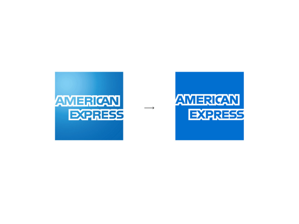
American Express has a new logo, but it probably slipped under your radar. It’s part of a complete brand redesign led by Pentagram partner Abbott Miller. The credit card company has swapped out its blue box with a gradient for. . .a blue box without a gradient.
“We didn’t want people to say, oh, did you see that new logo [ugh],” says Miller. “It was more if you cleaned the smudges off your lenses. It’s cleaner. Clearer.”

In fact, it’s a lot more than that.While Pentagram’s work doesn’t look significant at a glance, when you actually analyze the logo itself, you can see that the firm has subtly re-engineered the word mark to break American Express out of its own blue box. “I felt like the old blue box was sort of like a punctuation mark in their communications, from an older sensibility about being low key about the branding,” says Miller. “What we’ve given them are tools to make their voice more assertive.”

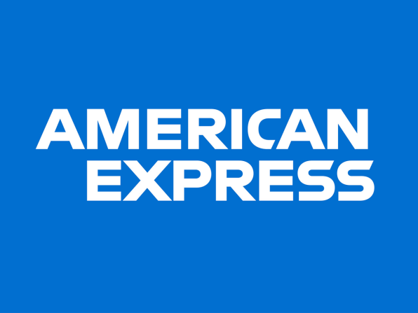
To do so, Pentagram redrew “American Express” itself. In the last version of the logo, used since 1975, the letters themselves were outlined with no true negative space of their own. Functionally speaking, the glyphs butted up to one another oddly, and that meant if you pulled them out of the box or removed the outline, the lettering fell apart. The redrawn version can live anywhere as type alone, making for a bold statement on a letterhead. After the redraw, the letters also scale with more fidelity, too, meaning they’re better equipped for billboards.At the same time, in the age of smartphones and apps, branding needs to easily shrink, too. The old blue box didn’t work at smaller scales–like online checkout, where the user has to select their credit card from several minuscule logos. “You line up Visa, Mastercard, and then you have this AMERICAN EXPRESS that’s illegible,” laughs Miller. “So you know, that must be AmEx!”

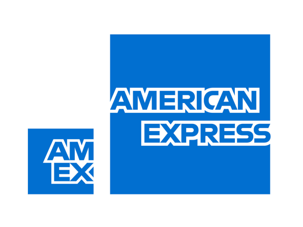
For moments like this one, Pentagram created a second version of the blue logo that simply reads “AmEx” over two lines. That’s a practical savings of 11 letters, which is crucial at the pixel level, and allows the logo to be legible even when presented in tiny sizes.
–
This article first appeared in www.fastcodesign.com
Seeking to build and grow your brand using the force of consumer insight, strategic foresight, creative disruption and technology prowess? Talk to us at +9714 3867728 or mail: info@groupisd.com or visit www.groupisd.com


