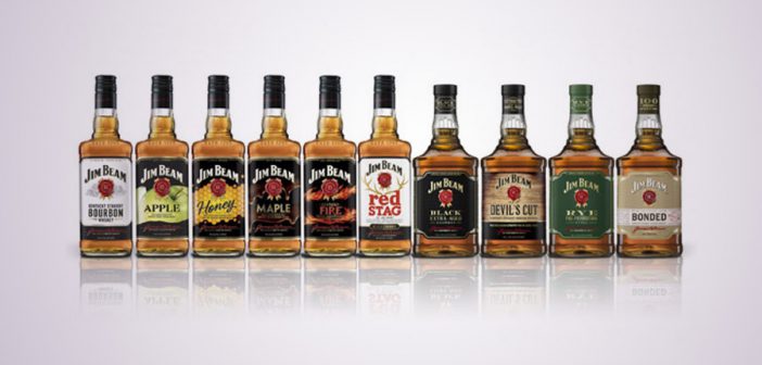
Global Jim Beam Portfolio Receives Packaging Makeover
Jim Beam is getting a new look for the first time in decades. The bourbon that’s been around since 1795 and all its varieties found in more than 100 markets will have new, consistent, cleanly designed labels with higher-quality paper. US consumers should see the changes by August while European shoppers started seeing the shift in March. Until now, different designs for Beam had been used in different markets.
“Being a truly global iconic brand, with packaging obviously being our most visible and valuable real estate, we wanted to make sure that wherever you went you saw a consistent look of Jim Beam across the family of products,” Megan Frank, VP of global marketing for the Jim Beam brand, told Ad Age.
New label, same bourbon. pic.twitter.com/0BXNoUpkQP
— Jim Beam (@JimBeam) May 27, 2016
For some beverages in the portfolio that are considered premium, such as Jim Beam Black, the shape of the bottle changes to be more rectangular. (Don’t worry, Beam lovers. It holds the same amount.) Premium products will also get “extra fine detailing, crafted borders, full finishes, refined embossing and a paper matte stock,” according to a press release. In other words, Beam wants its premium products to look a little classier. Other products in the portfolio include Jim Beam Bourbon, Jim Beam Apple, Jim Beam Honey, Jim Beam Kentucky Fire, Red Stag by Jim Beam and Jim Beam Devil’s Cut.
“This represents another historic milestone in my family’s history,” said Fred Noe, seventh-generation master distiller and Jim Beam’s great-grandson, in the press release. “I’ve always been proud to see the faces of every Beam master distiller displayed on Jim Beam bottles across the world. These bottles feel even better in my hands when I pour the world’s finest bourbon.”
This comes two years after Beam put into motion its first global marketing campaign, “Make History,” featuring actress Mila Kunis. The new look will be integrated into the campaign as well as in-store displays.

