How do you design for more than 100 million Americans? It’s the challenge of a lifetime for Original Champions of Design’s Jennifer Kinon.
Last December, Jennifer Kinon arrived at the offices of Hillary for America to a typical full-slated work day. Donald Trump had just declared that he would bar Muslims from entering the country, and the Clinton campaign, at this point relatively new to such explosive rhetoric, had to craft a response. A member of the social media team brought Kinon an idea for a social graphic he had been working on. “It was Love Trumps Hate,” Kinon tells me last week in one of the small conference rooms at the campaign’s Brooklyn headquarters. “We sat down and played with the typography and the color, then tweeted it out.”
Within hours, the slogan had tipped over into viral territory, spreading from social media to online media then offline onto bumper stickers and T-shirts. Eight months later, it has taken on a life outside of the campaign, still making its way onto clothing and billboards. It’s even become a kind of ad-lib: ___ Trumps ___.

It’s just part of the job for Kinon, who went on hiatus from New York-based firmOriginal Champions of Design last July to take on the role of the campaign’s design director. Kinon is tasked with creating and maintaining the campaign’s overall visual language, not unlike what OCD does for clients, including the WNBA, Friends of the High Line, and Girl Scouts of the USA. But Clinton is no ordinary client, and designing a presidential campaign is no ordinary job. The election’s battle lines are advancing and retreating on Twitter, Facebook, TV, T-shirts,buttons, and anywhere else you can imagine. Whereas President Obama’s message in 2008 could be neatly summed up in a single powerful “Hope” image, Clinton’s has to fight a war on all fronts. It has thusly fallen to Kinon to quietly craft the most sophisticated campaign design strategy ever. “I don’t think you follow formulas,” Kinon says. “I think authenticity comes with telling the story of your candidate at the time and place of your candidate.”
JOINING THE RANKS
When I visited the office earlier this month, the social graphics team was working on a response to the news that Trump hired Steve Bannon, the executive editor for the alt-right site Breitbart News, to work on his campaign. (Two days later, Trump’s chief strategist Paul Manafort unceremoniously quit. There’s a graphic for that, too.) Others on the design team, which recently grew from six to 16, were working on the web design for the new podcast the campaign just launched, With Her or designing graphics for individual state campaigns.

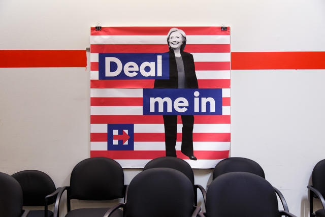
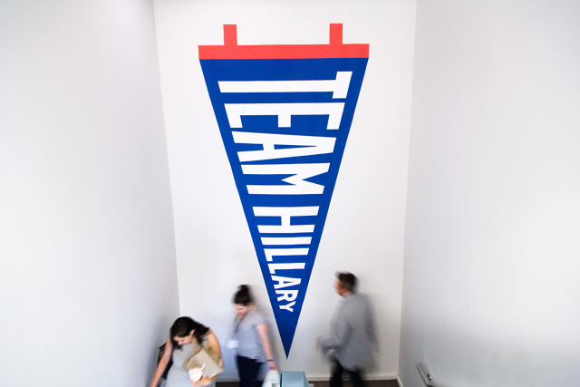
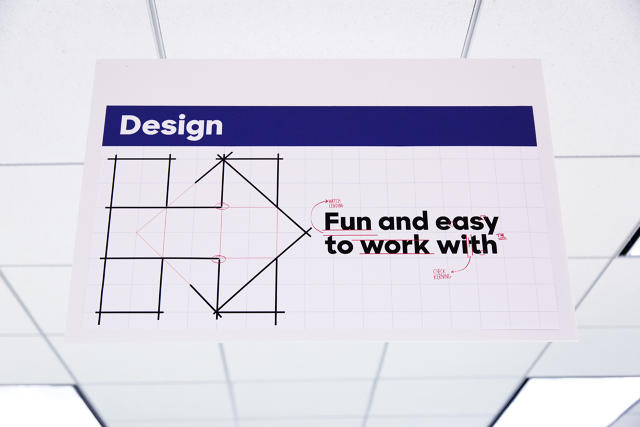
Campaign headquarters take up two floors of an office building in downtown Brooklyn, where the drab gray-carpeted, cubicle-laden interiors have been overtaken by an almost manic array of post-it notes, campaign placards, strung-up lights, hand-made signs, and a blown-up wall decal of the Hillary logo. There is near-constant activity, but Kinon assures me that this is a relatively calm day in campaign world. When I called her for an interview a month ago, the design team was right in the middle of a triple jump: preparing for the Republican National Convention and the Democratic National Convention, as well as the roll-out for Tim Kaine’s Vice Presidential campaign. They had also just launched a redesigned website and a digital organizing app and published a 280-page policy book.
All of this came at Kinon’s directive. As a gift on her desk from Bobby Martin, her partner at OCD, reminds her, Kinon has been at the campaign for a little over 400 days. It’s a long time away from OCD, which specializes in setting up and implementing cohesive visual systems that can be applied to all elements of a business: website, social advertising campaigns, merchandise, as well as various company divisions.

In the spring of 2015, Kinon got a call from a “well-known designer” (my guess was Pentagram partner Michael Bierut, who did the Hillary campaign’s logo, which Kinon didn’t deny) asking Kinon if she would be interested in the position. After she said yes, Kinon took a series of calls with the people in the campaign and went in to the headquarters for a large group interview. The job offer came over the phone while she was walking through Tompkins Square Park. “It was something I couldn’t say no to,” she says. “I was really energized by the idea of [designing for]the first female president.”
DEPLOYING THE SYSTEM
When she officially joined the campaign in July of 2015, Kinon’s plan was to do what she had done with countless other clients: create a comprehensive visual system. Such an approach would not surprise graphic designers, but it’s unusual in campaign design, which has a reputation for being inconsistent, cliched, and pretty much awful. Recall Mitt Romney’s disastrous American flag “R” in 2012, or any of the generic, bash-you-over-the-head symbolism of the logos from this year’s primaries. Then you have something like Trump’s campaign, which changed its Trump Pence logo after it was widely mocked.
Kinon had the benefit of working with Pentagram’s logo, which is contemporary, professional and adaptable (if only recently appreciated). “What I came in and did was take the raw elements—there was a typeface, I think, and a logo and a color palette that had been floating around—and formalize it into a strategy that had meaning for a candidate and a campaign, and the issues that were important to us,” she says.
Simple enough. Except that when your client is running for President of the United States of America, her target audience is quite literally every eligible voter in the entire country. “Whenever a client used to say to me ‘my audience is everyone,’ I would say ‘that’s very nice, but now we need to focus on who your audience really is,'” she says. “Here it really is everyone. In order to do this right, they need to come to this information, process it and make conclusions about it.”
So how do you develop a design strategy for a project that has very little by way of constraints and has no focused target audience?
Step one, says Kinon, is effective communication, both between the design team—which means daily morning meetings to discuss assignments—and across the other departments within the campaign. To make their overarching task manageable, Kinon and her designers treat their campaign colleagues like clients, speaking one-on-one with strategists, aides, speech writers, and others involved in policy about what message they are trying to get out there and how they can help them do it.
Take Hillary’s position on tax loopholes for the wealthy. Kinon and her designers might talk to the policy team about what they want to communicate. They would then do research, mock up some ideas, and put together a presentation for their feedback. Once the policy experts approves, the project can take many forms:graphics for a piece of writing on the website, or for the Twitter feed. It might eventually make its way onto merchandise in their shop.
Constant communication is great, but not everyone can have a hand in every task, especially when issues pop up in the news cycle that designers need to address right away. So the team is divided into four sub-teams: social, web, “persuasion” (emails and merchandise), and state-level organizing. The social team typically works on a day-by-day basis, nimble enough to respond to an outrageous Trump tweet, for instance, at a moment’s notice. Other teams work more slowly and deliberately; the email team, for instance, will adapt a social graphic that has done well to merchandise for the store. Meanwhile, the states team works on branding for various coalitions and individual states.
The teams have also gotten in the habit of making design toolkits for historic days, key issues or movements they know they will want to address—so that departments will have a formula to implement themselves. “We put them in people’s hands and saying here are these tools you never knew you wanted. Enjoy,” Kinon says.

THE POWER OF MANY
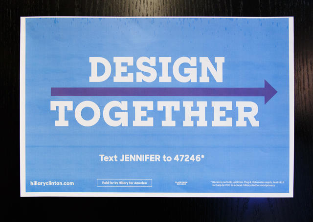
Having a full team dedicated to state design is unique to this campaign. In previous presidential campaigns, state organizers would typically find their own designers and operate as a separate entity. “There wasn’t a lot of communication between the states, graphically, to get the power of many,” says Kinon. “Coming out of brand strategy and knowing that you’re going to get more understanding of your message by unification across multiple people. We try to bring all of the states into one central unit you can meaningfully differentiate but still get that impact of coordination across multiple surfaces.”
This personalization strategy is tailored for Clinton, whom many—even in her own party—criticize for being too entrenched in the establishment. One story being toldagain and again in the media is of a divided perception of Clinton. People close to her or within her campaign are constantly painting her as a warm, caring person who is a good friend in addition to a skilled politician and thoughtful leader. Outside of the campaign, many express difficulty relating to her as a human being—probably because she’s been in the public eye as a politician for so long.
None of this is lost on Kinon, who uses words like personal and authenticate to describe the branding. Creating a cohesive design system that reaches out on multiple platforms and at multiple levels is smart branding, but it’s also used to humanize Clinton. Then there’s the fact that it is starkly different from their opponent’s design strategy, which is apparently non-existent. Instead Trump’s campaign relies on sweeping statements and caustic rhetoric to lure people in.(And it works.)
“One of the things that spoke to me when [Clinton] was speaking during the convention was when she was speaking about how important details are,” says Kinon. “To me, craft is a mirror for our candidate and all her wonkishness. A hanging punctuation, an apostrophe here, a color choice there. That craft is going to bring in another person who is going to amplify the message in just the right way. So we are holding ourselves to the most professional standard to reflect her because we know we’re her voice.”
In other words, thoughtful messaging trumps fear.
[Photos: Celine Grouard]
This article first appeared in www.fastcodesign.com


