Pinterest is on a mission to make online shopping fun
Editor’s note: This piece is part of our Columnist Network series, which explores the tactical thoughts and actions from Adweek’s community of high-level experts. Today, Jim Habig of Pinterest encourages marketers to rethink the online shopping experience they provide. Below, in his own words, he builds his vision of the future from the tried-and-true.
You’d think, after over a year of shopping almost exclusively online, consumers would have fashioned an experience they were a little more fond of. Yet in many discussions with shoppers, we’re finding the opposite is true. Fewer than half of consumers say they like ecommerce: Only four in 10 people prefer shopping online to in-store.
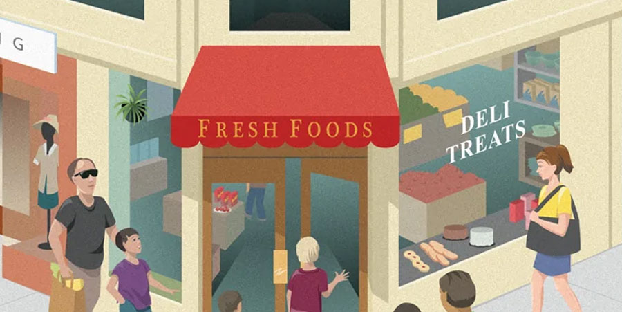
Why? Because online shopping is really online buying, and buying is boring. People miss browsing. They miss taking their time in stores: considering, looking, enjoying. Four decades of making online shopping fast, and the industry forgot to make it … fun. If ecommerce has to compete with actual stores again, ecommerce better step up its game. And how might it do that?
To usher online advertising into a new age, we need to look backward to a formula that worked—to magazines, actually. I can’t tell you how often I’ve bonded with new ad biz colleagues about our shared, long-harbored love of print. It’s also probably why every “think big” marketing pitch includes some version of the magazine idea (a misdemeanor of which I am guilty many times over).
For a sizable subset of U.S. consumers (and I’d guess a fair number of media buyers), magazines represented a high water mark for some alchemical mix of leisure, learning and shopping. The elegant interplay of content and commerce meant that ads weren’t intrusions—rather, they were a big part of the appeal. As an industry, we should channel that ethos and build editorial and advertising experiences in which people actually want to spend time.
How might brands capture some of the magic of that older form and shoehorn it into modern online platforms built for ruthlessly herding consumers to a checkout? For starters, consider bringing a print-like frame of mind to your catalogue feeds. Who decided that the best way to show a product is a simple photo on a white background? In our data, we see that more print-like imagery—think products in situ, or steal a page from your catalogue (if you even still publish one)—tends to perform much better than a rote product image typically featured in a catalogue feed.
And second, remember that speed to transaction isn’t always a good thing. Think about the last time you really luxuriated in the shopping experience. A couch, an outfit, a new piece of tech. Now compare that to the last thing you bought with one-click checkout. Which were you quicker to open when it arrived at your doorstep?
At Pinterest, we’re on a mission to make the shopping experience enjoyable again. But this isn’t just an experiential argument. Turns out that when you rush people to purchase, you leave money on the table. Our research shows when people spend more time shopping, they also spend more money.
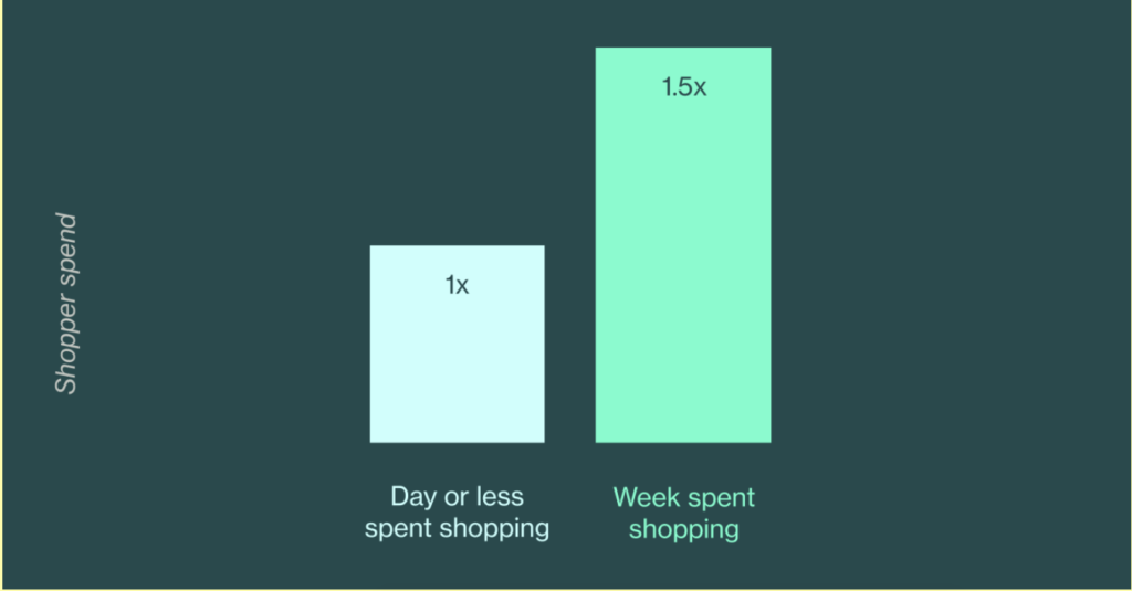
So rather than retargeting the daylights out of them, offer up an experience that feels like a ritual, not a rush. Try inspiring them with a vision. Your dollars depend on it.
…
This article first appeared in www.adweek.com
Seeking to build and grow your brand using the force of consumer insight, strategic foresight, creative disruption and technology prowess? Talk to us at +971 50 6254340 or mail: engage@groupisd.com or visit www.groupisd.com/story

