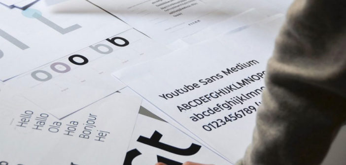
With the launch of YouTube TV, Google wanted to make a statement. And it made it with a typeface.
Go to YouTube TV’s website or app, and you may notice something that feels remarkably, well, non-Google: the typeface. It’s full of personality, with joyful curves that contrast against aggressive edges–the aesthetic equivalent to balloons floating next to knives. The letters are playful, sharp, and approachable–much like YouTube itself.
The font, called YouTube Sans, is very unlike Google’s normal approach to fonts, which is best described by the company’s anonymous, informational Roboto. Roboto is built to have little to no personality, to adapt to any situation, and to only convey data. YouTube Sans, on the other hand, is a new identity lurking in letterforms. And it was designed by the international branding firm Saffron to be just that.
“We didn’t want it to be too generic. You go, ‘oh, it’s just there,’” says Saffron creative director Matt Atchison, who led the project. “We wanted to create something that entered someone’s consciousness, and so bit by bit, people start to absorb this typeface and the message: ‘Ah, that’s YouTube TV talking to me!’”For those unfamiliar with YouTube TV, the service is Google’s latest expansion into global media domination. It’s not enough for Google that people watch 3.25 billion hours of content on YouTube each month. With YouTube TV, the company wants to offer more live-streamed and traditional “cable” content, too. That means it’s competing with everyone from Comcast and DirecTV to subscription streaming services like Netflix and Hulu for the tens of billions of dollars potentially up for grabs in the market.
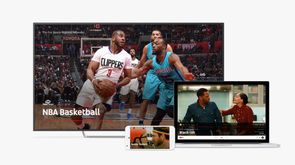
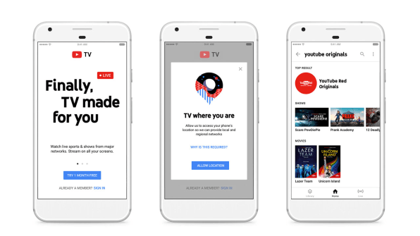
Google handled the interface and experience design of YouTube TV in-house. But it brought on Saffron to consider how the brand itself would be baked in. What Saffron’s designers realized early on was that they had very little to work with. YouTube TV was meant to be a Spartan media experience–the polar opposite of Netflix. Netflix had a black background with white text. YouTube TV would keep YouTube’s traditional white background with black text.
“When we were talking to the UX team [at Google], they started to give all the technical limitations, and you say, ‘Okay, right, it’s going to be a white interface with content, and beyond that, there’s very little room for expressing an identity or personality,” says Atchison. “Of course, one of the things you know will live throughout the user experience is the typeface, and the way that content is communicated. So that’s where we focused our attention.”The question became, if YouTube TV’s font could look like anything, what should it look like? Should it be gothic like a newspaper headline? Should it be blocky like a Hollywood film marquee? The team actually found its inspiration in YouTube’s core interface element–not the logo, which users actually see relatively infrequently–but the one thing YouTube had before any of its online competitors: the play button.

Of course, it’s not just any play button. It’s YouTube’s play button, what Atchison lovingly calls “a lozenge with a triangle in it.” The outside is curvy, almost like an Altoids can. The inside is a sharp, traditional play arrow.
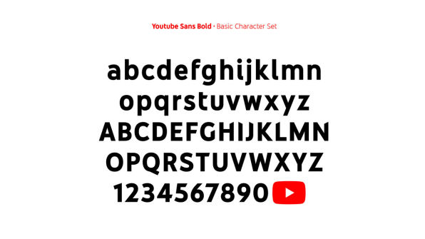
The play button itself was actually built as its own glyph in YouTube Sans’s font set–plus it influenced the shape of every letter. “We wanted the contrast of the roundness of the play button and the edgy triangle of the play button,” says Gabor Schreier, chief creative officer at Saffron. “This created a quite spunky combination of very memorable letters that, when we published this work, some people thought that looked sort of weird and provocative. [It is.] Otherwise it won’t stand out.”
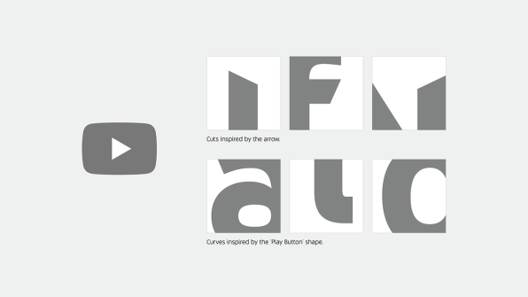
Looking at the letters themselves, you can see exactly this contrast at play. Look at the “y,” “w,” “n,” and “t,” and you’ll spot the hard slants that cut through the letters with all the bravado of a men’s razor commercial. But at the same time, Saffron creatives added curves wherever they could without making the font look, as they put it, “ridiculous”–like at the bottom of the “i” and “l” forms.
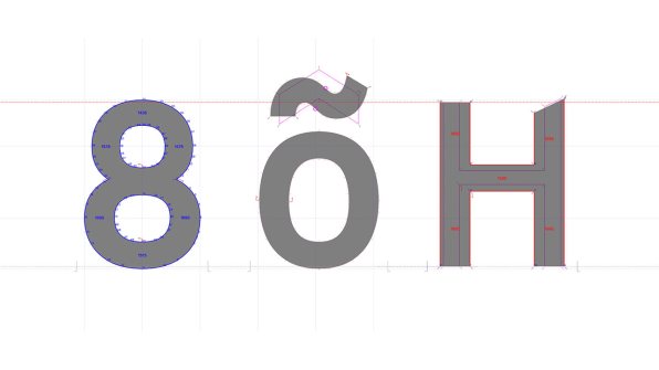
Such polarity within a typeface creates an identity out of an identity crisis.“There was a very thin line to make it look balanced, friendly, and functional, and sufficiently aggressive, in a positive way,” says Schreier. “To make it stand out was a little bit of the idea. But even if the dots on the ‘i’ and ‘j’ were square [rather than round], it would have been very cold.”
Not every decision made for the font had purely stylistic merit; many increase readability. Schreier argues that the curve at the bottom of the lowercase “l” distinguishes it from capital “I.” Meanwhile, the font’s shortened ascenders and descenders–the hair and feet of letters, essentially–mean that lowercase and uppercase letters are closer in height, and thereby more legible in tiny sizes where lowercase letters might begin to disappear.
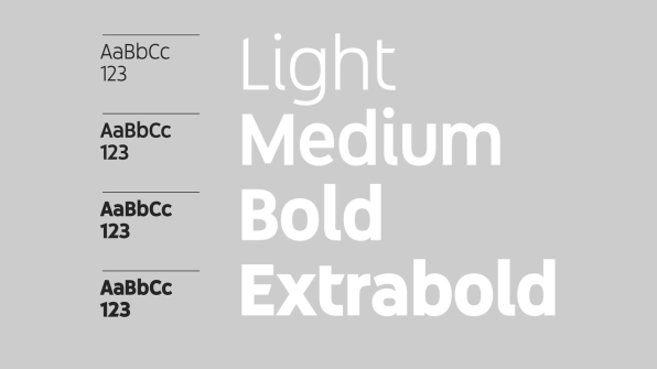
For now, YouTube Sans is only being used for the titles of videos–which are rendered large and bold–while Google’s function-forward Roboto still takes over for all the subheads and other content. “However, this typeface has a potential to be used in a much more functional way as well,” insists Schreier, who no doubt would love to see it beat out Roboto for responsibilities across YouTube TV.Until that day comes, YouTube TV has the beginnings of its own identity outside of Google. And it raises a question: Could we see similar branded type treatments of Google’s other services, such as Gchat or Gmail? Or more importantly, is the world really ready for a Google that speaks in more than one tongue?
–
This article first appeared in www.fastcodesign.com
Seeking to build and grow your brand using the force of consumer insight, strategic foresight, creative disruption and technology prowess? Talk to us at +9714 3867728 or mail: info@groupisd.com or visit www.groupisd.com

