The dynamic visualizations entirely depend on the music the orchestra plays–and represent a new way to make classical music more accessible.
Classical music can often feel like the domain of an elite few. But a new generative logo for the amateur Brooklyn Symphony Orchestra aims to make the community organization’s music accessible to a broader audience.
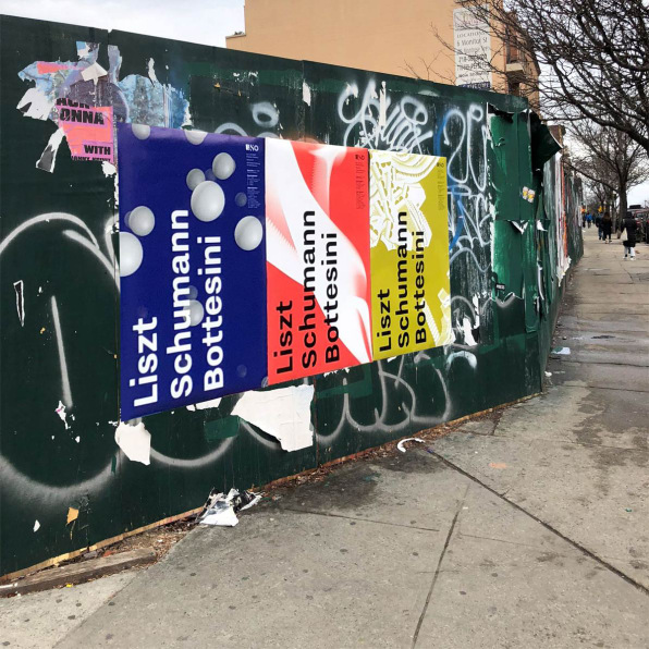
Created by the branding agency Superunion, the static version of the logo is composed of three bold typographic letters–an architectural “B” that echoes the arches of the Brooklyn Bridge, and sinuous “S” meant to evoke the expressive rhythm of music, and an “O” letterform that’s entirely composed of dots, which represents the community focus of the organization. It’s a striking contrast to the old logo, which used a graphic of the Brooklyn Bridge that looks like a piece of clip art.
For Nick Clark, an executive creative director at Superunion who also worked on branding for the London Symphony Orchestra, the biggest challenge for creating the logo was to not fall into the clichés that other classical music organizations tend to rely on graphically–like music notes, instruments, and representations of the orchestral pit–which doesn’t help them appear to be accessible to a wide range of people. “The visual identities tend to be a lot of imagery of varying quality showing performers and instruments because these are easiest to depict,” Clark says. “However, this very much speaks to the cognoscenti rather than new audiences, to whom this sort of stuff is either irrelevant or can be real turnoff. It also says very little about the experience of the music, being much more about the means of its production.”
It was important to avoid such overused tropes because BSO isn’t like most orchestras, which tend to be professional institutions. BSO is a nonprofit that enlists only members from the local community, and does weekend concerts at the Brooklyn Museum at low price point–specifically targeted at music lovers who have less income and feel left out of larger institutions.
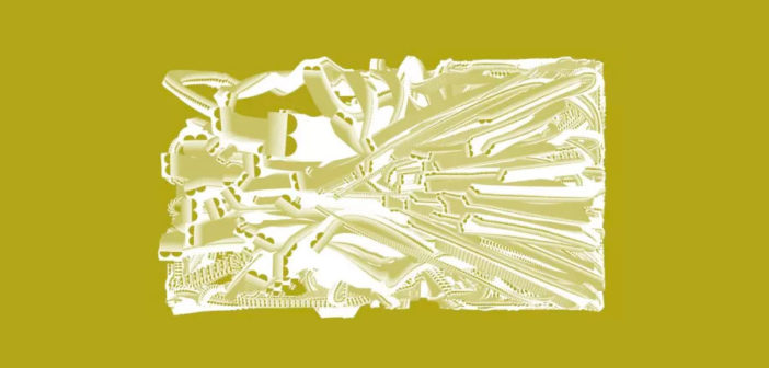
To ensure that BSO’s logo was something dynamic that would reflect the orchestra’s community-oriented approach toward music, Clark brought in the New York-based design studio HAWRAF to create generative graphics that are derived from the music the orchestra plays. HAWRAF created a tool for the orchestra that the organization can use in two ways. First, they can use a microphone to generate graphics live in front of an audience. Or, they can upload a recording later and use that to create graphics for marketing and promotional materials like tickets, merchandise, and advertisements.
The simple interface gives the orchestra different visualization options inspired by each of the logo’s letterforms. One visualization, derived from the blocky “B,” looks like the music is dragging the letter around the screen, creating dynamic, architectural forms. Another, inspired by the “S,” looks like a wisp of smoke that twists and turns to the beat of the music. And the last, inspired by the dots of the logo’s “O,” looks like a swarming beehive that slows down and speeds up their movement as the music ebbs and flows. Because every piece of music that’s fed into the system will be different, even if slightly, the software will always yield a brilliant new combination of forms.

The software also allows the orchestra to choose between different colors that still work within the organization’s new identity–allowing for cohesion amid each random new visualization. “Every time it creates these very unique visuals but at the same time has these elements that always stay the same,” says Andrew Herzog, a partner and cofounder at HAWRAF. “Colors and composition may change, but the elements that underlie it always stay the same.”
For Clark, the generative tool gives the orchestra power to express itself and distance itself from the assumption that classical music is old-fashioned and staid. “Getting past those barriers for people is really important. That’s why if you really believe that classical music has got something to offer, it’s important that they are presented in new ways to people,” Clark says. “It’s about breaking down those preconceptions. If I live in a part of Brooklyn and I don’t have a lot of money but I’m looking for cultural enrichment, this is something that welcomes you to be a part of it.”
–
This article first appeared in www.fastcodesign.com
Seeking to build and grow your brand using the force of consumer insight, strategic foresight, creative disruption and technology prowess? Talk to us at +9714 3867728 or mail: info@groupisd.com or visit www.groupisd.com


![[Photo: courtesy HAWRAF/Superunion]](https://images.fastcompany.net/image/upload/w_562)
