“Muji Is Not A Trend”: How Design Fuels Muji’s Growth
THE PIONEERING “NO BRAND” BRAND VIEWS DESIGN AS A SOLUTION FOR PROBLEMS WE ENCOUNTER DAILY.
With around 400 stores in Japan alone, and another 300 operating internationally, housewares brand Muji shows no signs of slowing its rapid clip of expansion. For the past 35 years, the company has unwaveringly remained faithful to its philosophy of functional, quality design offered at a reasonable price and plans to stay the course for the next 35 years. But in a climate that constantly celebrates novelty, how can Muji continue to thrive?
Since hitting a rocky patch in 2001, Muji has bounced back to become bigger than ever with a design-first approach that proves good products equal good business.
The Philosophical Compass
Muji’s full name—Mujirushi Ryōhin—translates to “no brand, good quality.” When the company launched in 1980, Japan was very brand conscious. Muji’s generic, anonymous products were a statement against the excessive labeling and high price tags accompanying luxury goods. While it was popular at the time to buy a name-brand product regardless of how well it worked, Muji smartly recognized that a growing segment of the population placed a premium on functionality, affordability, and quality over marketing hype, inflated price tags, and status symbols.
“Some people felt that it was ‘fake’ to pay for a brand,” Asako Shimazaki, president of Muji USA, says. “The philosophy of Muji is not only the price, not only the quality, not only the design—it’s everything together.”

“Muji is not a trend.”
The company launched with nine household and 31 food products. Today it counts thousands of items in its ever-growing roster of goods:radically restrained small electronics, body cushions that ooze comfort,apps, air-purifiers, the list goes on.
Step inside one of Muji’s emporiums and you’ll find virtually any product you need, from bedding to boxers and notebooks to neck pillows. “Muji is not a trend,” Shimazaki says. “It’s about fixing problems that arise on a daily basis.”
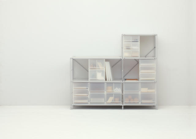
The “problems” to which Shimazaki alludes and that Muji addresses through design are large and small. Its vast array of storage boxes and units impose order to even the most unruly of apartments. On the more subtle side, some of its umbrellas have a small loop integrated into the handle. At first it seems like a formal embellishment, but it’s actually so users can tie a charm on the end identify their own much easier (and ward off someone else walking off with it by mistake).
The search for solutions to everyday challenges leads to on-the-ground research about how people live. The company regularly visits homes to see how design can lend a helping hand and then incorporates that intel into new products. One of its recent studies informed a new line of refillable dispensers for shampoo, soap, and lotion. Researchers visited many homes and found that messy bathrooms were the norm.
“The reasons why our bathrooms are so complicated and messy is because all of these brands want to promote their own product by making it very colorful and desirable—everyone has a priority to stand out.” Shimazaki says about the visual clutter from packaging. “[The refillable dispensers] are the complete opposite, they make the room neater.”

No Flash, Just Function
Today, obsolescence is all but guaranteed—and expected. We’re accustomed to upgrading to a new phone every year or buying clothes seasonally. Many of Muji’s products look simple, its not for style; it’s so they endure the test of time.
“Our design is very basic,” Shimazaki says. “Nothing stands out so you can continue to add to your home.”
At lecture in San Francisco, Naoto Fukasawa, a revered industrial designer and former design director at Muji said the following about the brand.
The keyword is “Muji is enough” . . . Muji always indicates what’s appropriate to fit our everyday life. That’s very important. We have to think about the “appropriateness,” the “fit-ness.”
He went on to outline other key phrases about the brand, that it’s Muji embodies products that are just the right size, made from just the right material, that are compact, and that reflect richness in having the bare minimum.
Take the storage boxes. They come in a number of sizes and materials, but can be nested, and combined in myriad ways because they’re based on the same module. “Every product can stack together in a [proportionally]perfect shape,” she says. Moreover, you can be assured that the bins you buy today will fit with the ones you bought five years ago—the module will never change.
Muji favors unfinished or natural materials—like rattan, linen, unbleached cotton, bare metal—and subdued colors. This limits the amount of processing on a single item, like painting or dyeing, because it reduces manufacturing costs, which transfers straight to the retail price—it’s not about a new back to basics trend, it’s about the bottom line. Muji views its products as daily essentials and for that to take hold with consumers, the items must be affordable. “To provide this level of price we remove the frills and color,” she says.
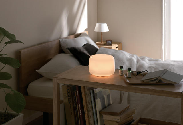
Pared-back designs are part and parcel with an international company. Each of the products must be intuitive and easy to figure out regardless of what language the user speaks. Muji’s international bestseller is an aromatherapy scent diffuser engineered to calm nervous senses. “It’s very easy for everybody around the world to understand because it involves smell,” Shimazaki says. Just open the top, place water and essential oils inside, and turn on. No complicated settings, no fussy details. “It’s very universal. In that sense, all Muji products are made with a worldly view, and for all ages, too.”
Muji is banking on the fact that people want to buy thoughtfully designed products that just function well and it’s working so far. At the close of 2014, Muji posted four consecutive quarters of two-digit profit growth and 12 consecutive periods of increasing revenue. “Since we don’t use logos or who say who designed it, it proves the strength is in the design and not the name of the actual product designer,” Shimazaki says.
Hurdles for Expansion
The company has faith that its products speak for themselves. And in spite of its “no brand” ethos, Muji has significant brand recognition. This summer, Muji is opening its 10th store in the United States in Palo Alto, a strategic move. “In Silicon Valley, there are many design conscious people and many people who understand the philosophy of Muji,” Shimazaki says. For a company that doesn’t advertise, proximity to customers who want and seek out these products is key to growth.
Though there are hundreds of products available in the United States, it’s only about 50% of everything that Muji manufactures. Shimazaki says that this is due in part to the limited store sizes, the cost of retail spaces, and regulations. The body fit cushion, for example, took 10 years to make it to the U.S. because of the materials used inside. Restrictions on food have limited the assortment to just a few products while Japan has thousands. And prefab houses—a potentially lucrative product in the United States—represents another product line that hasn’t crossed the Pacific. While they’re popular in Japan (Shimazaki wouldn’t disclose numbers), the housing line is difficult to expand outside of the country.
When Muji first started out, it was a reaction to a cultural phenomenon in Japan, but Shimazaki feels that the brand will continue to resonate because of its base in functional design. “Our products should be daily essentials,” she says. “Even if generations change, you’ll always need these products throughout your life.”
