It’s not enough to observe how people with disabilities use tech. They need to be in the design process.
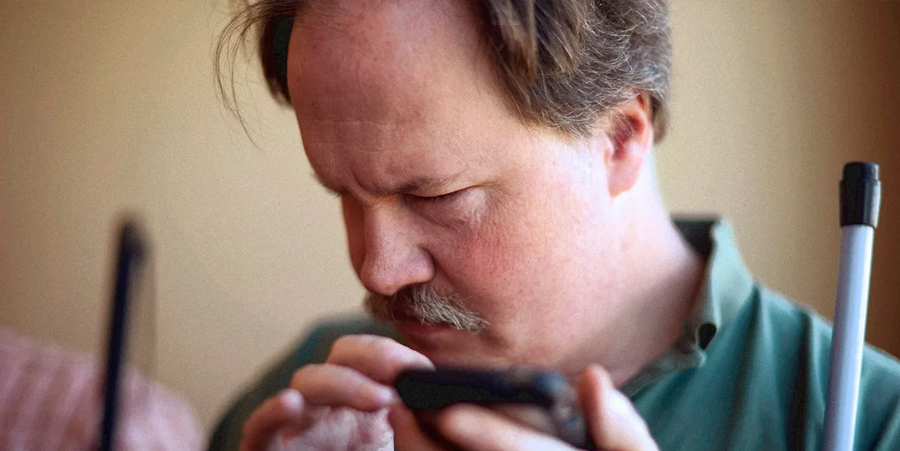
Unless you’re blind or know someone who is, you might not know that blind people use the same smartphones as sighted people. In fact, many blind people use touch-screen smartphones every day. The secret is that smartphones have a screen reader, a tool that allows blind people to use a mix of gestures and taps, along with vibrations or audio feedback, to use their apps.
Screen readers work on desktop computers as well as mobile devices. You can usually find the screen reader in settings under accessibility. On iPhones the screen reader is VoiceOver. It provides a verbal description of what’s on the screen, including buttons to click and other actions available to the user. A well-designed website or app user interface makes the information on the website or app accessible to the screen reader, which makes it accessible to blind users. However, a badly designed website or application will be rendered invisible to a screen reader.
We are researchers who focus on technology design that is usable for people with all kinds of disabilities. We’ve found that more needs to be done to make technology accessible and inclusive, such as improving design tools so they are accessible to screen reader users.
It’s not just a matter of fairness and inclusion. Accessible technology is generally better for everyone. An app or website that causes problems for a screen reader is likely to be more difficult than an accessible app or website for anyone to use because it will take more time or effort.
OBSERVING PEOPLE IS GOOD; THEIR PARTICIPATION IS BETTER
At first, user interface designers found that the best way to create accessible technology was to study how people with different disabilities used touch screens. For example, early researchers reported that blind users sometimes found locating small icons and specific numbers on the on-screen keypad difficult and time-consuming.
To solve this, accessibility researchers used the whole touch screen as an input and navigation control, similar to a game console controller. Instead of having to touch a particular part of the screen, users can tap anywhere in response to audio prompts. These insights would have been impossible to come by without including blind people in the evaluation and design of touch screens.
User interface design best practices have long included users in the design process. Including users with disabilities results in more accessible technology. Yet many technologies are still not accessible out of the box to users with disabilities.
One way to make apps and websites more accessible is to have people with disabilities designing the technologies. But the design process itself is not very accessible to those very people. Few tools in the user interface designer toolbox are themselves accessible. It’s a Catch-22.
ACCESSIBLE TECH REQUIRES ACCESSIBLE DESIGN TOOLS
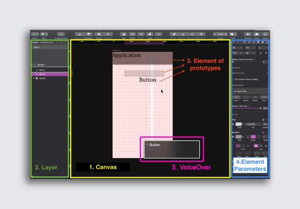
Little research has been conducted about how accessible the user interface design process is, including for blind people. Our recent research evaluated the accessibility of prototyping software, which allows user interface designers to create temporary mock-ups of user interface designs to show clients or to test with users. This software is instrumental to the field. Examples include Balsamiq, Adobe XD, and UXPin.

We found that most popular prototyping software is not compatible with screen readers. Therefore, the prototyping software is not accessible to blind designers who use screen readers.
We tested two common screen readers, VoiceOver on MacOS and Narrator on Windows, with popular prototyping software and documented when and where they provided access to the different buttons and features in the prototyping software.
Although we found some compatibility, such as screen readers identifying a button and indicating that the button could be selected, other aspects were less clear for screen reader users. For example, the prototyping software might not present information that the screen reader could pass on to the user to indicate what a given button does, like change the font size of text. Or it might not clearly allow the screen reader to focus on the button to select it, which is necessary for the user to be able to “click” the button.

Ultimately, the limited access uncovered in our research is severe enough to conclude that a blind designer would not be able to use the software to create mock-ups of their own.
A BETTER FUTURE IS ACCESSIBLE
Accessibility is an issue that touches everyone. Providing access to technology is legally required in most cases. In the past, organizations that failed to provide adequate access have faced lawsuits.
But accessibility is also a hallmark of good technology. Many technologies that people take for granted today came about when innovators designed for users with disabilities, including optical character recognition, which allows computers to read printed text.
Building accessibility into the design process is crucial. And while it is useful for designers to be aware of how users with disabilities interact with technologies, the most powerful insights may come from those with disabilities themselves. No matter how much empathy designers glean from researching user behavior and preferences, it can’t replace the benefits of having a piece of technology built by people who actually use it.
…
This article first appeared in www.fastcompany.com
Seeking to build and grow your brand using the force of consumer insight, strategic foresight, creative disruption and technology prowess? Talk to us at +971 50 6254340 or mail: engage@groupisd.com or visit www.groupisd.com/story

