The cultishly popular app maker FiftyThree releases tools for people who use visual slide decks at work–but don’t need the bloat of PowerPoint or Keynote.
Four years ago, FiftyThree—the team of ex-Microsoft creatives who launched a wildly popular iPad sketching app called Paper—was flush with venture capital and full of expansion ideas that they put into action. They started producing hardware: an iPad stylus called (unluckily) Pencil. They expanded the app to work on iPhones as a Post-it-esque idea jotter. They experimented with in-app purchases and a patronage model. They even soft-launched a whole new app called Paste, which lets Slack users pass visual materials back and forth with ease.
But all this activity had a somewhat flailing feel: What was Fiftythree’s core business? Was it about productivity software, or creative apps? Now, with a relaunch of both Paper and Paste, the company seems to have its story straight again. And that story is . . . they’re about productivity and creativity. And making great slide decks.
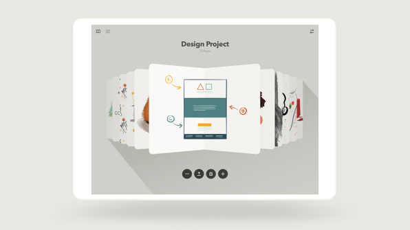
Wait, what?FiftyThree’s research showed that a large majority of Paper users were using the app for work-related design or visual problem-solving tasks (as opposed to making art or production-ready visuals), including making presentation decks. And more than 60% of those making presentations with Paper were using those decks to communicate within their own teams. “That made us ask: What’s going on with decks, why do they exist?” says FiftyThree cofounder and CEO Georg Petschnigg. “A deck is there to facilitate conversation. It’s not necessarily a lecture tool anymore. These days it probably serves best as a collaboration tool within a team.” In other words, people were using Paper to get their ideas down visually, and then using those images as slides to discuss the ideas with their coworkers.
But that presented a problem: “The presentation tools we know were all invented in the ’80s. Before the internet, before the iPhone,” Petschnigg says. “Now we’re in a very different environment. The need to keep creating and working across teams is heightened.” Paper made digital whiteboarding, diagramming, and sketching intuitive and easy, even for people who didn’t necessarily think of themselves as “visual” or “creative.” But collecting that visual material into a package to share with coworkers required exporting them into a heavy Keynote or PowerPoint file, and emailing it around. Have you ever tried to open one of those things on your phone?
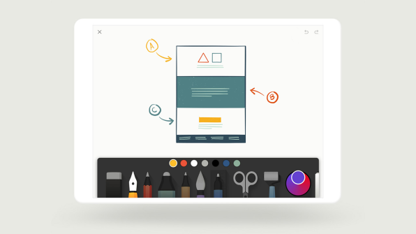
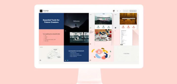
The FiftyThree-ers realized there was an unmet need in the way many of their customers were actually using Paper. “The reason people come to Paper is that they need a quiet place to visually think,” says Petschnigg. “But the question we heard from our community was, ‘Where are all these ideas going to go?’” FiftyThree’s answer: Paste, a web and iOS app that combines the online shareability of Google Slides with the team-messaging “superpowers” (as Petschnigg calls them) of Slack, plus the handsome, analog-feeling, mobile-friendly aesthetic of Paper.“Every team has their big creative process loop, but you can really condense it down into two parts: make, and show,” says Andrew Allen, FiftyThree’s cofounder and head of design. Paper is for making, and Paste is for showing: the place where ideas ultimately have to go. Since so much of today’s “showing” work happens in Slack, Paste is designed to integrate with the messaging channels and threads that coworkers are already using to communicate. The basic workflow: Draw things in Paper and then drag them into Paste (both apps have been rewritten to take advantage of the iPad’s “Split View”), which auto-imports the material into a clean, mobile-optimized, storyboard-like grid that’s already connected to Slack.
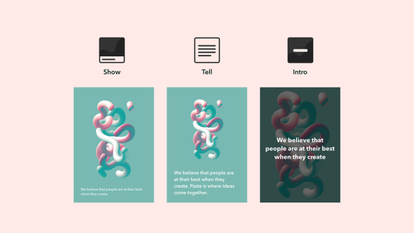
From there, Paste works like a lightweight version of PowerPoint or Keynote: You can add text, pull in other images and video (including animated GIFs), and reorder slides. But since Paste lives on the web, you can also copy a raw URL into it and Paste will autoformat the content from the corresponding web page into a slide. This “living deck” capability means that content from other web apps–like spreadsheets and graphs from Google Sheets, or visual designs from Figma–can actually be edited on the fly, with the changes showing up in Paste. And slides are responsively formatted, so that viewing them on a phone or a laptop preserves the spirit of the slide’s purpose (there are only three “semantic layout” options: “intro,” “show,” and “tell”) without “locking you into a 16 x 9 or 4 x 3 aspect ratio” that may not translate across devices, Allen says.

“We take the idea of the living deck literally: There’s no distinction between presentation and editing mode,” says Petschnigg. Slides can be assigned to certain Slack members or channels; Slack comments are also piped into Paste (and vice versa), so you don’t have to leave the app to start conversing about the contents of a deck. “Messaging is like a room with chairs where people talk, and Paste is the table where people share the artifacts,” Petschnigg adds.
With Paste taking over the team-focused features that had been increasingly shoehorned into later versions of Paper, FiftyThree decided to bring the latter app back to basics. The unapologetically skeuomorphic “sketchbook” interface metaphor that made the original version of Paper so inviting–you can literally flip through drawings as if they’re in a virtual Moleskine notebook–has been restored. (You can also blow the pages out into a more “corporate” grid view, if that’s your style.) Text notes created in Paper can now be lifted up and stuck, Post-it style, onto other sketchbook pages.
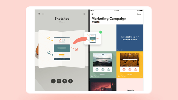
The paired relaunch of Paper and Paste also brings a new subscription-based business model. (Paper will continue to have a free version, full-featured but lacking certain “Pro” subscription add-ons like unlimited color swatches and the ability to cut and paste between sketchbook pages.) “You’ll be hard-pressed to point to productivity-type software companies that survive with one-off app sales,” says Allen. “It’s different from an emoji app. You’re trying to build a long-term relationship with people.”FiftyThree doesn’t necessarily see the Paper-plus-Paste combo as a PowerPoint killer. (Petschnigg actually helped ship tools in versions of PowerPoint during his time at Microsoft.) Instead, the company sees it as fulfilling a need that PowerPoint and Keynote needn’t be in the business of in the first place. “If a unique piece of graphic design is your deliverable, or you’re doing a TED Talk, you’re moving into a more theatrical performance–and that’s not what Paste is for,” says Petschnigg. “It’s for everything that happens before that, where the rate of iteration is high and the objective is to develop the best story–not to deliver the story.”
–
This article first appeared in www.fastcodesign.com
Seeking to build and grow your brand using the force of consumer insight, strategic foresight, creative disruption and technology prowess? Talk to us at +9714 3867728 or mail: info@groupisd.com or visit www.groupisd.com

![Paste [Image: courtesy FiftyThree]](https://images.fastcompany.net/image/upload/w_562)