After years of lawsuits and a major corporate restructuring, the company turned to the designers at Lippincott for help.
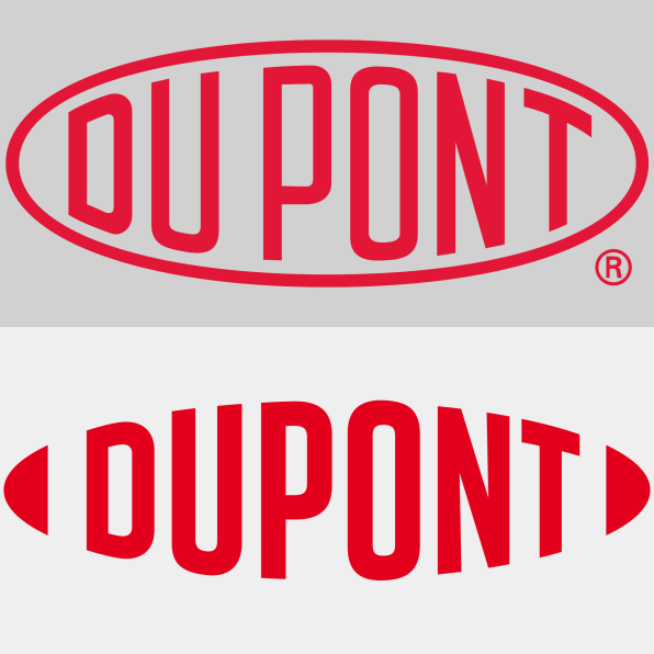
DuPont is an important company that’s impossible to love. A new logo and identity system designed by global branding firm Lippincott aims to help, redesigning the company’s machined logo from 1909 into a curvier–and perhaps more likable–mark that recalls a football, fish, or mouth, depending on how you look at it. “It’s a very familiar shape that’s also welcoming,” says Brendán Murphy, senior partner at Lippincott.
And DuPont needs to be more welcoming. The company, which merged with Dow in 2017, is known for bringing the world bullet-stopping Kevlar and HIV-thwarting Tyvek, but it’s also been embroiled in 14 yearsof controversy since 2004, when it emerged that the company knew about carcinogens in its popular material Teflon for decades, along with Dow’s continued production of a pesticide deemed unsafe for children by the American Academy of Pediatrics. In 2017 it paid $671 million to settle 3,550 lawsuits over the toxic chemical C-8 in Teflon. Following the legal and social backlash, the mega company DowDuPont announced its split into three separate companies last February–one chemical company for its agriculture line known as Corteva Agriscience, a second chemical and material sciences company known as Dow, and a third, product-innovations arm that owns Tyvek and Kevlar, that gets to keep the namesake, DuPont. (A fourth company called Chemours, which spun out of Dupont in 2015, now owns and produces Teflon itself.)
“[We wanted] to signal this transformation of the company into something very different than perhaps what people remember us for than in the past,” says Barbara Pandos, chief communications officer, Specialty Products Division of DowDuPont.

After over 100 years of the same logo, it was time for a rebrand anyway. But exactly how much to update the century-old logo wasn’t entirely clear. With Lippincott, the company began examining a wide range of rebranding options, from not updating at all to radically transforming the look of the company.
“Recently, we did a survey, and most corporations are changing their branding roughly every seven years. They have a seven-year itch. Companies like Uber are changing even more often. A lot of the startups, as they go from newborn to adolescent to adults are really trying to find a way, and they often try to find a way through logo changes,” says Murphy. “It’s a different situation for an established brand. We have equity in the market. The challenge with a heritage brand like this is, how do you take all that positive equity, but get people to look at it with fresh eyes?”
What Lippincott created looks somehow bolder and friendlier at the same time–my own sentiment with which Murphy fully agrees–and it retains its retro flourish through carefully spruced-up typography. The boldness stems from a thicker weight on the redrawn glyphs. The approachability comes from letterforms that made their way through three separate typographers, each of whom tried to whittle away at the industrial look by mixing up curves and thicknesses. “It’s idiosyncratic in its expression, but that’s also what makes it human,” says Murphy. By breaking up the oval shape, DuPont wants to broadcast its increased commitment to “a collaborate and open flow of ideas and innovation,” according to Pandos. And it “wanted to tell a story by taking that outer ring out,” Murphy explains.
Of course, what that commitment to open ideas and innovation really means from a company responsible for a chemical that is now in the blood of 99% of people in the U.S. is anyone’s guess, leading a skeptic to see the rebranding as less DuPont turning over some new leaf, and more of a redoubled commitment to appearing more transparent while doing business as usual–albeit through a far more complicated corporate structure. When I float this perspective to Pandos, she, naturally, disagrees.
“There’s always going to be those who will gravitate to that kind of rationale, but at the end of the day, what we’re hoping is that it will invite customers and stakeholders to learn more about who DuPont, in the future, will be,” she says. “I do think it’s true and authentic that we are transforming, and the logo reflects that as well.”
This post was updated to reflect the fact that Dupont and Dow no longer own or make Teflon.
–
This article first appeared in www.fastcompany.com
Seeking to build and grow your brand using the force of consumer insight, strategic foresight, creative disruption and technology prowess? Talk to us at +9714 3867728 or mail: info@groupisd.com or visit www.groupisd.com


