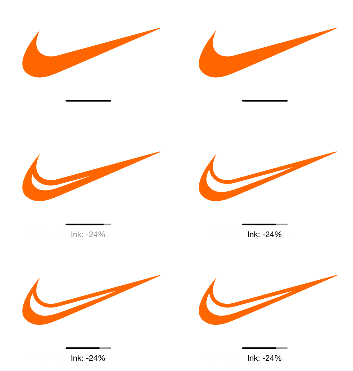
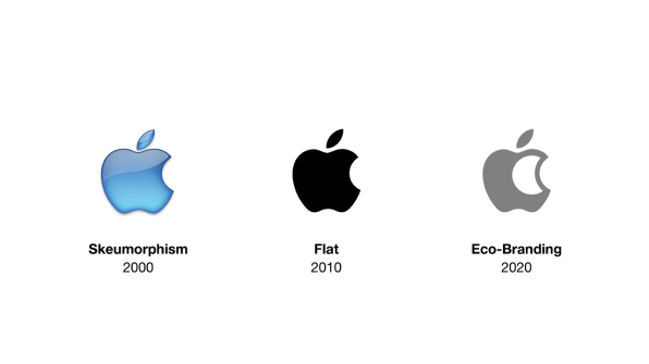
You can still recognize the apple and the swoosh, but they’re far more ecologically friendly.
If Apple sells 100 million iPhones, that’s also 100 million boxes, on which 100 million Apple logos might be printed. The smallest decisions a mega company makes can have massive impacts–even when it comes down to the ink inside a logo.
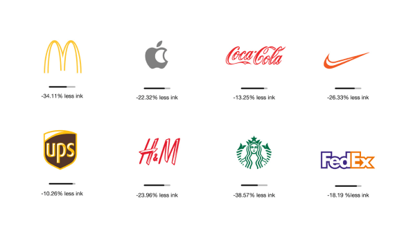
That’s why the French designer Sylvain Boyer has rethought the logos of some of the biggest companies in the world through a lens he calls “ecobranding.” In short, he’s redesigned their logos so that they use up to 40% less ink on every sign, box, and ad.

“The idea of creating a brand design that is more eco-friendly came in 2013, at the birth of my first daughter. I was designing a birth announcement card with many colors. On the computer it looked great, but when I submitted the design to the printer for silkscreen printing the bill was great too . . . greatly expensive!” says Boyer. “So I simply reduced the number of colors, which immediately became more economical but also greener.”Boyer admits that “it may seem stupid” that it took a personal project for him to realize the impact of his own work, but in the years since, he’s considered that the world’s most famous logos are printed billions of times over, and that every drop of ink costs us all something.

Spotted on BoredPanda, the corporate makeovers he has created in the four years since–not endorsed by their respective companies–are superb. Most importantly, they’re still recognizable. A Nike swoosh that’s been hollowed out uses 24% less ink, but you know it’s the swoosh. Much like the wirey McDonald’s arches still tower brightly with a third of the ink removed.“To transform a logo into an eco logo, we start from the initial shape of the logo without deforming it, but we ‘dig’ a little inside to reduce its environmental impact,” says Boyer. “There is always a creative aspect to this process. We try to have an interaction between the full and the empty space, like the Apple logo that accentuates the bitten part, or the H&M logo that accentuates its brush aspect.”
For the most part, the strategy works. The new logos don’t just advertise the company; they advertise that the company is thinking lean and green. The only logo that looks amiss is Starbucks’–the siren gets a haircut and loses her recognizability.

Could Boyer’s idea ever take off? Maybe. Parts of the market are already thinking about ink. Notably, Nike released an internal app a few years back, which measured the ecological impact of various materials and color dyes to urge its designers to think about their products in terms of, not just financial cost, but overall earth impact. Meanwhile, Amazon will ship many products in Frustration Free packaging, which replaces colorful, shelf-friendly boxes and blister packs with a minimal cardboard wrap since you already bought the thing, and don’t really need another ad for it in your home.In truth, these sorts of updates are probably a lot more important than shaving a few drops of ink off of a logo. Then again, what is a McDonald’s cup but a 12-oz. delivery system for the golden arches? What is a UPS envelope but a container that declares, “I’m UPS, not FedEx, dammit!” We waste so much that it’s easy to forget: every bit counts.
–
This article first appeared in www.fastcodesign.com
Seeking to build and grow your brand using the force of consumer insight, strategic foresight, creative disruption and technology prowess? Talk to us at +9714 3867728 or mail: info@groupisd.com or visit www.groupisd.com


![[Image: courtesy Sylvain Boyer]](https://assets.fastcompany.com/image/upload/w_707)
