The retailer wants to translate the best parts of its stores–like the friendliness of its greeters and the local preferences of its shoppers–for the web.
Amazon’s unstoppable growth has set the entire world of retail back on its heels, but at least one company has the footprint to stand in its way. With $500 billion in annual sales and 11,700 locations across the world, Walmart is still more than three times the size of Amazon in yearly revenue–and it’s not about to be left behind.
So over the past two years, Walmart has invested heavily in e-commerce. It snatched up Jet.com, Bonobos, and Modcloth to expand its online footprint into hip millennial territory, along with the delivery service Parcel to expedite its shipping. More recently, it started offering Amazon-style conveniences like free two-day shipping with no membership fees, and one-button reorder options. Such updates have enabled Walmart’s online sales to grow 50%between 2016 and 2017, but that growth is already slowing. Jet.com faltered as Walmart struggled to woo the urban market. Walmart may be the bigger retailer, but Amazon’s online revenue in 2017 was almost 10 times that of Walmart’s ($118.57 billion vs. $11.5 billion, respectively)–and Amazon is still growing at a faster rate despite this difference in scale.
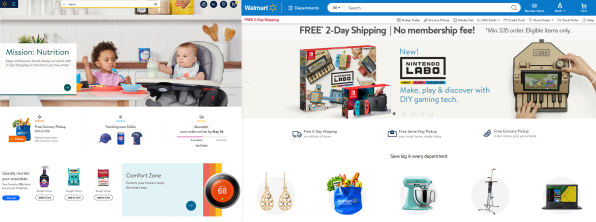
This week, Walmart is debuting a totally redesigned website–and it’s anything but an Amazon clone. Whereas Amazon feels like a digital warehouse stacked to the brim with seemingly random recommendations on its home page and an endless, searchable list of products, the new Walmart.com aims to be warm and approachable, with imagery that evokes a lifestyle brand rather than a place to just get good deals. Walmart plans to balance algorithmic recommendations with human curation. And most of all, it wants to leverage its greatest asset–those 4,700 physical stores–to take on the competition.
“Walmart.com is not just a national e-commerce retailer, but actually an extension of your local Walmart,” says Jordan Sweetnam, SVP, customer experience & product at Walmart U.S. eCommerce.
NOT ANY WALMART, BUT YOUR LOCAL WALMART
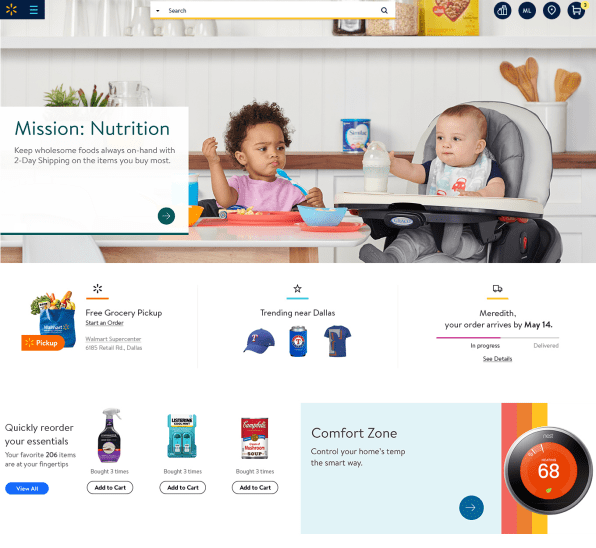
Take a look at the new Walmart home page, and three things stick out. First, it’s topped with a wide photo of people in their homes. Second, it recommends you order groceries, probably to be picked up at a local store. Third, the ratio of white space to product photos is far higher–the company has pared down the sheer number of offerings. “One school of thought is that more is better. You give a shortcut to anything you need,” says Sweetnam. “But it can be overwhelming for new customers.”
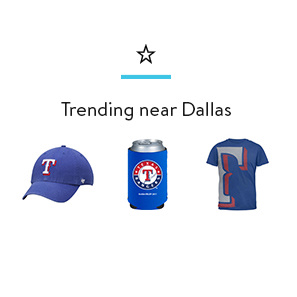
Instead of a product dump, Walmart.com is “local and personal.” The personal comes largely from the option to “Easy Reorder” recent products, and continues as you scroll into category shopping down the page. The local comes from a new trending module, which shows three products that are selling fast in physical Walmart stores near you. “You go into Walmarts across the country, and while 80% of the store is the same, there’s different inventory highlighted regionally. It’s not just a selling tactic. People are excited when they walk into their local Walmart and see [local sports items]stacked,” says Sweetnam. “When we started prototyping [the trending module], we got a really similar reaction.”
For Sweetnam, who lives in San Jose, CA, he’s seen Sharks gear as the hockey team made the playoffs and box fans as the town experiences a heat wave. Likewise, in my home town of Chicago, our first real days of spring have induced coolers, barbeques, and pink children’s bicycles to rise to the top. Some of these suggestions can actually get hyperlocal, depending on just how many Walmarts are in a town–like we see in the city of Houston, which has 33 Walmarts dotting the city rather than just a few. “It creates this connection,” says Sweetnam. “This isn’t a generic website, this is actually my Walmart.”
THE LOOK OF A LIFESTYLE BRAND (BUT DON’T CALL IT THAT)
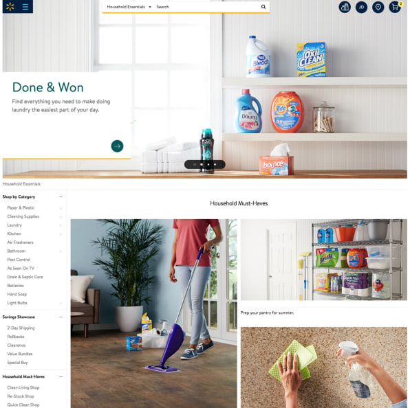
The redesigned site features photography heavily–a pointed choice that tips the scale against the kind of information density you’ll find on Amazon or other e-commerce sites. The images feel like that of a “lifestyle” brand, though the company disagrees with me on that word, insisting they’re still focused on “everyday low prices.” But on the new site, even Walmart mainstays like Tide and Swiffer Wet Jets are photographed in situ, as if they’re the stars of a perfectly orderly home.
Contrast this to Amazon, which lists products shot (or Photoshopped) in front of soulless white backdrops. Walmart.com may be going for deal shoppers, but its vibe is borderline aspirational.
“The imagery is very different. It’s much more focused on the human elements . . . showing real-life products in use and in context,” confirms Sweetnam. “In our customer testing, it draws people in more. It’s less like you’re being sold a product, and more like, ‘I also have a kid in a highchair and see cereal thrown on the ground!’”
As Sweetnam puts it, this photography is meant to transform the quick chore of ordering more Cheerios or paper towels into something more akin to a “life journey.”

WALMART, CURATED
This life journey continues into new verticals, in which Walmart offers a more tailored window shopping experience for topics like furniture and, soon, fashion. Before, a search for furniture would bring you to one of those massive results pages like you get on other e-commerce sites, with a sidebar full of toggles to tailor your search. Walmart.com is meant to feel like a specialty store, with a photo-heavy mix of algorithmic recommendation and merchandiser-curated selections that mine your shopping history.
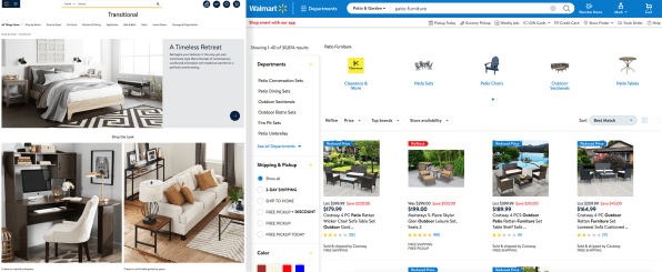
“We spent a lot of time building up the personas, [like]‘I have a family with two kids. I have a dog,” says Sweetnam. These personas were constructed by Walmart based upon your shopping history, but they weren’t all that deeply utilized by Walmart.com, which only used them to funnel you into generic lists like “back to school” or whatever else might fit that generalized portrait of you the best. Now, Walmart is using your persona to create curated product pages just for you, by allowing its own merchandisers to make the best recommendations for your persona.
“What we can get to now is, looking at differences [in shoppers], the merchants can target specific products,” says Sweetnam. “If it knows I have two kids, 8-10, and it knows it’s raining, it’s not just sharing generic rain gear. We can actually highlight rain gear for boys and girls, and a merchants can say, ‘for boys, for girls, these are the best products. The best value, the best brand, the best sellers.’
“Aggregating it up a level, if you are now looking for that midcentury modern coffee or dining table–it might say, ‘Mark, you’re looking for a dining room!’ Most people aren’t just looking for a dining table. They need chairs, lights for the kitchen, and we can tailor merchandising that speaks to that dining mission, in the style, midcentury modern.”
Walmart is rolling out its redesign this week, and it will inevitably begin collecting lots of real-world data on the updates. No doubt, things will change within the year as the design is optimized. Could Walmart, against all odds, solve some of Amazon’s worst problems, and translate the best of its brick and mortar–like the friendliness of its greeters, and local preferences of its shoppers–into an online experience? Time will tell.
“What we heard from customer feedback is, ‘it’s dangerously enticing.’ It’s kind of sucking people into these journeys of discovery [for products]they just weren’t aware we had before,” says Sweetnam. “In the stores, it’s easy. You can’t miss the home aisle in a physical store. On a website, it’s not as intuitive.”
–
This article first appeared in www.fastcodesign.com
Seeking to build and grow your brand using the force of consumer insight, strategic foresight, creative disruption and technology prowess? Talk to us at +9714 3867728 or mail: info@groupisd.com or visit www.groupisd.com

