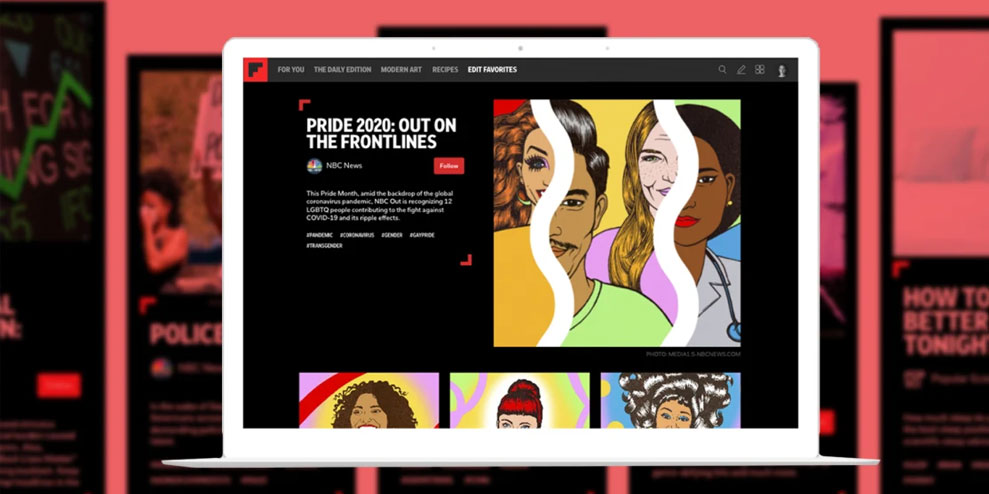
The reading app introduces a way to bundle up a few related articles into an approachable one-time package.
The internet has always excelled at abundance. Take Flipboard: You can plunk yourself down with the social reader app and just keep discovering new articles from around the web, placed before you in an endlessly-replenished stream by algorithms and the curation efforts of other users who manage their own Flipboard magazines. Even just within the technology section, there’s more material than the most voracious of readers could possibly consume.
But when Flipboard began thinking a year and a half ago about the future of curation on its platform, it concluded that abundance isn’t everything. Sometimes, the people who share stuff on Flipboard don’t want to create a magazine and update it with content indefinitely. Instead, they just want to carefully pick a few worthy items on a theme and share them at one moment in time. “We refer to it internally as finite curation versus infinite curation,” says cofounder and CEO Mike McCue.
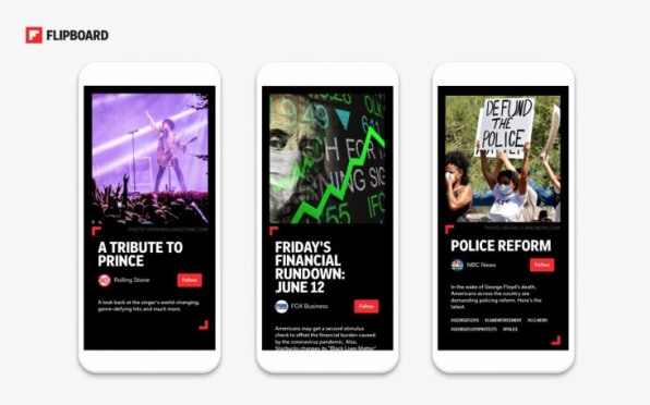
That’s the thinking that led to storyboards, a new form of Flipboard curation which the company unveiled last month. Now Flipboard is announcing Curator Pro, an upgrade to its toolset that lets you create storyboards and monitor how they’re doing with users. Some publishers have already had access to storyboard creation for awhile, including Fast Company; starting today, Flipboard is opening them up to more users, and will eventually make it available to everybody.
WINNOWING IT ALL DOWN
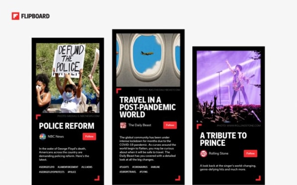
With the magazines it assembles itself, Flipboard has been investing in finite curation for years. Edited by Flipboard staffers, publications such as Daily Edition and 10 for Today offer a new collection of stories every day rather than a never-ending river. If you’ve read them in their current form, you already know what storyboards look like, with a white-on-black design that contrasts with rest of the app.
In a way, storyboards more closely parallel magazines in their dead-tree form than Flipboard’s digital magazines ever have. Print publications, after all, aren’t non-stop processions of articles: They have a start and a finish. Neither are they organized in the strictly last-in-first-out order of a Flipboard digital magazine. Instead, human beings give a lot of consideration to what comes where and how it’s packaged.
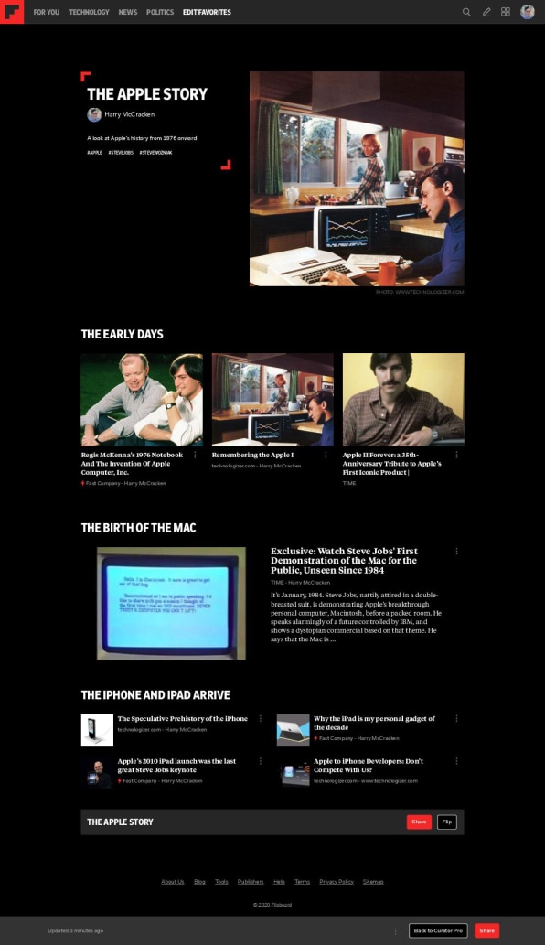
Storyboards—which, for now, you create in the web version of Flipboard—let you create similar packages. You add stories by pasting in links, and can break them down into sections with their own titles and varying layouts. The end results look a bit like a magazine table of contents or a website home page. Though storyboards are a new discrete element within Flipboard, they’re also intermingled with the app’s magazines: You can include your storyboards into your magazines, or include magazines in a storyboard. And other users can share your magazines by “flipping” them, just as they can with any piece of Flipboard content.
McCue envisions storyboards being used for thoughtful list-style assemblages of material that lives outside of Flipboard—”The five best pieces of gear to bring with you on the Appalachian trail, or the three stories you have to read to understand what’s happening with Black Lives Matter, curated by people with a perspective,” he says. Though you can go back and edit your storyboards later, they only get a big algorithmic push upon first publication, emphasizing their purpose as as a tool for once-off curation rather than ongoing feeds.
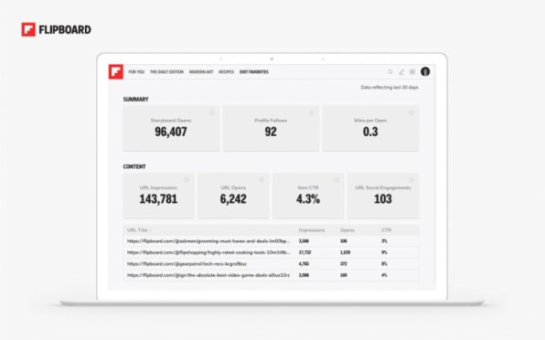
Flipboard users who create storyboards can browse analytics that show data such as how many times other users opened a storyboard, how many impressions the items it contains got, and which stories people clicked on. “The curator gets the full 360 view of how users are engaging with both their own curation, as well as the content inside,” says engineering VP Troy Brant. This new dashboard will eventually subsume Flipboard’s existing, somewhat tough-to-find analytics for magazines.Based on my own early access to the storyboards creation tool, it’s slick; I’m excited about using it, after a period when I’d slacked off on my Flipboard curation activities. But it also looks like a first pass at an ambitious idea. At the moment, you can’t move an item between sections after you’ve created it, for instance.
McCue says there’s lots more to come, including features that will allow users to publish newsletter-like editions of a storyboard, such as a weekly roundup of science stories. And beyond storyboards, Curation Pro is about an ongoing commitment to giving Flipboard’s most serious curators—be they passionate amateurs or media-company staffers—a growing portfolio of power tools. “You’ll have all sorts of ability to enhance your presence and define who you are on Flipboard as a curator,” he says. “We’re going to be building on that all through this year.”
–
This article first appeared in www.fastcompany.com
Seeking to build and grow your brand using the force of consumer insight, strategic foresight, creative disruption and technology prowess? Talk to us at +971 50 6254340 or mail: engage@groupisd.com or visit www.groupisd.com/story

