The last time Gap messed around with logos was in 2010. It presented a new logo that made the fashion retailer look something like an enterprise IT company. The internet hated it. And quickly, Gap reverted.
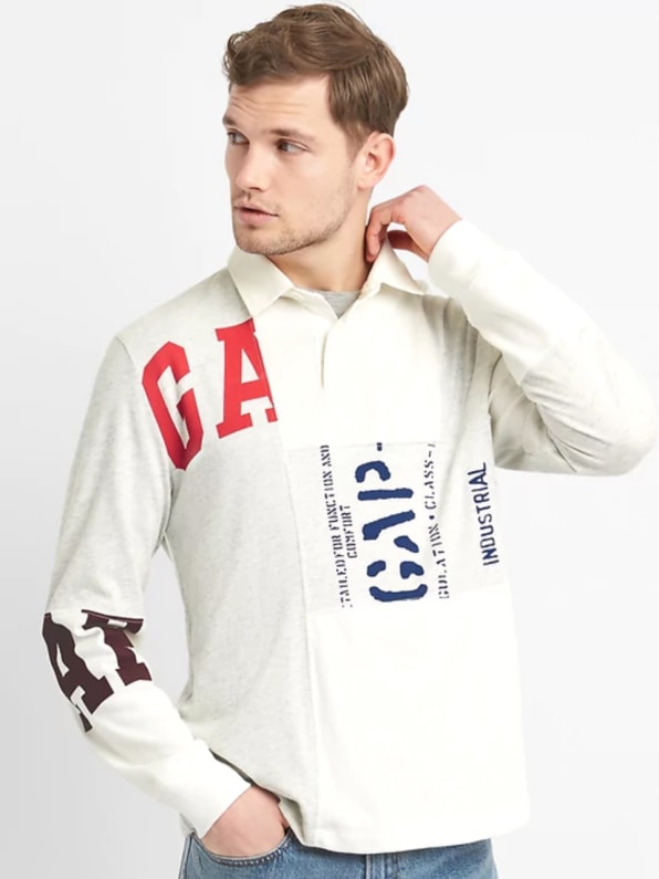
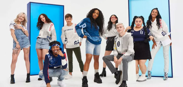
Now, the company has restarted the public conversation around its brand identity with a new line of clothing dubbed Logo Remix, which features a patchwork layout of various wordmarks Gap has used over the years. It was launched in the commercial below, highlighted by Brand New. Notably, the wordmarks don’t appear to be Gap’s official logos over the years, but various permutations of “Gap” that have appeared on its clothing. Because as we all know, Gap just loves screen-printing iterations of “established in 1969” onto blue, preshrunk cotton.

My quick two takeaways on the new spot: SZA so convincingly bad-dances that . . . she might not actually know how to dance? (Though maybe she’s just Drake-ing it.) And perhaps more importantly, rather than introducing a new logo, Gap gave us all its old brand marks, sampled together like a hip-hop beat. Why? Big logo wear is in right now, so it makes sense for Gap to sell it. But as a larger strategy for Gap, by going retro, Gap can effectively refresh its image without betting on any single decade as the most relevant–and without invoking another 2010 brand disaster.Maybe, just maybe, Gap’s creative team is slowly weening us off from that all-caps wordmark it’s used since 1986, priming us for another new brand altogether.
–
This article first appeared in www.fastcodesign.com
Seeking to build and grow your brand using the force of consumer insight, strategic foresight, creative disruption and technology prowess? Talk to us at +9714 3867728 or mail: info@groupisd.com or visit www.groupisd.com

