Over the last week we’ve seen a rash of rebranding efforts by major companies such as Burger King and Pfizer. Now, General Motors announced it too had a New Year makeover, unveiling a new logo aimed to reflect its commitment to the production and sale of electric vehicles.
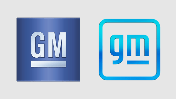
The logo takes the familiar GM in a blue box, turns the coloring to a lighter blue metal gradient, and drops the letters to lowercase, with a slight flourish of an underline in the “m” (giving off some major Y2K vibes). The company said in a statement:
The new GM logo features a color gradient of vibrant blue tones, evoking the clean skies of a zero-emissions future and the energy of the Ultium platform [GM’s EV battery system]. The rounded edges and lower-case font create a more modern, inclusive feel. The underline of the “m” connects to the previous GM logos as well as visually representing the Ultium platform. And within the negative space of the “m” is a nod to the shape of an electrical plug.
One of the most important attributes of any brand is trust. Trust in the product quality, first and foremost, but also in things such as retail experience and marketing. The symbol of that trust is the logo. Brands spend millions on creating juuuust the right logo that will represent what it is and stands for to both customers and employees. It’s a big deal!

Anyone who disagrees needs look no further than The Great Tropicana Debacle of 2009. After a disastrous rebrand, sales dropped 20%, and Tropicana quickly dumped the new look. That was five months of design work, launch planning, and $35 million in marketing spend down the drain.Which is why I’m worried about GM.
The company says it’s evolving its brand identity “as GM transforms itself to deliver on a vision that creates a world with zero crashes, zero emissions and zero congestion.” The thing is, it’s doing so with a logo that has zero history, zero trust, and, frankly, zero originality. It looks like a Bland. If I told you it was the logo for a new direct-to-consumer toothbrush brand called Good Morning!, would you believe me?
The redesign is accompanied by a new brand campaign called “Everybody In,” starring Malcolm Gladwell, pro surfer and shark attack survivor Bethany Hamilton, fitness instructor Cody Rigsby, and gamer Erin A. Simon.
It’s all . . . fine. But at a time when brands are desperate for consumers’ attention and eager to build trust equity through product innovation and marketing prowess, I don’t understand why GM is veering so wildly away from its 113-year history. The new spot talks about safety and price accessibility, two things its traditional logo evokes for so many people.
When Ford unveiled its first new lineup of Broncos in July, it leaned very heavily on the legacies of both the pioneering SUV and its parent company. It managed to cash in on decades of brand equity and trust while inspiring excitement over where it’s headed in the future.
A cynic might see this new GM look as a reflex to the popularity of Tesla, and a desire to not look old, outdated, past it. But there is a way to do that without ditching a century of history, brand trust, and innovation, while evoking a certain thirstiness for youth. It’s like your granddad in a Supreme shirt. Just . . . unnecessary.
GM has incredibly big and admirable ambitions for its future, with plans to invest $27 billion in electric and autonomous vehicles over the next five years. Now it just needs a logo to match.


