California designers Zuzana Licko, April Greiman, and Susan Kare influenced a generation of graphics.
Virtually all design today involves a computer, but in the early age of digital design, most professionals perceived these new machines skeptically–they were devices meant for the military, not creatives. Today, that’s all changed due in large part to Susan Kare, Zuzana Licko, and April Greiman–three California designers who transformed the computer from an enigmatic machine into a powerful medium.
“They were all exploiting the new potential of computer-aided graphic design but also working within its limitations,” says Justin McGuirk, curator of California: Designing Freedom, an exhibition at the Design Museum, in London, that includes the work of these three vanguards.
Kare created the first computer icons, an essential element in user interface design; Licko developed some of the first digital typefaces; Greiman was a bridge between paste-up and desktop publishing. These enterprising women embraced computers as a new language, as a medium, and as a tool. Here’s how they pushed graphic design into new territories.

SUSAN KARE: MOTHER OF ALL ICONS
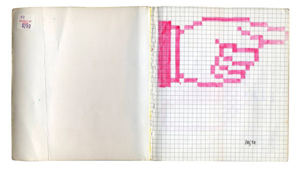
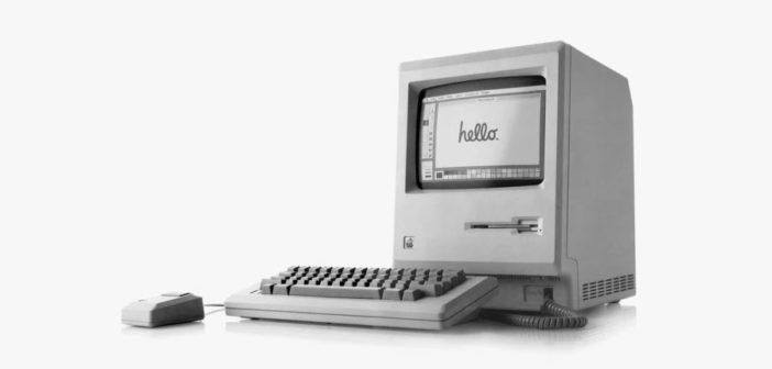
Before Susan Kare created Apple’s first icons and typefaces, computers didn’t speak to people; they spoke to programmers. Her symbols were an entirely new language and were the foundation of the Macintosh’s user interface.
When Kare joined Apple in the early ’80s, most designers balked at how rudimentary computers were since they could not replicate what designers could achieve in analog. Kare was excited by the challenge and went on to create the icons by sketching out pictograms on graph paper using a 1:1 ratio of squares to pixels.
“At a time when most designers were put off by the limitations of the computer and its inability to exactly replicate existing technology, Kare was inspired by the digital environment, working within limitations as if they were assets,” writes Brendan McGetrick in More Is Better: Making Makers in California, and essay in the exhibition’s catalog.

APRIL GREIMAN: DESKTOP PUBLISHING PIONEER
AIGA medalist April Greiman, an artist and designer based in Los Angeles, was one of the first designers to use a computer as a design tool. Throughout her career, she’s embraced technology in her work–like video–since she views print as a very limiting medium. She described her eclectic style, like the cacophonous covers of Wet magazine, as “the Swiss school on acid.”
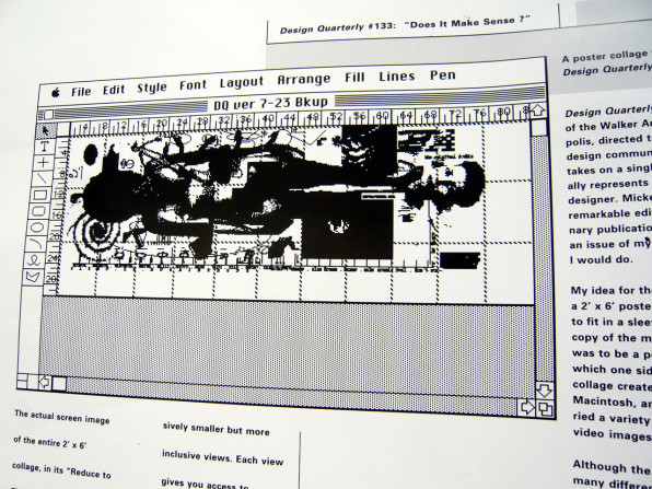
But in 1986, she created what would become one of the most iconic computer-generated images: Does It Make Sense?, a nude self portrait produced through a highly complex process.
The portrait was actually a three-foot-by-six-foot poster emblazoned with a collage of Greiman’s body, photographs, symbols, and text. She created the collage on a Mac and printed it out in segments on a dot-matrix printer. Then, she instructed the poster’s printer to assemble all of the pages, photograph the whole composition, and print the image. This work–which required a computer to create–showed the potential of the medium.
“It’s video computer graphic, because it’s video that’s run through the computer, and output on a dot-matrix printer,” Greiman said in an interview published in California: Designing Freedom. “And then offset printed. It’s a video-computer-offset-lithograph.”
ZUZANA LICKO: DIGITAL TYPOGRAPHY MAVEN
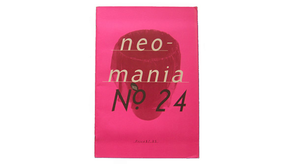
In 1984, Bay Area-based type designer Zuzana Licko and her husband, art director Rudy VanderLans, launched what would become one of the most influential magazines for graphic designers: Emigre.
They designed the publication on a Mac and experimented with layouts and type treatments that would be incredibly difficult to produce with analog methods. For example, they layered different fonts and let columns crash into one another. To achieve these visual effects, Licko designed digital typefaces using a bitmap font tool. Emigre went on to become the first digital-only type foundry.
“As former Emigre contributor Michael Dooley has observed, Brian Eno’s quip about the Velvet Underground–that only a few thousand people bought their records but every one of them went on to form a band–could apply as well to Emigre,” McGetrick writes. “The magazine that VanderLans published and art directed, and the fonts Licko developed for it, have stimulated designers to defy, and even overthrow, entrenched rules and to set new standards.”
Each in their own way, Licko, Kare, and Greiman bravely dove into uncharted territory involving digital design, embraced the computer (still an imperfect tool), and upended an entire industry in the process.
“Kare’s icons for the Mac are absolutely instrumental in the development of the user interface, but they’re still these quite crude drawings that used square paper to simulate pixels,” McGuirk tells Co.Design. “Similarly, Greiman’s early self-portrait, Does It Make Sense?, which she made on a Mac with PageMaker software, was a serious technical feat–very slow and painstaking to create, and it used to take all night to print out. Licko’s early fonts for Emigre magazine were bitmapped faces that catered to low-resolution printers. But these were the constraints of early digital aesthetics, and these designers were pioneers in digital graphics. They helped spearhead the digital publishing revolution.”
Without these women’s willingness to break with established thinking, visual communication would be very different today.
–
This article first appeared in www.fastcodesign.com
Seeking to build and grow your brand using the force of consumer insight, strategic foresight, creative disruption and technology prowess? Talk to us at +9714 3867728 or mail: info@groupisd.com or visit www.groupisd.com


![[Greiman -DS] 3 – 18 WET Magazine [Image: courtesy the Design Museum]](https://assets.fastcompany.com/image/upload/w_707)
