The rise of each new technology creates a need to depict it graphically in a way that promotes recognition and acceptance. And crypto has embraced the hexagon.
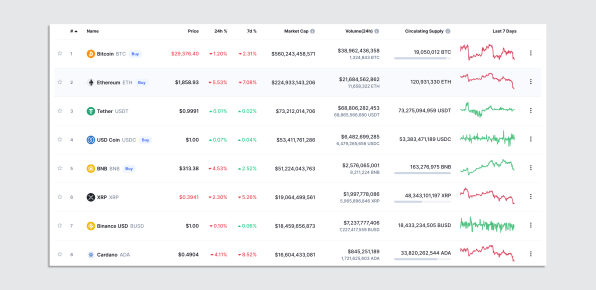
The latest crypto crash sent investors swarming price-tracking sites like Binance’s CoinMarketCap, where the value of over 10,000 crypto assets is continually updated. Notably, the listing for each cryptocurrency, from the mighty Bitcoin to the lowliest memecoin, is accompanied by its own logo.

Crypto is a field in which logos, as elemental forms of branding, have outsize importance. Much of the public is still warily trying to wrap its head around crypto. According to a recent survey by the Federal Reserve, only 12% of Americans have ever used or invested in cryptocurrency. A logo helps to put a face on an enterprise that can be intimidatingly abstract and, well, cryptic—and may even lend legitimacy to some dubious offerings.
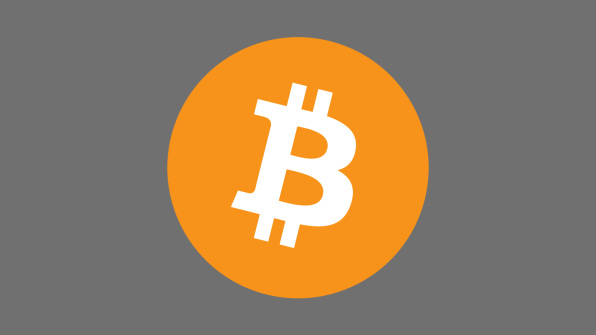
What form do these crypto logos take? One might think, given the essential newness of crypto and the B-school textbooks’ insistence that logos serve to differentiate through unique design, that they would be unlike any symbols we’d ever seen. But in fact, a common approach to the design of crypto logos is to refer back to things people are already familiar with. Bitcoin’s logo, for example, references the dollar sign, a coin, and, through its orangish hue, gold (the real sort, not the digital). What’s more, crypto marks tend to resemble one another: Of the logos for the top 500 CoinMarketCap listings recently, 13% mimicked Bitcoin by using initial letters struck through with lines or gaps, much like good old-fashioned fiat currency symbols.

These tendencies should not come as a surprise. With the rise of each new technology comes the need to depict it graphically in a way that eases public recognition and acceptance. Electric power brought a deluge of lightning bolt logos. The internet gave us dot-com logos featuring various design elements, often representing information, circling the planet. Eventually, their orbits took on a more abstract and simplified form, turning into the ubiquitous and much-derided swooshes.
Other crypto logos’ attempts to project a futuristic vibe end up, ironically, rehashing designs of the past, such as crossbarless A’s doubling as launching rockets, like those in NASA’s 1975 “worm” logotype, or letters broken apart with horizontal strokes of white space, as in ESPN’s 1985 mark. Even the old lightning bolt makes an appearance in some of these emblems, although it’s perhaps unwise to remind people of crypto’s massive electricity consumption.
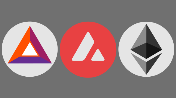
Two shapes in particular emerge as characteristic of crypto logos: Pyramids appear with some regularity, likely thanks to the influence of Ethereum, the second-banana crypto entity whose mark points enigmatically both upward and downward; apparently, the mystical appeal of the symbol and its back-of-the-dollar-bill Illuminati associations are worth the risk of graphically invoking the concept of the pyramid scheme.

But it’s the hexagon that’s the true breakout star among crypto logos, from those of Crypto.com (an abstract lion’s head; yeah, I didn’t see it at first, either) to Chainlink to UNUS SED LEO (uh, another lion). Last in vogue in the 1960’s in the emblems of chemical companies, the hexagon has seen its use in American logos nearly triple over the past decade, and it appears in over 9% of the CoinMarketCap top 500. More businesslike than a circle but hipper than a square, the hexagon can be efficiently arrayed in a honeycomb pattern that hints at the power of interconnectivity and the depth of the “hive mind.”

The hexagon’s current popularity probably stems from designers taking a stab at a simple literal depiction of crypto as an enterprise based in the blockchain: Rotate a cube, or block, to a three-quarter perspective, and you’re looking at a hexagon. In any event, Twitter’s introduction earlier this year of hexagonal profile pictures for NFT holders likely cemented the shape’s status as the de facto emblem of the crypto space.
[Animation: Fast Company]As crypto evolves, so will its logos. As in any field, these symbols will need to strike a balance between communicating familiarity and legitimacy through common and well-known design elements, and fostering distinctiveness by exploring alternative visual approaches. Given the recent shakiness in crypto, expect to see even more new ventures in the space opting for the increasingly-generic hexagons to signal familiarity and trustworthiness.
—
This article first appeared in www.fastcompany.com
Seeking to build and grow your brand using the force of consumer insight, strategic foresight, creative disruption and technology prowess? Talk to us at +971 50 6254340 or engage@groupisd.com or visit www.groupisd.com/story


