FOR THE GUY WHO TURNED JORGE LUIS BORGES’S “LIBRARY OF BABEL” INTO A WEB APP, THIS ISN’T AN IDLE QUESTION.
Somewhere in the universe, there is a shelf of neatly organized books with titles made of nonsense. One of these books contains 410 pages of uncapitalized English words strung together in no intelligible order. On page 26 of this particular book, about halfway down, bookended between “holons” and “linkman“, is a 26-word couplet that my 4-year-old daughter will attempt to recite in her preschool’s Christmas pageant. Somewhere else, on a different shelf, is another book: this one contains a precise transcription, down to the syllable, of how my daughter will adorably mangle those 26 words onstage when her cue arrives.
If this scenario sounds familiar, it’s because the 20th-century Argentine author Jorge Luis Borges imagined it in his mindbending short story “The Library of Babel”:
The universe (which others call the Library) is composed of an indefinite and perhaps infinite number of hexagonal galleries… The Library is total and that its shelves register all the possible combinations of the twenty-odd orthographical symbols (a number which, though extremely vast, is not infinite): Everything… the true story of your death, the translation of every book in all languages, the interpolations of every book in all books.
It’s a philosophically dizzying piece of literature. But what if it were real—what if someone designed a digital product that faithfully replicates Borges’s Library?

Novelist Jonathan Basile did just that. When I wrote “somewhere in the universe,” I meant it literally: Basile’s version of the Library actually exists on his home computer in Brooklyn, New York. Other publications have noted the impressive programming that went into realizing this project. But I was more interested in Basile’s UX thinking. If good design is all about embracing constraints, what are the constraints for the design problem of “displaying every possible book on demand”?
Others have attempted to instantiate the Library online, but Basile’s version stands out for its elegant design, from the medieval-looking illustrations of the hexagonal rooms right down to the fonts (“the texts would all have the exact same dimensions according Borges, so I knew they’d look best in monospace,” Basile says).
But Basile didn’t stop there. His Library comes complete with an onboarding experience (or “reference hex”, as he calls it), plain-English interactions (you can browse, search, or shuffle), and even a traditional “breadcrumb” navigation scheme (you can view individual pages or zoom in and out to bookshelves, walls, or rooms).
“The browse page is the anchor of the user experience. It makes the user almost feel like they’re interacting with a real library,” Basile explains. “I wanted to create a sense of physical architecture in the user’s mind by visually representing the hexagons, walls, shelves, books and pages in an internally consistent way—making it as easy as possible to see where you ‘are’ in the library. Otherwise it’d all feel very thin, or like a prank—you wouldn’t get a sense of the vastness.”

The fact that every possible permutation of text in Basile’s Library already exists creates a user experience that is intentionally opposed to everything we think we want out of digital interactivity. Searching the Library alone in the middle of the night—typing in, say, sentences from my deceased father’s journal, the GPS coordinates of my childhood home, or the birthdates of my kids—felt palpably uncanny. I literally got dizzy several times.
Basile can relate. “I hoped that working on this project would lead me to be very confused about existence and nonexistence,” he says, without an iota of irony. The same is true for his user feedback. “I heard from one person who said that I’ve destroyed humanity and wondered why should anybody ever bother to make or do anything ever again,” he admits. “I tried to reassure him…I hope he’s rediscovering purpose in his existence.”
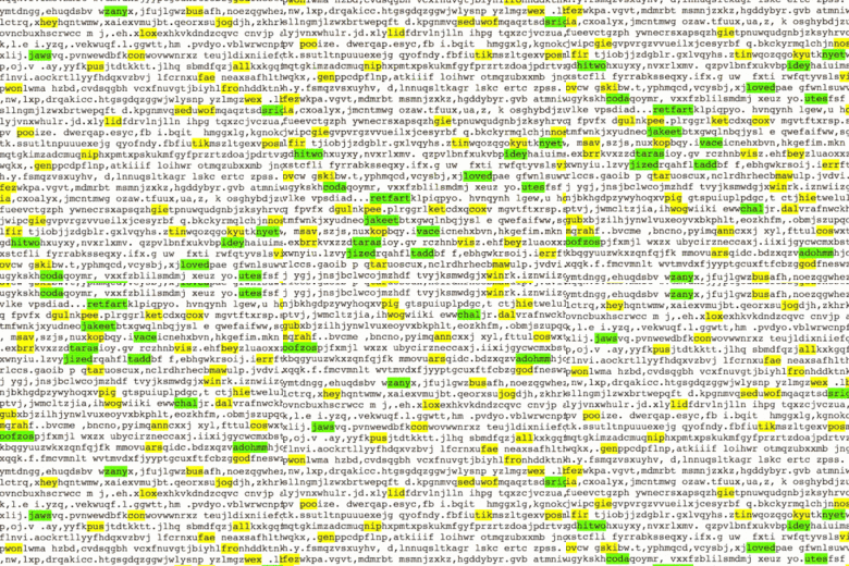
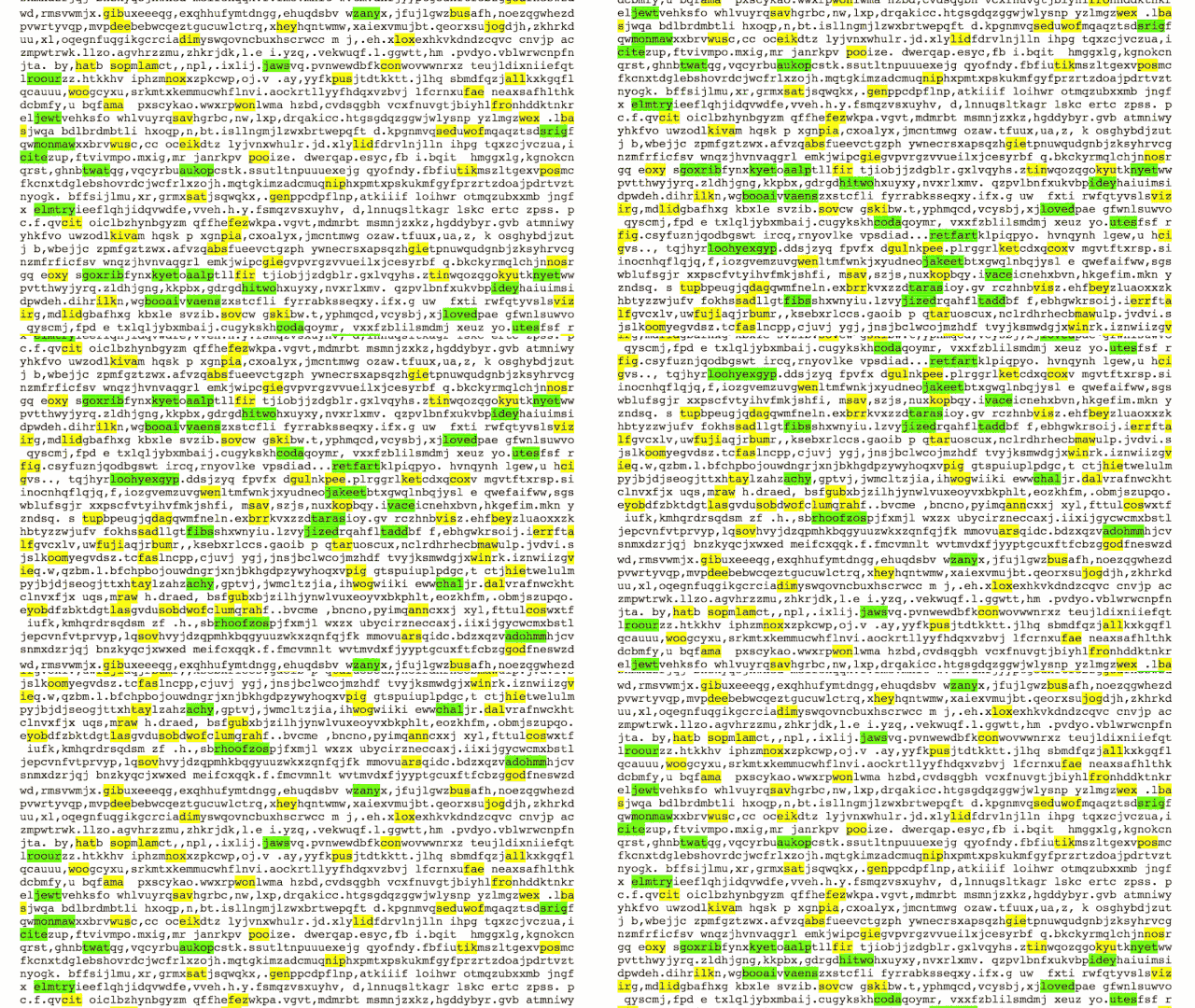
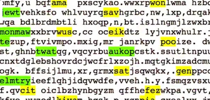
If you can stay under the Library’s spell long enough for the Sartrean nausea to subside, something richer than mere “delight” begins to emerge from Basile’s UX design. “In addition to this initial reaction of ‘staring into the abyss’ that I hear about, there’s also a playful feeling that a lot of people get too,” he says. His Library provides lighthearted analysis tools that let users toy with the Library’s galaxies of gibberish. For example, an “Anglishize” function highlights any real words that happen to emerge in the reams of noise. Using it feels a bit like peering into a Hubble Ultra Deep Field image of the English language. (For instance: Did you know “booai” is a Scrabble-legal word? Me either. Thanks, Library of Babel!)
According to Basile, this kind of user-experiential ouroboros—in which dread and delight feed backwards and forwards on each other—pays homage to Borges’s own literary style. “It’s kind of bleak and dark, but it has a wonderful sense of humor and is very open about infinity in a way that can be very liberating if you’re willing to laugh with him, rather than just be terrified,” Basile says. I agree. The source code to a better version of Basile’s design already certainly exists within the Library’s own confines—but as far as I’m concerned, there’s no need to go searching for it.

