When it comes to optimizing your site for organic clicks, just how much time do you need to create a visual identity and align your content strategy?
What is visual identity?
A visual identity is a collection of graphic elements that represent and differentiate a brand.
It can be a logo, a tiny element of a logo, a color palette, a unique font – or any combination of all of these visual branding elements that make a brand recognizable.
Creating a recognizable visual identity used to be a prerogative of big brands with huge budgets. Thanks to digital channels (social media, video, etc.), a visual identity is something every brand can and should have because it helps your past customers recognize you and become your returning customers.
Creating a consistent and cohesive visual identity is key to cross-channel marketing. People traveling from channel to channel and seeing your brand everywhere will finally start recognizing you and with recognition comes more trust and engagement.
How is visual identity reflected in organic search?
Historically, Google has loved brands because they are easy to understand and map together (hence the Knowledge Graph is based on entities, i.e. brands).
A few years ago, Google started featuring brands visually in SERPs too. So now brands can actually build recognizability through organic search results.
Let’s look at just one example.
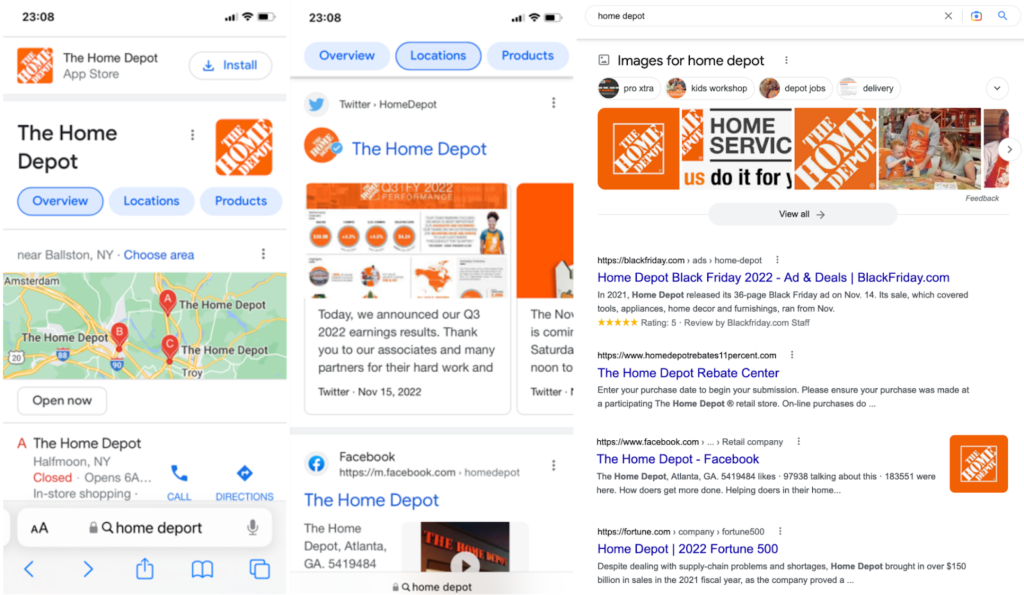
Let’s search for a brand name first: Notice how many images show up in different search sections across SERPs, including:
- The knowledge panel
- Twitter carousel
- Image thumbnails
- Image carousels
- Video thumbnails, etc.

Visual elements are all over branded search results.
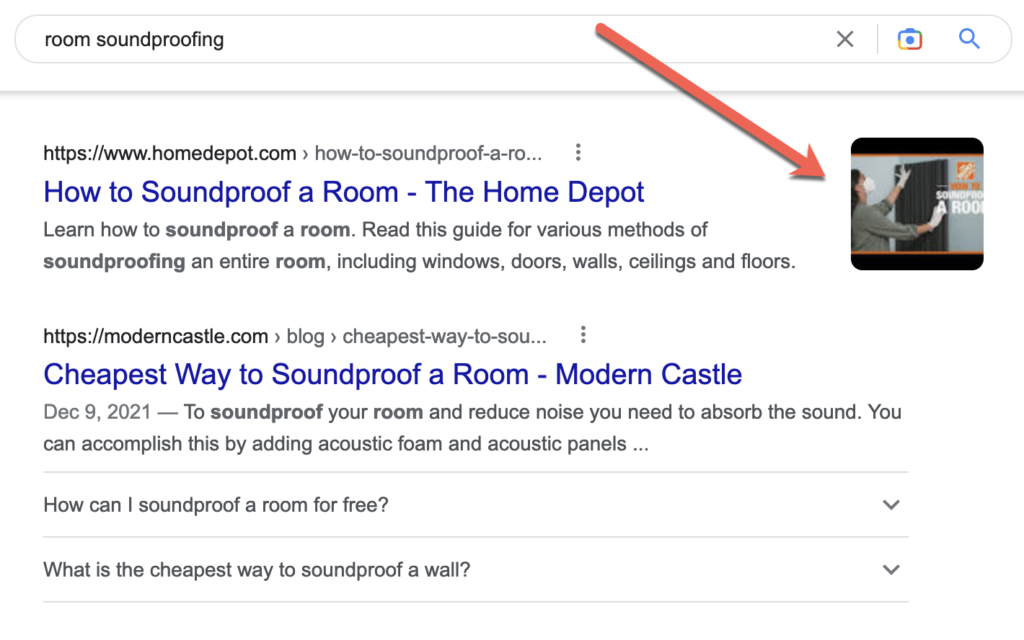
Now, searching for something informational, like [room soundproofing]brings up a well-written guide on how to do it from Hubspot, and the best part is that its search snippet includes a well-branded image:

That’s when a searcher can immediately recognize the brand’s results and click through just because it looks familiar.
How to create a consistent visual identity
The key to building a visual identity online is being active and consistent.
It doesn’t mean living on social media sites. It means using social media strategically and regularly to publicize well-branded visual messages that keep reminding your target audience of your brand.
According to Namify, it takes five to seven impressions for people to remember your brand.
This means serving your visual message to the same person at least 5 times before you start looking familiar.
How can this be achieved?
Reuse the same image across several channels
Apps like Photoleap make it extremely easy to create effective visual assets that can be used across multiple social media channels. You can use it to apply advanced effects or minor touch-ups to existing images, or use the built-in text-to-image AI engine to describe whatever visual you want to see, and then edit from there.
You can find inspiration at the brand’s Instagram account, which is filled with creative images you can create using the app:

Once you have your concept created, you can easily fit it to multiple social media channels, and even animate it, which extends your possibilities even further allowing you to use it as Reels, shorts, and even stories.
Curate your own (and your customers’) images
Monitoring your customers’ reviews and turning them into visual assets (images and videos) is a great way to control your brand sentiment under control and promote your brand’s visual identity through user-generated content.
There are many ways to approach that, and you don’t have to choose once. Try several of them before your create your own UGC-driven visual identity strategy:
- Create a unique hashtag and encourage your customers to publicize their feedback using it (then re-share to updates and stories from your own account)
- Use Highlights to keep those brand-driven stories permanent
- Embed 20-second videos on your landing pages to increase conversions
- Set up a contest to reward weekly/monthly photo submissions from customers
- Turn text reviews (from Google or Yelp) into visual quotes
- Curate multiple images and turn them into a video presentation (to publish on Youtube and Facebook)
- Monitor your competitors’ (or peers’) reviews to better understand what kind of feedback they generate and how they re-package and re-market it for better results.

Visualize all you can
You need your brand-own assets to rank for a wide variety of brand-driven and generic queries to build recognizability, one search session at a time. This includes posting visual content on Twitter (which has its own carousel section in SERPs) and Facebook (that is usually granted visually rich snippets).
Make sure you stick to your brand-driven color palette for every asset you create (see the orange SERP example above), play with your logo elements, and add watermarks inside your videos.
Consider (but not limit yourself to) a few ideas below:
- Create original images for every article you publish (and then re-use those images on social media when sharing your link)
- Use image optimization tactics to ensure your images rank in organic search results. There are SEO plugins that make this step easier.
- Embed videos on your landing pages to generate video-rich snippets in organic SERPs
- Create infographics to visualize how-to guides or make steps easier to follow. There are quite a few data visualization plugins to make this easier.
- Use illustrations: A brand illustration system is a collection of images with a cohesive mood and style that visualizes a brand’s promise
Use retargeting
Retargeting is a great way to reach people who are already familiar with your visual identity, and so they will respond better to your ads. Google offers dynamic remarketing ads within its display network. Facebook is another great retargeting platform that makes it easy to reach your past site visitors and let them continue their buying journey from where they left it.
Conclusion
Building a recognizable visual identity takes time and effort but it is well worth it because a recognizable brand brings higher conversions and more sales. Keep your visual identity in mind when planning your content and visual marketing strategy and you’re halfway there! All you need now is time and consistency. Good luck!

30-second summary:
- 2022 saw nine confirmed updates (including two core updates,) five unconfirmed instances where volatility was observed in page rankings, and one data outage that caused chaos for 48 hours
- Video and commerce sites were the biggest winners in the May core update, while reference and news sites lost out most, especially outlets without industry specificity
- This theme largely continued and saw ripple effects from the helpful content update
- What were these ebbs and flows, who won, who lost? Let’s find out!
- Joe Dawson takes us through another round-up post that gives you the complete picture of Google’s moves
ENDS
—
This article first appeared https://www.searchenginewatch.com
Seeking to build and grow your brand using the force of consumer insight, strategic foresight, creative disruption and technology prowess? Talk to us at +971 50 6254340 or engage@groupisd.com or visit www.groupisd.com/story


