Samsung tapped the design powerhouse to overhaul the S8’s interface and establish a cohesive design language.
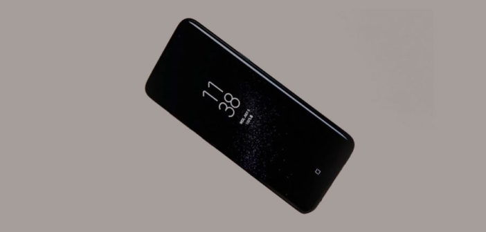
Samsung isn’t known for its UI design, but the company is now trying to change that, and boost its brand, with a signature interface style that debuted on its new S8 phone. To design it, Samsung called in the heavyweights: the New York-based design firm Pentagram. The firm worked closely with Samsung’s own UX Group 1 within its UX Innovation Team to not only design the overall interface, but establish a design language that Samsung could use in other products.
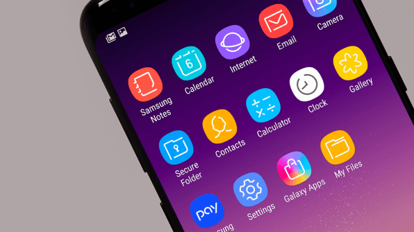
While Samsung phones typically rely on standard Android UI, the company wanted to differentiate itself with its interface for the S8 as a way of strengthening its overall brand. In comparison to the chunky, colorful design of Android, the S8’s interface is sleeker and more abstract–part of the company’s efforts to make the phone look elegant and timeless.
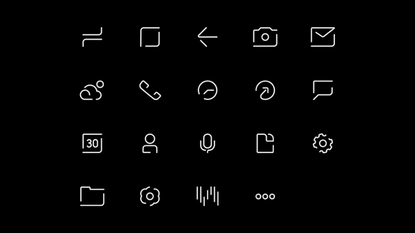
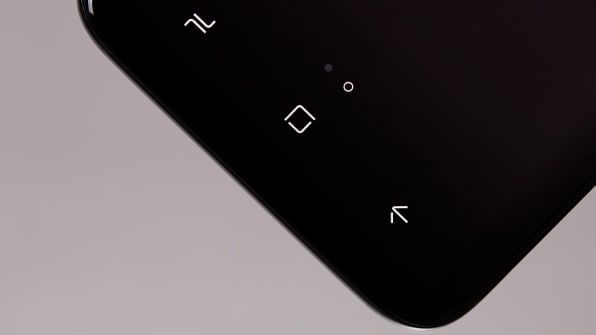
To satisfy this brief, Pentagram partner Eddie Opara and his team took inspiration from the phone’s widely admired industrial design. The S8 has been lauded in particular for its large screen that curves around the edges of the phone. Opara’s central design concept, which he calls “Light and Line,” comes from these curved edges. He applied it to every icon by focusing on how the curves of any given shape interact with straight lines–a nod to the phone’s rounded edges.
Each icon, from the camera to the weather app to the voice recorder, is heavily abstracted–unlike the circular bubble icons of Android or the curved boxes of Apple. Opara used the same open, abstracted approach for the interface’s custom typeface, which is heavily featured across the system alongside other typefaces. From there, Pentagram created a set of design guidelines that Samsung could use for other products and interfaces in the future. Unlike the “plethora of pages” that “other companies” use for their phone interfaces, Opara limited his to 12 pages.
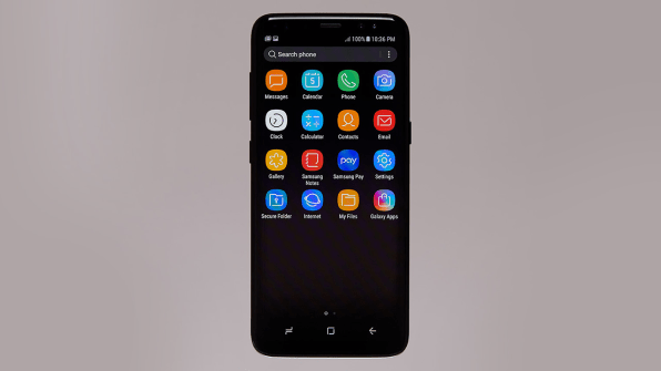
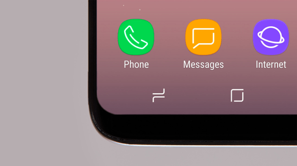
The biggest challenge for Opara and his team, who had never worked on a phone interface before? “It’s everybody in the world,” Opara says, pointing to Samsung’s continued domination in market share over Apple. “How do you think about that? Large amounts of users around the world will be utilizing this phone.” This informed the straightforward, universal look of the icons, which feature less illustrative imagery, as well as the simplicity of the three ever-present icons on the bottom of the screen that replace a physical home button.
Samsung has worked with many high-profile designers in recent years. Besides Pentagram, the company has worked with the graphic designer Neville Brody on a universal typeface, partnered with the French designers Ronan and Erwan Bouroullec on the Serif TV, and with Yves Behar on the Frame TV. Meanwhile, the S8’s overhauled interface design seems to have done its job. Even on the heels of the exploding Note 7 debacle, Samsung sold 20 million phones in quarter two, and analysts expect it will sell 93 million phones by the end of 2017. But it still has a ways to go to beat Apple–in quarter two, the company sold 50.8 million iPhones.
–
This article first appeared in www.fastcodesign.com
Seeking to build and grow your brand using the force of consumer insight, strategic foresight, creative disruption and technology prowess? Talk to us at +9714 3867728 or mail: info@groupisd.com or visit www.groupisd.com

![[Photo: courtesy Pentagram]](https://assets.fastcompany.com/image/upload/w_707)