When Hillary Clinton announced her bid for the 2016 presidential election, the Internet freaked out—mostly over her campaign logo. Rumored to be designed by Pentagram’s Michael Bierut, the logo was called everything from an ode to the hospital sign to an Easter egg revealing Clinton’s true, right-leaning agenda.
We challenged Moving Brands—a global creative agency with AAA clients like Sony, Google, HP, and Netflix—to rethink the Clinton’s approach in an impossible project. While a new brand might be built over the course of months, even years spent going back and forth with a client, we gave them just five days to remake Clinton’s brand in a small-team design sprint between their London and San Francisco offices. Despite the constraints, they managed to create an evocative conversation piece—a political campaign without a logo—that offers a fascinating peek into the branding process.
Step One: Get To Know Your Client
To get started, Moving Brands brought together a few designers, a copywriter, a brand and communications expert, and a project manager. They were supported by whomever else was available each day.
Usually, the agency’s designers would meet with a client to get a deep, nuanced perspective on their work. They’d have several conversations with various members of the company, conduct interviews, and hold workshops. That would inform everything to come.
“The biggest difference was that we didn’t have any client input nor feedback so we have to really research and study what Hillary has been saying publicly and read various articles to understand her story,” explains creative director Aki Shelton. “We love collaborating with our clients and most of the time, many of the answers are in our conversation with them—we’re just there to help identify and define them.”
Step Two: Research and Form A Point Of View
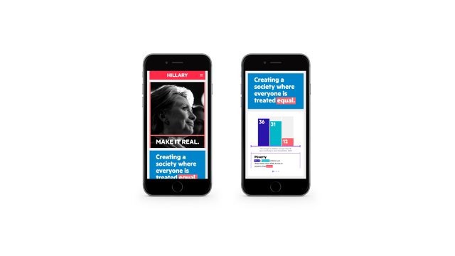
The designers ran several internal polls and interviews (and did a lot of Googling) to form what they call a “point of view,” or, in essence, what would become Clinton’s branded take on the world. This point of view encompassed everything from her views on debt, abortion, and education.
Step Three: Define The Brand Story, “Make It Real”
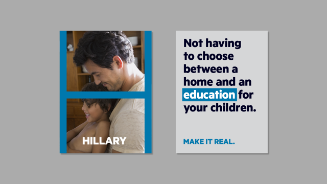
With a Hillary Clinton persona in mind, the team built the brand story. In this case, it was a first-person letter from Clinton herself. The letter proposed that we unite on the causes that we all care about, it imagined the world we would want, and it suggested that citizens come together to make that world a reality. “Make it real” became the punchline of the story—the unifying thread of the entire brand.
But is “make it real” really unique enough to be a brand, let alone help Clinton stand out?
“I would normally agree [that it’s too cliche], but we’re talking about politics, where the concept of reality is shockingly rare,” copy director Michael Meyer says. “We all have coworkers and family members with wildly different points of view on political issues, but we’re able to live, work, and talk together … the media often portrays America as completely polarized, but in our experience, that’s just not the case. Hillary is the most centrist of all of the candidates, and we believe that her brand should reflect that.”
Step Four: Decide On A Name
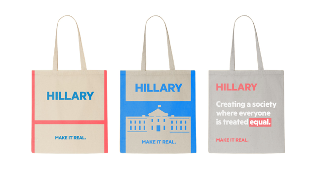
Any recognizable brand—whether it’s a company or a product—needs the right name. But in the case of Hillary Clinton, Moving Brands decided that name shouldn’t be “Hillary Clinton.” Instead, it should just be “Hillary.”
“Everyone in the studio was referring to her as Hillary, which at first seemed inconsequential until we started talking about how much of a differentiator it was. It’s a huge and rare advantage to be on a first name basis with America,” Meyer explains. “Additionally, it helps to separate her from the baggage of previous Clinton administrations. Hillary Clinton was First Lady—Hillary is the Senator/Secretary of State/Presidential Candidate. Once we got to ‘make it real,’ using her first name became a no-brainer to be more relatable, more approachable—more real.”
Steps Five and Beyond: The Visual Brand
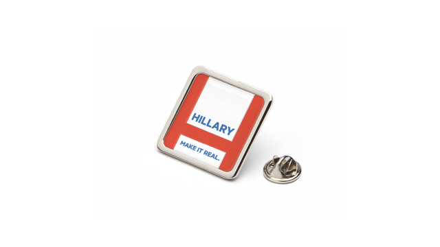
With the brand’s name and story intact, the designers turned their attention to all that visual stuff that most laypeople would call “the brand,” like the typography, imagery, colors, and, of course, the logo.
The new campaign’s boldest decision was to ditch the stereotypical red, white, and blue of the American flag, which, while traditional (in fact, the team came across some pins that FDR had used in 1932 that looked “exactly the same” as what we use today), seemed too tired for a progressive candidate. Instead, they opted for an electric red and blue—a contemporary remake halfway between an American flag and a 1980s seafoam and pink color palette.
“It was also how we [tacitly]addressed the fact that Hillary has a good chance of being the first female president,” Meyer explains. “Historically, that’s significant, but Hillary does not play the gender card. The palette is unisex, but warm and optimistic.”
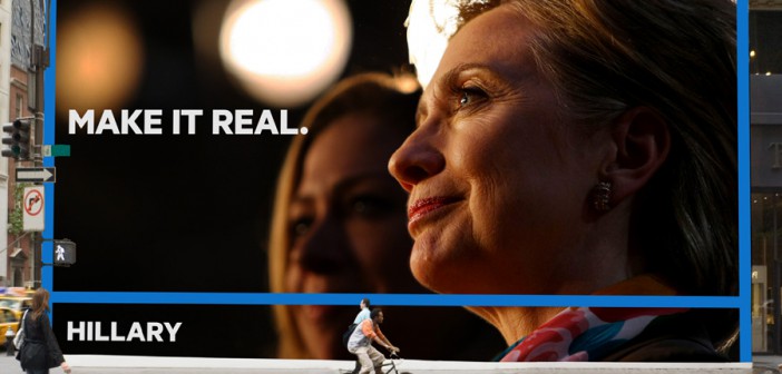
Imagery of the brand was carefully curated. Photos had to have just the right tone: “real but not gritty, posed but not preconceived.” Airbrushing, even for the 67-year-old candidate herself, wouldn’t be in line with the “make it real” tagline playing itself out in photography.
Ditching The Logo
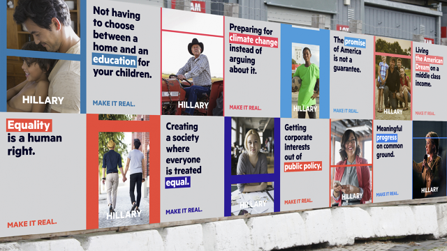
Ultimately, the team decided that the photo-driven visual branding, anchored by Hillary herself, would be more powerful than any one campaign logo.
“There’s no symbol in the world that could ever have as much equity as Hillary’s name and face. She’s an icon in her own right,” Meyer explains. “All a brand needs is a consistent visual design element that makes it instantly recognizable in any application.
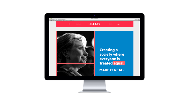
So to unify the visual brand, the team created what they call an H-Frame system. Yes, it’s built from the “H” in Hillary, and it leverages the brands electric blue and red colors to frame any images and text in the campaign.
“We didn’t want this to be called a logo. It’s not just about the one symbol to represent Hillary’s brand. We created a system and voice to represent Hillary’s brand instead,” Shelton says. “Brand is about story, aligned touch points, and how you connect with your audience. We saw all the conversations on the Internet where everyone was criticizing the existing logo (symbol), and we thought that was totally the wrong conversation. We should have asked, ‘What is her story? Why should everyone care?’ rather than, ‘Why an H and an arrow?’”

