Apparently, some people hate–really, just hate—the redesigned Gmail, which Google began rolling out today. Some hate the layout, others hate specific features, and plenty just hate change. If you’re in the hater camp, perhaps it’s time for you to recognize a truth that I’ve known for some time: That Gmail sucks, and the only good Gmail software client out there is Inbox.

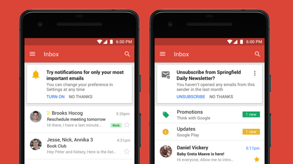
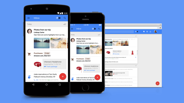
The new Gmail comes with a long list of great new features: The ability to snooze messages, perform quick actions on messages, easily preview attachments, automatically send smart replies, create new reminders and calendar events, or get nudges that remind you to follow up on what Google’s AI thinks may be important emails. I know these are great features because I’ve been using them through Google’s Inbox for years now, along with Google cards that automatically show you travel itineraries, car rentals, and other important events in a clear, impossible-to-miss way. I love all of them.

What Google has done with the new Gmail design is retrofit all of those Inbox features–along with, admittedly, some new ones like self-destructing emails and un-forwardable emails–into the Gmail interface. The company claims that it has revamped that interface to make it easier to use, yet I can only see clutter and such a density of interface elements that my left eye twitches every time I look at a screenshot. While these great features work elegantly and effectively on Inbox, they look just crammed in the new revamped Gmail interface.
So perhaps it’s time for you to leave that old user experience behind–and make your life a lot less stressful in the process. Inbox did that for me, and it may do the same for you. You can download it for Android oriOS or access it on desktop here.
–
This article first appeared in www.fastcodesign.com
Seeking to build and grow your brand using the force of consumer insight, strategic foresight, creative disruption and technology prowess? Talk to us at +9714 3867728 or mail: info@groupisd.com or visit www.groupisd.com

