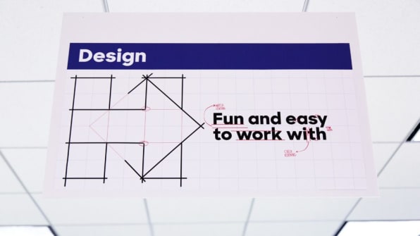
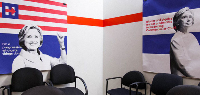
For the first time, Pentagram partner Michael Bierut tells the full story behind designing for Hillary Clinton.
After Hillary Clinton revealed her campaign logo in 2015, everyone in media, politics, and design seemed to have an opinion on it—though one designer stayed silent. In the months that followed, it became an open secret that Pentagram’s Michael Bierut had designed the logo and identity system—later confirmed by Wikileaks emails—and pieces of the branding story became known. But Bierut himself had declined to speak to the media about it.
Yesterday, he broke the silence with a lengthy essay published on his site Design Observer. The piece is fascinating for many reasons, not least of all because of the previously untold details about designing for an election with one of the most surprising outcomes in recent history. Most remarkable, however, is the candidness with which Bierut writes about how designers, too, miscalculated the reality of a divided country. It offers rare personal insight into a very public, high-stakes project, from one of the leading designers and thinkers in the field.
The essay tells the full story behind the design for the first time—from creating the logo in secrecy to an internal campaign controversy that left Bierut uncertain his identity would be used until the day Clinton announced her presidency. It details the surreal pendulum swing of public reaction to the logo, from all out bashing to eventual embrace (the first is common in the age of Twitter design commentary, the latter not so much). It also sums up nicely the design legacy of Obama’s 2008 campaign, and why in 2016 it could be built upon but not repeated—a topic frequently brought up in design community prior to the election.

Most importantly, though, it reveals where Bierut believes the branding for the Clinton campaign fell short. For him, it wasn’t in the design of the logo or the systematic execution of the branding by Jennifer Kinon and her campaign design team. Rather, it was a fundamental misunderstanding of the political climate of a country for which red trucker hats resonated more deeply than a carefully orchestrated design campaign modeled after corporate identity systems.
It’s the same miscalculation that led the most prominent political scientists and data crunchers in the country to miss the strength of the populist fervor to elect the candidate no one thought would win. Bierut’s essay looks at it through a design lens. “We had spent months developing a logo; Trump had spent years building a brand,” Bierut writes. “Had Trump won not in spite of his terrible design work, but because of it?”
Bierut points to Obama’s 2008 campaign as the first time in history that a political campaign had treated its design and marketing strategy like a corporate identity program, with a polished logo and consistent typographical system. The Clinton campaign followed suit, though Bierut and his team at Pentagram strove to make Clinton’s branding less about exuding familiarity and experience—unlike Obama, Clinton had already been in the public eye for decades—and more about being approachable. Still, Bierut and, later, Kinon executed the campaign similarly to how they would any corporate identity project at their design firms (Kinon runs Original Champions of Design). Bierut created an identity flexible enough to work across multiple platforms and for multiple coalitions, and Kinon rolled it out with precision and professionalism.
However, the way that design is distributed and consumed had changed in the intervening years since Obama’s first campaign. Images are everywhere today, and design even more democratized. Digital tools and social media give everyone a way to create and share, enforcing multiplicity. In this new reality, difference and individual ingenuity are often valued over the top-down, collective consistency of corporate identity design popularized by midcentury modernists.
This isn’t necessarily a new idea. What is new is seeing it articulated by one of the most famous corporate identity designers living today. Bierut puts it this way:
As we worked on the campaign, it never occurred to us to be anything less than perfect. (As our campaign contact Teddy Goff observed much later, to be imperfect would have been inauthentic to our detail-obsessed candidate.) During the height of the primary battle, Lindsay Ballant, a Bernie Sanders supporter, wrote a perceptive critique that compared the graphics of the two campaigns. “While Hillary’s visual campaign is inarguably successful by all traditional design principles, it’s also calculated, expected, and contrived,” Ballant wrote. “It reinforces the perception of establishment status, which is one of the main criticisms of her as a candidate. One of the consequences of a campaign so tightly controlled is the campaign feels so tightly controlled.” In contrast, the design of the Sanders campaign had the homespun charm one associates with do-it-yourself craft sites like Etsy. They looked and felt authentic. When I read this in the spring of 2016, I had to admit she was onto something.
Still, as Bierut points out, it would have been strange and disingenuous to visualize homespun, grassroots-style graphics for a candidate who has been in politics for so long and was so connected to the establishment. The objective of the design was to be a representation of Clinton. As Kinon told me in an interview before the election, “To me, craft is a mirror for our candidate and all her wonkishness . . . we are holding ourselves to the most professional standard to reflect her because we know we’re her voice.”

In that way, the branding did what it set out to do—it did mirror Clinton, her preparedness and her long-standing career in politics. The fact that Bierut feels that it wasn’t effective in reaching the people it most needed to reach also mirrors the gulf that has divided the country along geographical, economic, and cultural lines. Just as the election was a wake-up call to many, Bierut also considers it a call for designers to both rethink what has worked before, and consider design’s place in a changing world.Read Bierut’s essay in full on Design Observer.
–
Featured Photo: Celine Grouard for Fast Company
This article first appeared in www.fastcodesign.com
Seeking to build and grow your brand using the force of consumer insight, strategic foresight, creative disruption and technology prowess? Talk to us at +9714 3867728 or mail: info@groupisd.com or visit www.groupisd.com


