THE ORIGINAL MADMAN OPINES ON EVERYTHING FROM GOOGLE‘S REDESIGNED LOGO (“RIDICULOUS”) TO JOHN GALLIANO (“I WANT TO JUST PUNCH HIS FACE”).
It’s been a busy few months for the “Original Mad Man,” 84-year-old George Lois. The legendary art director released his 11th book, Lois Logos, a rapid-fire retrospective of the best logos and identity designs from his career—including the landmark campaign that introduced a then-unknown Tommy Hilfiger. His takes on more recent events, like the Trayvon Martin shooting and the Charlie Hebdo terrorist attacks, are in the book as well.
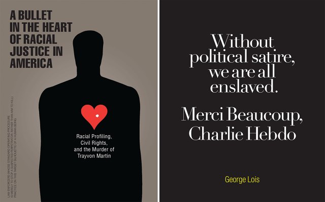
Trayvon Martin (Left); Chalrie Hebdo (Right)
This month, he unveiled branding for SOMA, a mobile app that combines free group video, voice calls, and messaging. How do you make a brand stand out in a crowded field of options? Simple. You go directly for a takedown of the established competition and at the same time place SOMA in the middle of the conversation. Lois‘ campaign is pretty straightforward, “Say no to Skype, to WhatsApp, to Viber. Say yes to SOMA.” But it’s his clever logo that makes it a success. Two nose-to-nose faces (unhappy ones for the competition) connecting and talking to each other, and from that, one happy face.

We sat down with Lois last year in a sweeping interview that touched on everything from Google‘s logo to plagiarism.
In your new book, Lois Logos, you comment on other logos with conceptual imagery. What’s the one logo that you wish you had designed?
The CBS logo. When I came back from Korea in ‘52, I had a dream job in my mind. I wanted to work for CBS television because they had just started with the CBS eye, and also Bill Golden was a terrific art director. I worked there for five years. I loved it there. It hurt me to leave there, but I wanted to change the world of advertising.
As you know, the Google logo has been recently redesigned, and they’re saying it’s not really just about a new typeface, but it’s also about its interactivity, how people interact with Google today across many different platforms. What do you think of the new logo?
To me, the character of the logo before was better with the serif. The new logo could’ve been designed by any amateur that plays with type. I think it’s ridiculous, and the explanation for it is complete bullshit.

You’re not buying the idea that they wanted to create a version that was recognizable enough from the previous logo, but was able to be adapted to different devices and different experiences?
No, it’s complete nonsense.
The designer who recently designed the Tokyo 2020 logo has been accused of plagiarizing it from a Belgian designer. What are your thoughts?
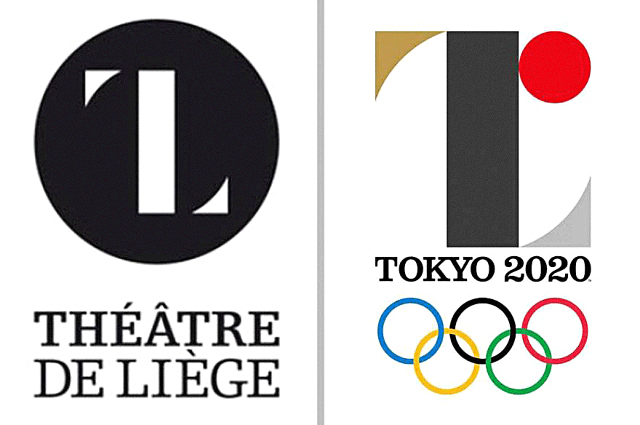
I had read about this. The designer explained himself by showing that he had a whole alphabet designed that way. If you take his word for it, he’ll say, ‘Well, I never saw the other one,’ so maybe he’s not guilty, but the point is when somebody first saw it somewhere in the world and said, ‘Oh my god, it’s like …’ they should have shelved it immediately, because it looks like an incredible rip-off.
Is this a case where everything has just been done and this is sometimes inevitable? Is this something that just sometimes happens without people knowing it?
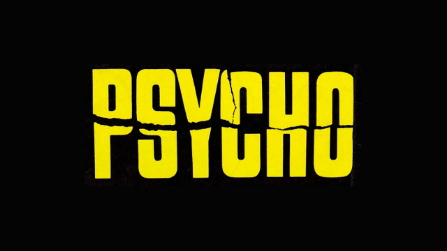
Well, this might be one of the most clear examples, because it looks really obvious. You know, Tony Palladino did the Psycho logo. And now anybody who does that kind of psychotic kind of rip, you’re going to think of the Psycho logo.
How do you know when design is inspired by something, or it’s ripping off something? It’s hard to know.
You’re talking to a guy who has had hundreds of homages to my Esquire covers. Somebody once told me I should put them together and do a book on them. I said, “Please!”
That would be good. And then you can comment on each one.
British Esquire once had 11 different fashion designers do rip offs on my covers and it went on and on. That designer, that Italian designer, the racist who shot his mouth off about—
John Galliano?
Yeah. He posed as Ali as Saint Sebastian. I want to just punch his face if I ever see him, you know what I mean? Do stupid stuff, but don’t mess with Ali, okay? (laughs)
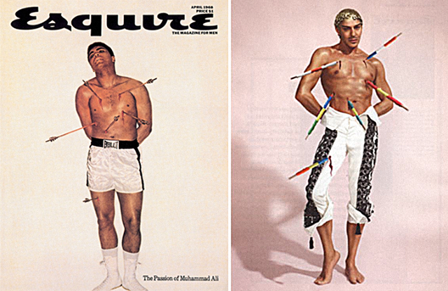
Original Ali Esquire cover and the Galliano “homage”
http://www.fastcodesign.com/3056190/legendary-ad-man-george-lois-is-still-at-it
Editor’s note: This interview was edited and condensed for clarity and readability.

