Flourishing stock. Beautiful, useful products. And plenty of room to grow. Just five years ago, the story couldn’t have been more different.
Two years ago, Bracken Darrell stood at a whiteboard and drew a tree.
As Logitech’s CEO since 2013, he sketched out a quick presentation for me that he’d probably given 1,000 times by then. His plan was this: Reimagine Logitech–one of the world’s largest hardware companies, with $2 billion in revenue–as a design-led company. Take the $100 million Logitech R&D budget–most of which was then funding new research on computer mice –and spread it across “new plants” like Bluetooth speakers and teleconferencing systems, the sorts of growing markets that Logitech could take over with its engineering background and a new focus on design.

“We originally used an analogy a lot internally, the keyboard and mouse was a big old tree,” says Darrell. “In the beginning, people said the tree was gonna die.”Indeed, in the wake of the iPhone’s growth, Logitech saw its business crumble rather than grow. Revenue dropped roughly 10% between 2009 and 2010 as the company hadn’t adequately prepared itself for a post-desktop world. So the PC peripherals company transitioned to something more like a digital lifestyle products company. And Darrell hired Alastair Curtis, the former chief designer at the beloved Finnish phone maker Nokia, to build an internal design team and helm these new products as the company’s first chief design officer in its two-decade history.
This month, Darrell gave me the same presentation, again. His cadence, uncanny. His marker work, unimproved. His messaging, undeterred. But one thing was different. While Darrell’s strategy had started to pay off in 2015, today, it’s proven to be a runaway success. As of the last fiscal year, Logitech has quadrupled its profits, and multiplied its stock value by a factor of five. Over that time, PC peripherals have shrunk from 75% of Logitech’s business to 49%, meaning its bets on mobile speakers and gaming have paid off. The company even received honorable mentions in Fast Company‘s 2017 Innovation by Design Awards–with a keyboard, no less, along with its IoT-friendly POP Smart Button.In a world where Google, Microsoft, and Apple all champion their success to the fact that their products all speak a single design language, Logitech pulled off the turnaround by focusing less on a design language than an important design law: that every product out of Logitech needed to have a big idea behind it, and everything else would follow. And for Logitech, a company that makes just about every type of diverse digital product you might want, it’s proven to be an indispensible strategy.
THE REBUILDING YEAR
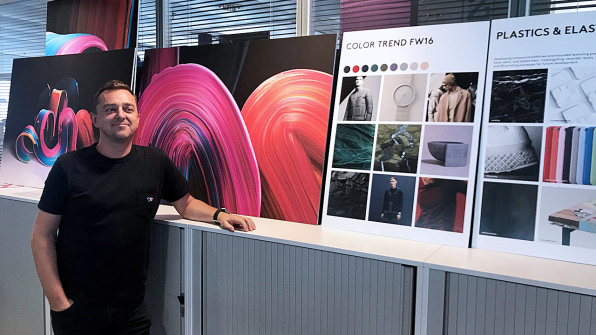
After what Darrell calls a “long courting process,” he convinced Curtis to sign on with the company in 2013. Almost 20 years earlier, Curtis led the vision of the watershed Nokia 3210, which sold over 150 million units and singlehandedly shifted the cell phone from a piece of technology to a fetching accessory like a Walkman. Logitech was notorious for releasing new products simply to release them, designing products to price points rather than consumer needs or tastes. Curtis’s job was essentially to inject a design sensibility into a company renowned for $15 dishwater-gray mice.

Together, Darrell and Curtis drafted a new take on Dieter Rams’s 10 principles of good design. Rams, of course, is a name synonymous with good design. His sensibilities informed the best industrial designers in the world, including Jony Ive and other designers at Apple.Creating their own rules of design wasn’t a move of arrogance, the company insists–Darrell keeps Rams’s list on a wall in his office to this day–but it was a way for Logitech to shore in what its unique take on design should be, to build a point of view the company could use as it staffed its design teams up to handle more of the process in-house, rather than hiring out.
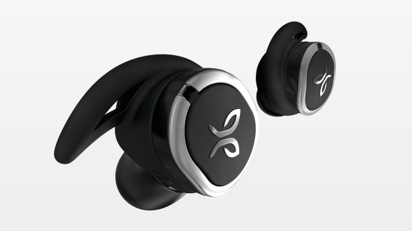
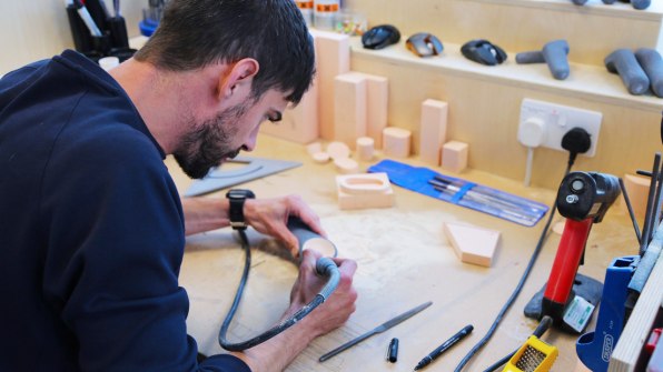
Over the next few years, Logitech recruited design talent from prominent American design firms, like Ammunition, Ideo, and Fuseproject, and large companies like Samsung, LG, and Nike. The design team expanded its headcount from half a dozen to over 100, spread across its headquarters in Lausanne, Switzerland, and Newark, California. In this churn, brand identity could be lost as easily as it was built. And to complicate matters, Logitech acquired several new companies with vastly different aesthetics, including gaming gear company Astro and high-end audio company Jaybird.But it was this list that Curtis used to unite his own teams, and to consider old products and new:
The 5 Design Principles of Logitech
- One Powerful Idea: clarity of purpose and the benefit to the consumer
- Soul: unique personality of the product/experience
- Effortless: relentless pursuit of creating friction-free experiences
- Crafted: simplifying, perfecting, and stripping down to the essential
- Magical: interactions that are alive and expressive
“Irrespective if it’s Astro, Jaybird, or Logitech, we’re still managing to keep these high-level design principles,” says Curtis. “The nuances of how you use those is unique to each brand, but it allows us to keep core high-level DNA irrespective of new brands that might enter the portfolio.”
REPLACING MARKETING WITH DESIGN
Of all of Logitech’s 10 principles of design, one stands out among the rest. “Our most important design principle is “one powerful idea.” If there’s not a powerful idea we’re designing around, then we’re designing to a price point or spec, and we’re trying to avoid that,” says Curtis. “We want to create meaningful products with a real sense of purpose.”
A sense of purpose doesn’t just give a product a problem to solve, it gives a product a market to sell to. It ensures that Logitech isn’t just designing for a use case but an audience. And it gives Logitech a way to marry design and marketing in a way that few companies can. The company’s Spotlight presenter doesn’t just offer a way to give PowerPoints, it’s designed to eliminate the fear of public speaking. Its K780 keyboard doesn’t just make it easy to type on a computer, it connects to a computer, any phone, or a tablet with the push of a button. Just explaining what the product is becomes a mini, self-explanatory commercial.
“When I think of designing a room, if you have a room that is extremely minimalist and beautifully designed, it’s harmonious and comfortable, it feels good, a wonderful place to stay. What it isn’t is magnetic,” says Darrell. “The difference between what Rams did, and creating magnetic products you’re just attracted to [he says this while holding up a bright Project Red iPhone as an example], that’s our goal.”
Curtis goes on: “Minimalism is beautiful, but it wouldn’t be appropriate to gaming. There’s a high degree of expression.” And this is why Logitech doesn’t have a single design language wrapping up all of its sub-brands. Because the aesthetic that’s right for a lawyer’s keyboard is not right for a professional gamer’s headset, and neither of those is right for the Bluetooth speaker that plays your slow jams on the beach. Logitech sells highly stylized products for all of these use cases.
BUILDING THE EXPERIENCE
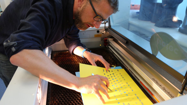
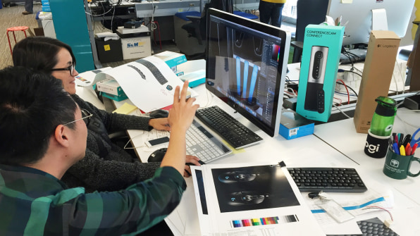
In turn, every new Logitech product is about building, not just a product, but an experience, in which designers and marketers think about the approach together. Logitech has placed its marketing teams and design teams next to one another in most offices. The CMO sits next to the CDO. And by anchoring each experience to one powerful idea, both teams can move forward with clarity.
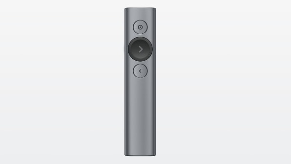
You can see how this marriage of marketing and design plays out in the Spotlight. It’s a little remote for presenting PowerPoints. Logitech had been making remotes for at least 15 years, but the Spotlight is different from your typical laser pointer and slide advancer.
“We looked at it and said, ‘Okay, how can we reimagine this space with our principles?’ We went back to the basics and said, ‘If we look at everybody, everybody has a fear of presenting. Even the best presenters in the world will talk about the high degree of fear. That’s a fundamental principle everyone is going through,’” says Curtis. “‘Let’s use that as the powerful idea: How do you create fearless presenting?’”
Everything about the Spotlight was pulled to that central idea to build out the product experience. Through the spotlight button, content is highlighted on your screen. But there’s even an accelerometer inside the Spotlight that eliminates visible shaking of this light, so the audience can’t see your fear broadcast. Hopefully that makes the user less afraid, too.
The Spotlight’s website, packaging, and main button all celebrate the same white orb–a function of the company’s “one idea” approach. (When an employee at Logitech wants to add a feature to a product–be it a designer or marketer–there’s a simple question to answer: Does this amplify the powerful idea, or detract from it?) It’s good design and good branding in one. And as a result, it’s probably the first PowerPoint remote with a name worth remembering.
DUPLICATING ONE POWERFUL IDEA, AGAIN AND AGAIN
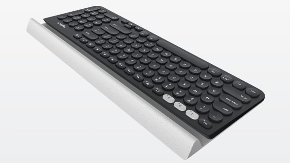
The Spotlight is no anomaly. You can see “one powerful idea” playing out across Logitech’s line. Even its old keyboards have seen a one big idea makeover. The Logitech K780 is a single set of keys that can be used across any device you own (tablet, phone, or computer). With a button press, you can swap devices, while a perfectly counterweighted slot can hold even large touchscreens without tipping.
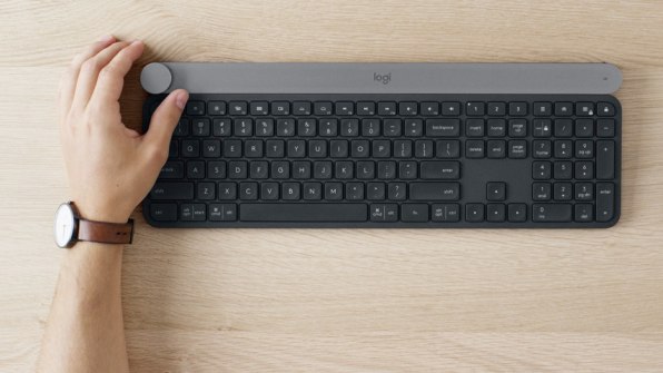
The K780 was short-listed for our 2017 design awards, but then the company followed up with the CRAFT–Logitech’s new flagship keyboard–which introduces a new key for those moments that no existing shortcut can do. It’s a dial, for twisting and turning your way through menus, Photoshop sliders, and playlists on Spotify.“It’s so hard to point to something as representative to what we’re aiming for because I don’t think we’re there with anything,” says Darrel. “I could pick apart every product we’ve ever launched, and Alastair could do it better than I could. By the time we’ve launched something, we can do something better.”
“I’m looking at the K780 which I loved. Now I can’t go back to this [keyboard],” concludes Darrell, who has since switched to the CRAFT.
Even still, Logitech’s design strategy of eschewing a single design language in the interest of milking the big idea out of every product seems well-tailored to a company that’s as successful in the buttoned up enterprise market as it is among neon-loving PC gamers. In a way, everything Logitech makes is the perfect execution of its new rules, because the rules allow for so much variety.
–
This article first appeared in www.fastcodesign.com
Seeking to build and grow your brand using the force of consumer insight, strategic foresight, creative disruption and technology prowess? Talk to us at +9714 3867728 or mail: info@groupisd.com or visit www.groupisd.com


![[Photo: courtesy Logitech]](https://assets.fastcompany.com/image/upload/w_707)