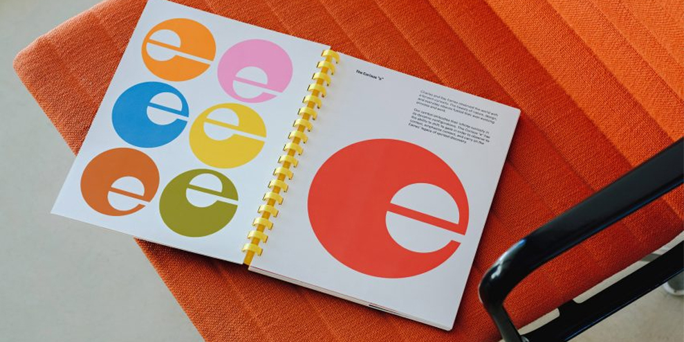
San Francisco-based design agency Manual has created colourful branding for the Eames Institute of Infinite Curiosity centred around a shape-shifting, “curious” lowercase “e”.
The Eames Institute of Infinite Curiosity is a newly launched non-profit dedicated to preserving the legacy of Charles and Ray Eames through physical and digital public programming that showcases a vast archive.
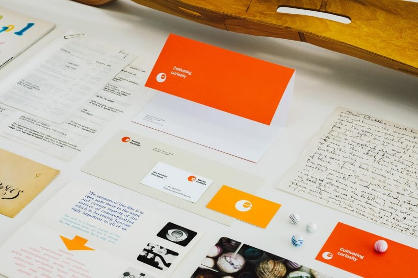
Manual was entrusted with creating the graphic identity for the organization, which spans a logo, packaging, merchandise, stationary, posters, publications and a website.
“We began the project in 2019, with deep immersion, research, and collaboration through multiple trips and work sessions at the Eames Ranch – delving into the Eames Collection and personal archive of Llisa Demetrios, the granddaughter of Ray and Charles Eames, and chief curator at the Eames Institute,” said the studio.
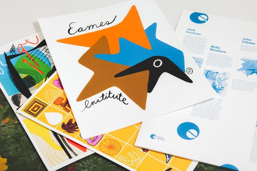
“Our goal was to uncover, and find ways to translate the spirit of Ray and Charles’ approach and work, all while creating a contemporary and future-facing identity for a progressive organization.”
The studio drew from the Eames’ graphic materials for the branding’s colourful palette, which features bright pinks, yellows, blues, oranges, reds and earthy greens, browns and greys.
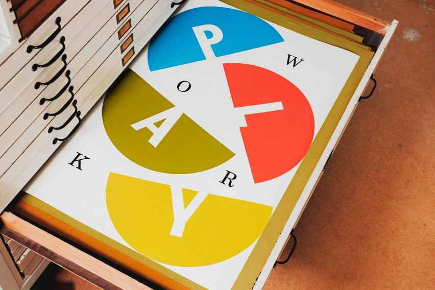
The colours were chosen to work functionally through a range of digital and print assets.
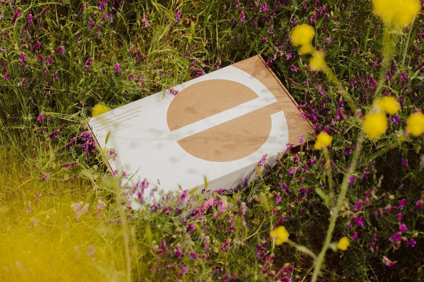
A bold lowercase “e” was used for the logo and is featured across various mediums. Its central counter was designed to shift in position within its circular body.
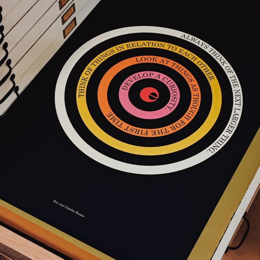
“The resulting identity is centred around ‘the curious ‘e”, a symbol that embodies infinite curiosity in its dynamic configurations,” said the studio.
“This curious ‘e’ has the ability to shift its gaze in order to observe its context, emphasize content, and carry on the Eames’ legacy of spirited discovery.”
Topol Bold, Century Schoolbook, Century Schoolbook Monospace and Graphik were used for typography in reference to the Eames archive.
“Topol Bold references News Gothic—a typeface that the Eames’ used in film titles, such as Powers of Ten—while its counterpart Century Schoolbook provides contrast and is used in ‘conversation’ with Topol, providing a classic and timeless voice to the brand,” said the studio.
“Century Schoolbook Monospace references the archive labelling seen in flat file drawers at the Eames Ranch and the Eames’ very own business cards, while Graphik serves as a contemporary ‘workhorse’ sans serif.”
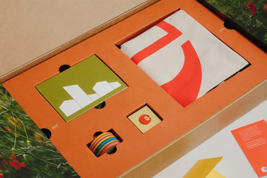
Manual created a launch kit for the project which contained a variety of branded merchandise including a tote bag, wooden blocks, a prism viewer and artwork prints.
The Eames Institute of Infinite Curiosity was founded in 2022. It will eventually call the Eames Ranch home, a studio and residential complex in Sonoma Valley, California.
Although the property is undergoing renovations, it will hold the Eames Collection, an “ever-growing” archive containing thousands of Eames artefacts, prototypes, furniture, art and ephemera.
While it undergoes construction, the Eames Institute will share the collection through “partner organizations and temporary installations”.
Manual’s branding for the institute has been shortlisted in the graphic design category of Dezeen Awards 2023.
Other recent branding projects include a playful refresh for Jello-O and a hotly contested new “I ♥ NY” logo from earlier this year.
—
This article first appeared on www.dezeen.com
Seeking to build and grow your brand using the force of consumer insight, strategic foresight, creative disruption and technology prowess? Talk to us at +971 50 6254340 or engage@groupisd.com or visit www.groupisd.com/story

