“The moment we realized it had to go was when we realized that our logo actually represented the worst part of meeting up with new people.”
With 27 million members and 250,000 separate groups, Meetup.com is probably the most popular social network that no one ever talks about. Among the Twitters, Facebooks, LinkedIns, and Pinterests of the world, it’s practically invisible.
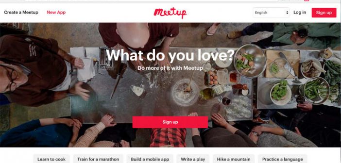
Part of that is by design. If Meetup does its job right, you’re not spending that much time on it at all. The site exists to facilitate offline friendships and experiences, through groups dedicated to particular hobbies and interests. But even so, Meetup’s existing design didn’t help. It was functional, but not sexy, a platform that looked appropriate for grandmas looking for knitting circles than, say, twenty-somethings searching out ultimate frisbee leagues.
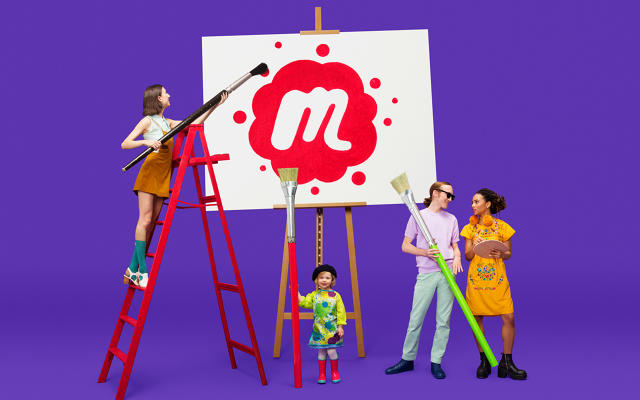
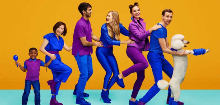
Today, that has changed. Thanks to a collaboration with fun-loving, nudist-friendly design house Sagmeister & Walsh, Meetup has a new logo, a new identity system, and a new app (which the design agency collaborated with Meetup on to make a reality). The best way to explain it, oddly, might be in musical terms: if the old Meetup app felt like Pandora—a functional app with a design from a decade past—the new Meetup feels like Apple Music, filled with lots of movement and bright, poppy bursts of color.
Let’s start with the new logo. The old one had some problems, the first being that the handwritten name tag, while having clear brand recognition, was a nightmare to work with on mobile. Look at Meetup’s old iOS icon, in which the nametag is inelegantly crammed, off-center no less, into the rounded rectangle. It looks even wonkier when adapted to the round Apple Watch icon. “That name tag logo had a lot of tactical problems,” admits Jen Gergen, design director of branding identity at Meetup. “There’s a lot of love for the nametag, and it’s built a lot of equity in the last 14 years, but it was increasingly frustrating to work with.”

But for Gergen, the “clincher” that put the old logo to rest wasn’t its adaptive problems. It’s what it stood for. “The moment we realized it had to go was when we realized that our logo actually represented the worst part of meeting up with new people,” she points out: that awkward introductory phrase, when you’ve scrawled your name on a sticker, slapped it on the lapel, and are milling about in a room full of strangers, feeling like a doofus. In other words, it didn’t represent camaraderie and friendship, which is the best part of a good Meetup. It represented social anxiety.
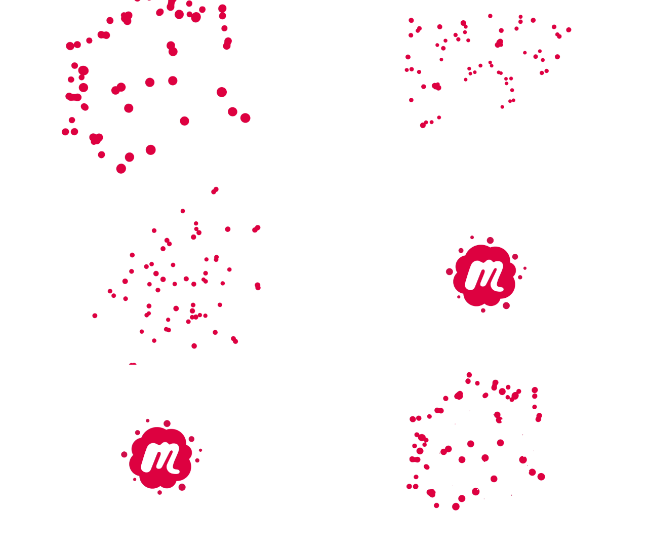
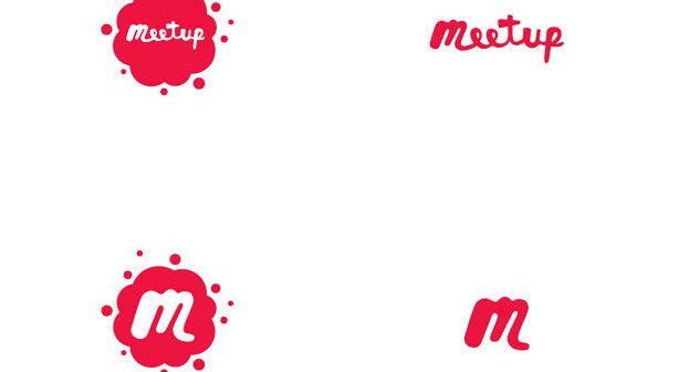
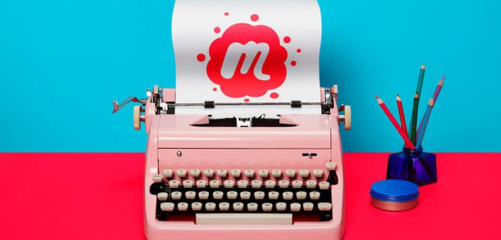
The new logo, designed by Sagmeister and Walsh, fixes the problem in some clever ways. Not everything has been thrown out: the distinctive Meetup red, as well as the handwritten look, are retained. But the nametag is gone, and the penmanship has changed, replaced with a thick, quirky, and hip signature that almost looks like it was drawn with a Crayola marker by someone adept at writing with their non-dominant hand. It has a blobby quality which becomes even more apparent when animated, turning the logo into a petri dish of points, swarming together like Twizzler-colored ferrofluid—a visual representation of many people meeting up. For round icons, like the Apple Watch, the “M” stands by itself, immediately recognizable thanks to its idiosyncratic slant. App icons, meanwhile, feature the monogram surrounded by incoming blobs, making it look almost like a paint gun splatter.
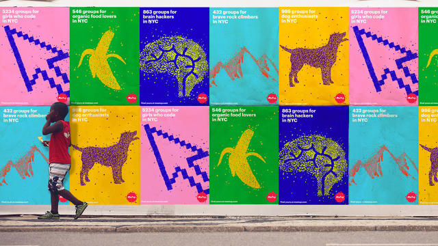
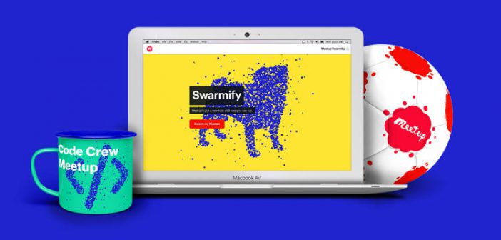
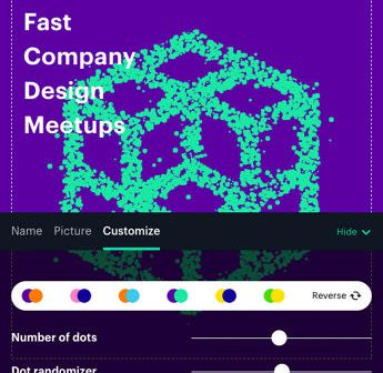
But the new identity needed to succeed outside of digital. It needed to be a proper branding system. “This needed to be easy to work in the real world,” Gergen says, because the whole point of Meetup is to get people talking face-to-face. Previously, Meetup had 27 million members, spread across 250,000 groups, but no branding system that allowed these group members to easily find each other in the real world. With the new identity, though, that changes. “It’s flaggable,” Gergen says, referring to the way the distinct “swarming” cursive can be used to write out the name of individual Meetup groups thanks to a dedicated web app, then printed out to serve as a flag in the real world for members. Nor do individual groups’ branding options end there: they can also choose duo-tone image headers for their group, giving individual groups a similar look to Apple Music’s category pages.
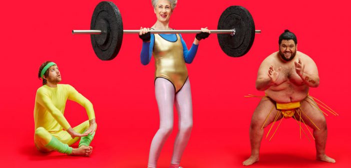
Is Meetup trying to court a younger audience with the redesign? Only partly, says Farah Assir, product design lead at Meetup: “We’re still targeting everyone, but it’s more about not being neutral anymore. About being bold, and having more of a personality. The colors and system we’re using are fresh, so it might attract a younger audience, but we think it’s actually more accessible to a lot of people, regardless of age.”
Gergen agrees, saying Meetup was inspired by other brands like Apple, Target, and the Gap. “They all have this bold, striking flavor, while still being acceptable to everyone,” she says. “We wanted something like that.” At first blush, it looks like Meetup might have gotten what it wants . . . and at the very least, it’s a clear improvement on the old design in every way. You can check out the new Meetup here.
[All Images: Sagmeister & Walsh]
This article first appeared in www.fastcodesign.com

