Sydney Opera House’s new brand attempts to solve a problem unique to the starchitecture age: What happens when your building is too famous?
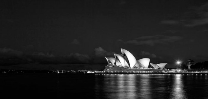
Since construction was completed in 1973, the Sydney Opera House has become one of the most iconic buildings in the world. Over 8 million people a year take a picture in front of the building’s rippling sails, but only a small fraction of those people—less than 350,000—actually walk through the doors for a guided tour. And although the Sydney Opera House is a popular arts destination, with over 1.2 million attendees a year, the venue doesn’t have much of an identity of its own, independent of the building’s soaring facade.
That’s a shame because the Sydney Opera House was never meant to be seen as just a shell, says Kieren Cooney, CEO of Interbrand Australia. The content of the Sydney Opera House was meant to be seen as one with its exterior; you were supposed to want to go in as much as you wanted to walk around it. Now, Interbrand Australia has created a new identity for the Sydney Opera House that Cooney hopes will finally succeed in integrating the organization’s iconic exterior with the vibrant arts inside.
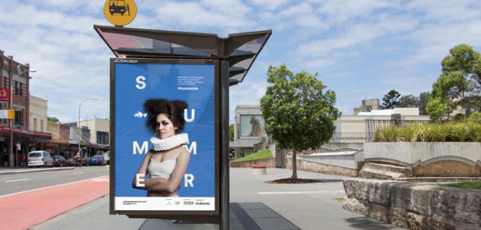
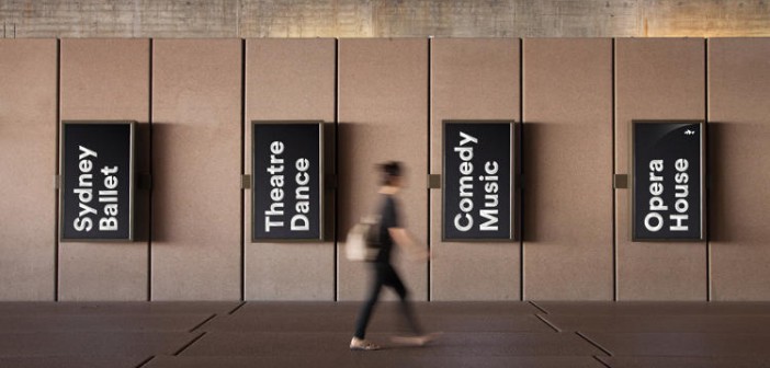
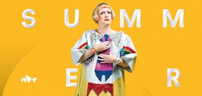
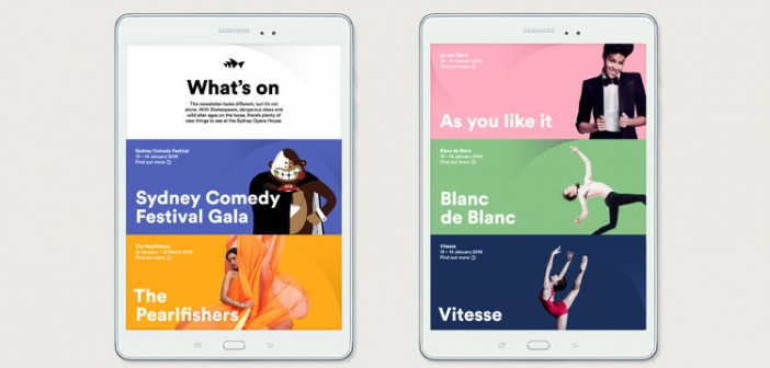
Inspired by the interplay of geometry, light, and shadow of the building’s exterior, Interbrand Australia’s new identity encompasses a custom typeface to accompany its old logo (an abstract, geometric representation of the Opera House’s profile), as well as a visual language that references the building’s iconic architecture, without beating you over the head with it. “At the heart of it, we wanted to help the Sydney Opera House reassert its purpose,” Cooney says. “To be a source of inspiration within a building, not just a building.”
It’s a problem unique to the starchitecture age, of which the Sydney Opera House—designed by Danish architect Jørn Utzon in 1957—is arguably the proto-example. Everyone wants an iconic building. But what happens when your building is too famous? How do you refocus attention when the building is viewed as more important than the cultural institution it was designed to promote?
To understand Interbrand‘s approach, Cooney says it’s important to understand the history of the Sydney Opera House. It was commissioned at a time when Australia, formerly regarded as a backwater colony, had just stepped onto the world stage as one of the Allied victors of World War II. “Up until that point, people had very simple ideas about what Australia was about,” explains Cooney. “But Joseph Cahill, the premier of New South Wales, understood that not only is public infrastructure important to the building of a nation, but so was building an infrastructure of the arts. So he put out the challenge to make an arts center.” This arts center, which became the Sydney Opera House, had “huge, noble, lofty goals,” Cooney says. “The project was a crucial part of Australia working out who we wanted to be, and how the world saw us.”
In other words, the Sydney Opera House’s original purpose was to shift perspectives. Shifting perspectives is also the goal (and even the name!) of the Sydney Opera House’s new identity. “We looked to the structure’s details for inspiration,” Cooney says. “Most of the shapes we use are inspired by the building itself, which is both beautiful in its magnitude, and beautiful in miniature.”
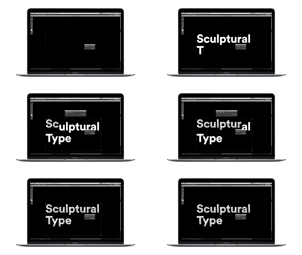
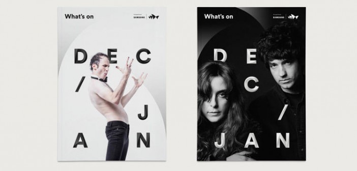
The identity includes a new custom typeface, Utzon. Designed by Swiss typographer Laurenz Brunner, Utzon‘s letters are beveled so that any given glyph is made up of multiple slopes and angles. When animated with a light source, these bevels create dramatic shadow patterns, which evoke the Sydney Opera House at sundown. And these letters don’t just exist as vectors: they have been designed to be real-world objects, so that they can be used as physical signage, and illuminated by real light sources.
Another key element of the identity are the colorful new sails used to tie together its posters, commercials, and other marketing materials. The sails emulate the subtle chevron pattern of the Sydney Opera House’s exterior, but unlike Utzon‘s shells, they aren’t just monochromatic: They also come vibrantly colored with shades plucked from the famous tapestries (designed by Utzon, with contributions from Le Corbusier) which hang on the inside of the building. It’s another example of how Interbrand Australia is trying to unite what goes on inside the Sydney Opera House with its exterior. These sails look good in static form (for example, as the background pattern on a poster for an upcoming program), but like everything about the new identity, also lend themselves to motion. “When you walk around the building, it feels like it moves,” explains Cooney. “We wanted our work to have the same effect.”
It’s a little too early to tell if the opera house’s new identity will push the attendance needle: It only started rolling out in December. But by another metric, Interbrand Australia has already succeeded in what it set out to do: The new identity looks native to the place, not retrofitted. When Utzon sat down at his desk to draft the original design of the Sydney Opera House, he didn’t simultaneously create an integrated brand identity for the organization his arts center would house. But now, thanks to Interbrand Australia, it looks like he did.
All Images: courtesy Interbrand Australia

