Even SpaceX is a massive fan.
NASA astronauts safely returned to Earth this past weekend, splashing down off the coast of Pensacola, Florida, after completing a trip to the International Space Station. The journey, carried out through private company SpaceX, was the first manned spacecraft to take off from U.S. soil since NASA’s shuttle program retired in 2011.
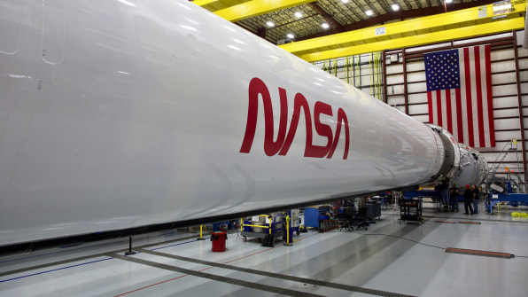
The mission was captivating, but it caught the attention of design and NASA fanatics for another reason: The “worm” was back. The wordmark was designed by Richard Danne and Bruce Blackburn of design agency Danne & Blackburn in 1974, adopted by NASA in 1975, and retired in 1992 until officially reappearing this year. But truthfully, it’s never gone away. It’s developed a cult following of its own over the decades and has been a part of fashion collaborations and pop culture generally. It’s gained such cultural cachet that SpaceX was “determined to resurrect this” for the launch, according to Danne.

The question is, why? Why does a logo that was only in use for 17 years—and was retired for 28—have such staying power? It comes down to three components: its removal, its design, and what it represents beyond NASA.Danne and Blackburn initially presented the wordmark during a time of flux at the agency. The Apollo era was behind it. The shuttle era was years away. Both publicity and excitement waned. The agency needed a rebrand. “We were filling the gap and organizing on a communication level so it looked more progressive,” says Danne. But it also needed practical help.
The design was meant to provide visual cohesion for nearly a dozen disparate departments across the agency. As Danne recalled, it “had to be a simple solution to anchor all this garbage that we saw in this agency.” So NASA introduced the “worm,” as it was derogatorily called at first, to complement the round meatball logo, which was more difficult to read and see at a distance. While the meatball logo was still used, let’s just say it got eclipsed.
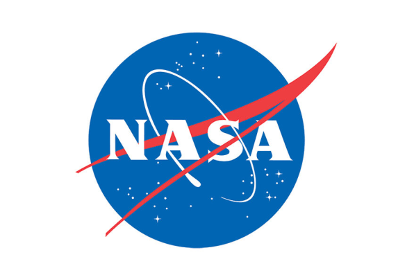
Fast-forward to 1992. As Danne tells it, the logo was retired by executive decision. The new NASA administrator at the time, Dan Goldin, allegedly didn’t like the worm and wanted to bring back the meatball as the primary logo. According to Danne, it was quickly phased out. NASA confirmed it was an executive decision but didn’t have any more details about Goldin’s motivations.
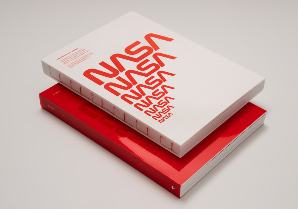
But while NASA retired the worm from its official capacity in 1992, it created a nostalgia market among a younger generation. “The logo seemed to gain in stature when Goldin kiboshed it,” says Danne. “It became more visible, not less.” Danne started seeing the wordmark on all sorts of unrelated products. This embracing also speaks to a broader trend, according to Jesse Reed, co-founder of Order design and Standards Manual, which will publish the monograph The Worm in October. “The general public probably sees it as a nostalgic and retro representation of NASA,” Reed says. “That’s a whole genre into itself.”
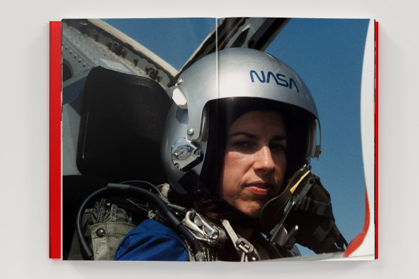
There’s another reason why the worm has saturated popular culture: It’s damn good design. In fact, Reed says the fundamental architecture of the wordmark, which is anchored by two major visual elements—the As and the very similar N and S—”is so harmonious, it’s like perfect graphic design.” The shape of the As also mimics the nosecones of a rocket or shuttle, and suggests vertical thrust, with curves borrowed from aerospace itself. And the monoweight of the line gives the wordmark a machine-like feel, almost like it’s bent out of metal, according to Order co-founder Hamish Smyth.
The visual details might be more than the average person would notice, but it’s worth recognizing because it also gives the logo profound versatility. “The designer population probably understands how it needed to work on the piece of paper, on a letterhead or an invoice, and also on the side of a satellite, and how it needed to withstand those different applications,” says Reed. “The meatball isn’t designed to withstand the types of design considerations that graphic designers think about.”
Danne says these simple, elegant, and versatile visual elements also underscore a deeper meaning. “NASA is very romantic and sexy,” he says. Especially when compared to other government agencies, like the Department of Transportation. “They both have motion built into their matrix, but NASA is the only one that has adventure and exploration.” It represents an entity that takes humans to the furthest possible realms; In just four letters, it “personifies innovation and moving ahead.” And compared to the meatball, it’s also consistently been associated with young progressives at the agency, who enthusiastically embraced its arrival in the ’70s—and are now in charge.
But just like space, Danne still doesn’t quite know how to explain the logo’s popularity (although he’s thrilled about it). He’s currently on a NASA committee that’s developing guidelines for an expanded use of the logotype, based on the SpaceX model and the worm’s enormous popularity today. “I think we got it right and we rang a bell and that bell is still ringing.” NASA certainly seems to agree.
–
This article first appeared in www.fastcompany.com
Seeking to build and grow your brand using the force of consumer insight, strategic foresight, creative disruption and technology prowess? Talk to us at +971 50 6254340 or mail: engage@groupisd.com or visit www.groupisd.com/story

