Penn Station, friendly? Pentagram’s new wayfinding in the notoriously unfriendly transportation hub aims to make it so.
When it was completed in 1910, New York’s Pennsylvania Station was one of the city’s most celebrated buildings; demolished and rebuilt underground in the 1960s, it’s now a labyrinthine mess–dark, confusing, and dirty. Yale architecture historian Vincent Scully famously quipped: “One entered the city like a god; one scuttles in now like a rat.”
Help is on the way. In 2020, an airy new train hall is scheduled to open, but before that happens the station is taking steps to improve commuters’ experiences, starting with better circulation and wayfinding. The West Concourse, the renovation’s first phase, just opened, and it features supergraphics designed by Pentagram partner Michael Gericke and his team.

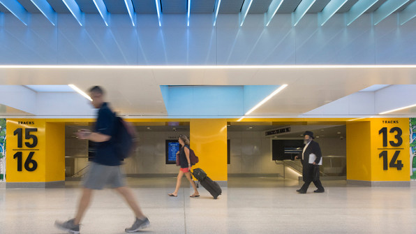
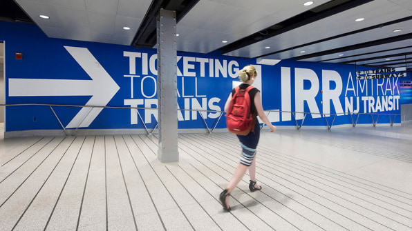
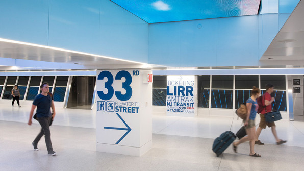
The new wayfinding is straightforward. And it’s big. Instead of installing a series of tiny signs that guide commuters to their destination–be it the exits, ticketing, bathrooms, taxis, or the Amtrak, LIRR, or MTA lines–Pentagram emblazoned large-scale graphics directly on the walls and columns. There are about 50 graphics in all in the concourse. Some are close to 100 feet long, which is about the length of a basketball court. Some are a few feet wide and fit on the structure’s columns, like the signage for specific tracks, which has three-foot-tall numbers. The greater visibility helps pedestrian flow since people aren’t looking around for small signs, impeding traffic while they look around. In effect, the entire structure is like a compass directing people where to go.

It’s meant to be “a simple, effortless, friendly, and engaging experience that makes you feel good about arriving at or leaving from Penn Station,” Gericke says. “We didn’t want to be shy about [wayfinding]. It was something that reaches out from a distance . . . It’s this attitude of rather than turning our backs on passengers, we’re going to get you here as fast as possible.”Over 650,000 people travel through Penn Station every day and the routes to get to a specific exit or transfer aren’t direct. Commuters typically have to look for signs at intermittent distances. If they miss one at a key juncture, they could head the wrong way.
“People have been trained to follow a sign to a sign to a sign,” associate designer Don Bilodeau says. “We thought, you can make one wall a sign instead of making five signs. It engages the users and makes the space friendlier and not as dark and dank and miserable.”

Since the passageway is entirely underground, Pentagram chose bright blue and cadmium yellow to make the space feel more cheerful and allude to the sky–something you’ll never see in the current station, but you will see in the addition–which will have a glass roof–once it’s complete. The sans-serif typeface is DIN, which was originally used in railways when it was designed in the early 1900s.
This new wayfinding is only in a small portion of the station, so commuters who don’t have to walk through the West Concourse still have to slog through the same old busy signage. Graphics alone won’t solve the problem. Corridors throughout need to be bigger; circulation everywhere–not just in the new building–needs to be more direct. However, the symbolism of Pentagram’s supergraphics embodies the forthcoming renovation’s aspirations: a return to the days when passing through the building was something you looked forward to.
–
This article first appeared in www.fastcodesign.com
Seeking to build and grow your brand using the force of consumer insight, strategic foresight, creative disruption and technology prowess? Talk to us at +9714 3867728 or mail: info@groupisd.com or visit www.groupisd.com


![[Photo: courtesy Michael Gericke/Pentagram]](https://assets.fastcompany.com/image/upload/w_707)