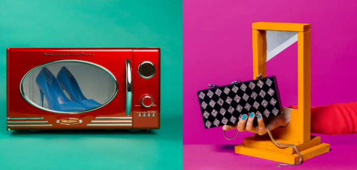
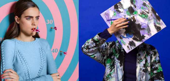
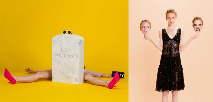
In rebranding the fashion company Milly, Sagmeister & Walsh created 400 images for social media, signaling a shift in design strategy.
A few years ago, a full-page ad in a glossy magazine and a flashy billboard would have signaled to the world that a fashion brand has made it mainstream. Today, it’s the post with 100k Instagram likes. The social media platform known for its proficiency in generating FOMO has proven a powerful tool for an industry that sells aspiration and desire as well as it does skirts and blouses.

For the New York-based brand agency Sagmeister & Walsh, wielding that power is an essential part of a fashion brand’s visual strategy, and its latest project suggests as much: a refreshed visual identity for the popular women’s clothing brand Milly.In addition to a new look and a print advertising campaign, Milly will also launch with an an arsenal of 400 images to roll out on Instagram over the next year.
Milly’s new look comes just as the brand releases its Fall 2016 line, a bold, contemporary departure from the brand’s traditionally vintage-inspired pieces. Milly founder Michelle Smith tapped Sagmeister & Walsh to update the visual identity to reflect that. Rather than pour money into redesigning and replacing the logo, originally designed by Pentagram, they instead focused their energies on animations and imagery that would adapt the existing logo to the brand’s evolving personality—one animation, for example, shows a bright yellow pump sprouting flora. They then developed a colorful and irreverent ad campaign to match.
Jessica Walsh, a partner at Sagmeister & Walsh and the project’s lead designer, says that central to the ad campaign was creating images especially for Instagram. “So much of a brand’s identity isn’t just a logo anymore,” she says. Consumers discover brands on Instagram, share new styles, or buy in to the brand’s overall look and feel. Previously, Milly’s Instagram was essentially Smith’s personal feed, so Walsh and her team put together images that correspond to the website and print ad campaign but are tailored for the platform.
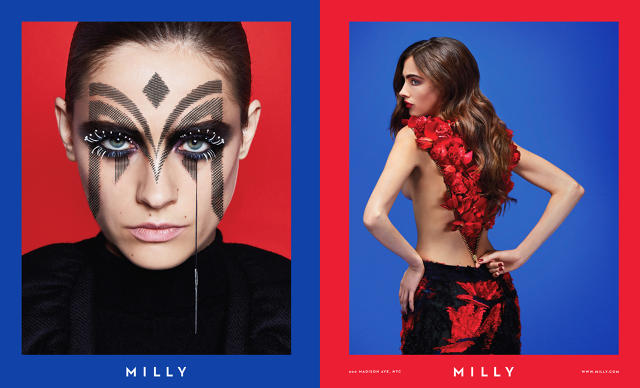
“With print, you’re aiming to do something that stands out when someone is passing on the street or standing at the subway,” says Walsh. “You want something that gets people to stop and consider it. But on a feed, you’re looking at what reads on Instagram on a small scale. It has to be more simple” and pop out on a vertical scroll full of other images. Walsh says with the Instagram images they had more room to have fun and tell a narrative. Most of the images were shot in-studio, with designers sourcing props, like a bubble gum pink balloon dog waggling its tail in one GIF, or a whoopee cushion with adorned with “Sorry I’m Not Sorry” in another.
Creating a cohesive visual campaign for Instagram is a great way to take advantage of the social media platform’s ability to draw in and maintain consumers. It’s also a good way to see what imaging sticks. “We will definitely be watching to see what will do well,” says Walsh. “The audience for Milly before is slightly different than the audience we’re focused on now, so we want to see what they hold on to.”
This article first appeared in www.fastcodesign.com

