Logos look a little different when they practice social distancing.
Efforts to curb the spread of coronavirus have shuttered doors, emptied stadiums, and changed lives around the world. The economic impact will be severe, although it’s too early to tell how the crisis will change global brands.
In the meantime, Slovenia-based creative director Jure Tovrljan reimagined some of the world’s most iconic logos for the new age of social distancing. Tovrljan had the idea about a week ago, he says over email, when he saw Starbucks’s mermaid logo and wondered how it would look with a mask. At that same time, coronavirus infection rates were rapidly climbing, and his social media feeds “were flooded with cheap memes about the topic,” he says. So after tweaking the Starbucks logo, he decided to make a substantive series.
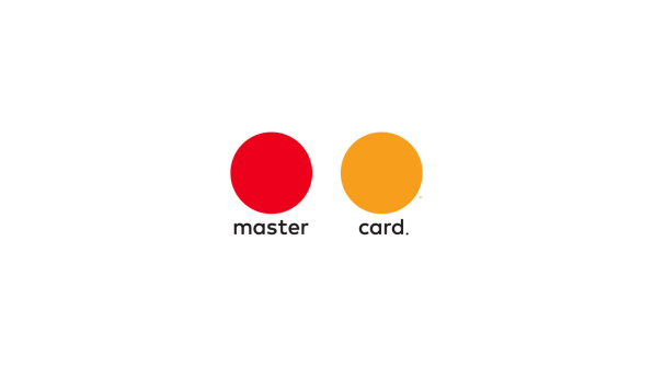
Tovrljan redesigned 12 logos from brands like Mastercard, the NBA, Nike, and the Olympics. Some updates use a simple play on words: United Airlines becomes “divided,” Nike’s eponymous “Just do it” becomes “Just don’t do it”; the U.S. Open becomes “U.S. closed”; LinkedIn becomes “LockedIn.”
“I tried to find something in every brand that communicates perfectly in normal circumstances, but is wrong in these difficult times—mermaid without a mask, Nike telling us to simply do it, Mastercard circles overlapping,” Tovrljan explains over email. “If you turn it completely around, it becomes even more powerful.”
In some redesigned logos, Tovrljan used visual sleight of hand rather than changes to the tagline to communicate our new normal. Tovrljan increased the negative space between the rings in the Olympics logo to completely separate them. He pulled apart the overlapping red and yellow circles of the original Mastercard logo, which was designed to emphasize “connectivity.” The NBA logo, which features the silhouette of a basketball player in motion, has been rotated 90 degrees for the age of social distancing: The silhouette still has one leg extended, but he’s now lying down. And the basketball is now a laptop.

While Tovrljan’s logos are just thought experiments, some brands have made actual changes to their logos to better express this current moment of social distancing. McDonald’s Brazil has separated the Golden Arches that make up its iconic “M.” In one animated GIF version, the logo is placed above a new tagline that reads (as translated by Google Translate): “Separated for a moment so that we are always together.”

Coca-Cola, meanwhile, widened the space between the letters in its iconic script. The logo is featured in a new Times Square ad, which reads, “Staying apart is the best way to stay united.” (Times Square, for its part, remains eerily empty after New York issued a stay-at-home order.) And while it hasn’t touched its famous “Just Do It” tagline, Nike reframed the public obligation to stay at home as a personal challenge in a new ad campaign by Wieden+Kennedy.
Tovrljan didn’t expect his series to go viral, describing the redesigns as “just an idea of how logos should look like in these difficult times,” in his original Behance post last week. But Tovrljan told me that since then, “huge brands”—even some from the original collection—have contacted him to make similar adjustments to their logos. He might have stumbled upon the sweet spot that brands are still trying to figure out: how to implement subtle design changes that acknowledge our new reality, while still maintaining the sense of familiarity we all crave.
–
This article first appeared in www.fastcompany.com
Seeking to build and grow your brand using the force of consumer insight, strategic foresight, creative disruption and technology prowess? Talk to us at +9714 3867728 or mail: info@groupisd.com or visit www.groupisd.com


![[Image: Jure Tovrljan]](https://images.fastcompany.net/image/upload/w_562)